What Is Really Going On?
The Investment Perspective – October 2021

Peter Flannery Financial Adviser CFP
“Neither the investing method nor the fundamentals of the business are right or wrong because the mood of the market is favourable or unfavourable toward the “stock”. That is because when you really think about it, “stocks” (shares) are all about the financials and the trading price, the share price… the cash up value. What matters more is the economics of the business”
Peter Flannery
The market direction and profits
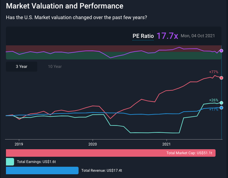
The above graph tracks the increase in total market capitalisation (the US share market), earnings (profit), and revenue (company turnover).
Looking at the graph above, the red line on the graph or the red horizontal bar underneath the line graph suggest that markets are either expecting better prospects in the future or simply chasing prices because they are rising – which one do you think it might be?
Yes, probably both. In my experience, the faster prices rise, the more the popular media plays it up and the more everybody wants to take part because of FOMO.
But what do things look like over a longer period? Let’s say 10 years…
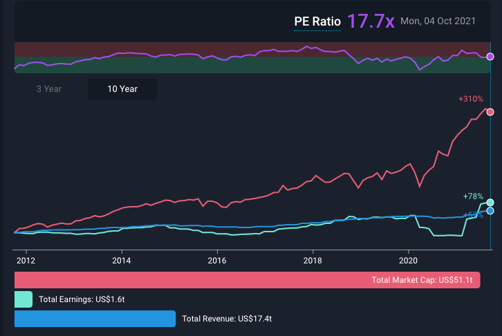
The above graph takes a 10-year view.
Interestingly, as I mention elsewhere, there are many different factions trading across markets. They are investing in different ways and make adjustments for all kinds of different reasons. That’s partly why market trading prices that we always hear about in the media are so random.
Market capitalisation is simply all of the trading prices added together across the market – total market capitalisation. Market capitalisation is the total of all shares for a company or the total of all trading prices across the market. We know that the market sets individual trading prices. So too is total market capitalisation driven by the overall market mood.
Hence, happy market then trading prices rise. Unhappy market, then trading prices decline. This information, of course, is very important if you like to play the market.
Whilst at WISEplanning, we find market-related information interesting. It is less valuable for us than other more fundamental information.
For example, in those charts above, the blue and green lines (or the blue and green horizontal bars across the bottom of each chart) are more interesting. In these examples, they show the movement in revenue and earnings (turnover and profit).
You can see how the green line (profit/earnings) dipped towards the middle of 2020, flatlined and then jumped up early 2021.
Looking at the 10-year view in the graph above, we can see that the divergence between trading prices and earnings looks bigger, although the P/E ratio at 17.7x hasn’t moved that much. The P/E ratio, by the way, on these graphs, look a bit light. However, it does depend on which index you are using to measure this ratio.
And so, that’s pretty common information that you can find anywhere across the markets. That’s because it is information based on the financials rather than the economics.
But where are the economics reported?
Well, at WISEplanning, we closely follow the economics and the information about the economics is largely in-house (not widely circulated).
As you may know, WISEplanning did not invent the economics of the business. That’s down to Charlie Munger and Warren Buffett mostly.
Value investing is generally considered those shares whose prices are beaten down or low when compared to say discounted cashflow (or some other measure of value), with their trading price lower than the intrinsic value (however that might be measured).
As a side note, it’s interesting to see many analysts and commentators now referring to their approach to assessing value as ‘the intrinsic value’.
Some of these measures, frankly, are wide of the mark. For example, discounted cash flow could be argued to be a form of intrinsic value; however, it excludes the underlying economics of the business, similarly, for P/E ratio, PEG ratio, and other common valuations used across the market.
Anyway, the point here is that market-related information and financials can provide some financial framework for decision making.
Blunt numbers such as turnover, earnings, and, say, the rise or fall in the trading price over a period of time are interesting but simplistic.
Ratio analysis is more useful, whereby we are comparing one number with another.
One of my favourite ratios is the return on shareholders’ funds. Another is a return on capital.
That’s because those ratios provide some clue as to how well the business uses its capital. They include both the income statement and the balance sheet and provide us some idea of the effectiveness of the underlying business economics. If you see what I mean, that is a long-distance from market capitalisation, share price movement, turnover and profit.
To be clear, I’ll take one competitive advantage over ten rising share prices every day of the week.
One provides reliability, and a decent amount of information, whereas the other is largely a game of chance.
One challenge that many people face is that as herd animals, we’re inclined to believe and trust more common information.
Information and data that is scarce or not widely known is generally viewed with a degree of scepticism and mistrust.
“If it’s that good, then why doesn’t everyone do it!?” A question that I have heard many times over the last 35 years.
Contact Energy vs. Alphabet (Google)
Just for fun, let’s take a look at two totally different businesses. Neither are recommendations. This is just for your information and learning.
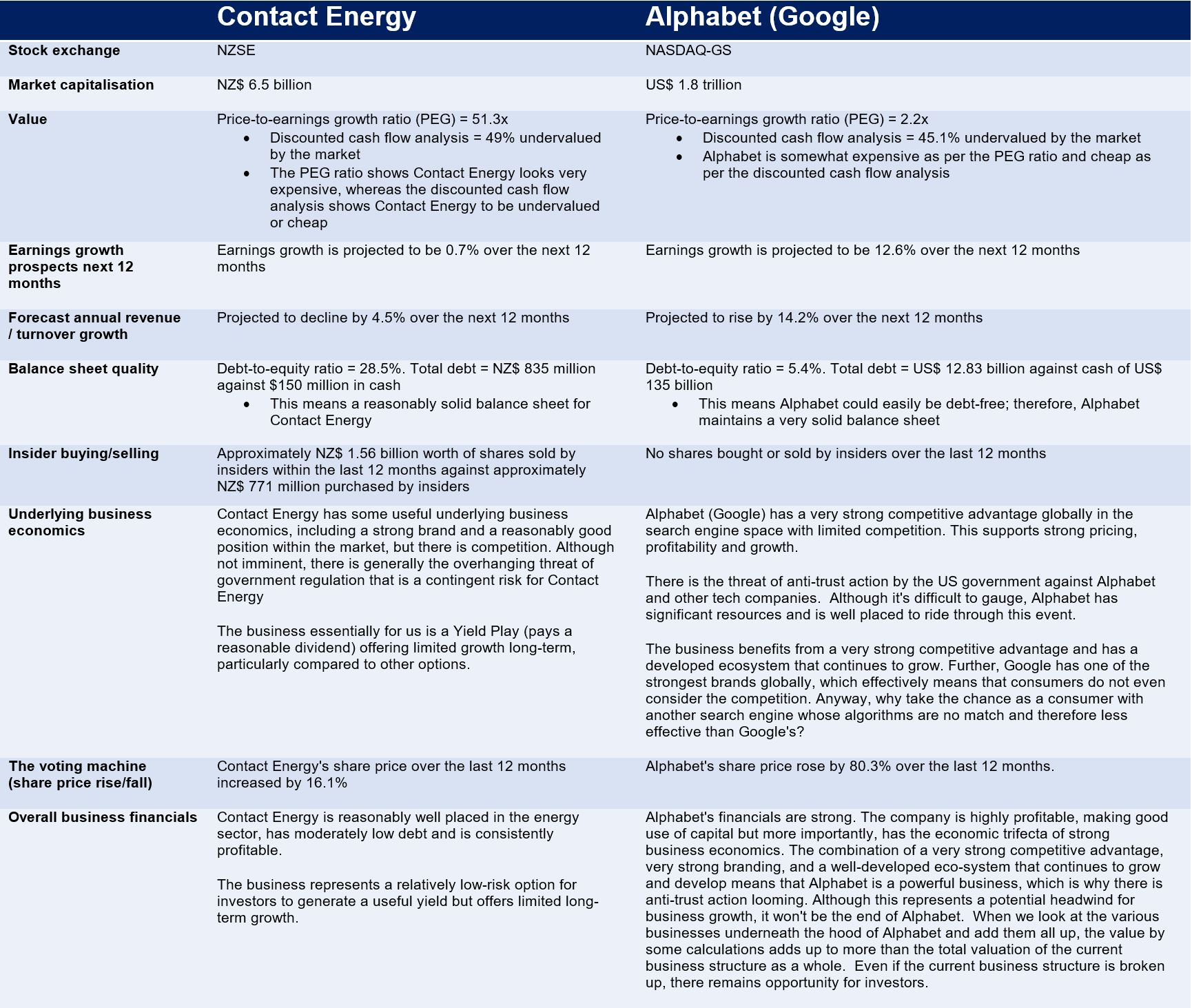
The above comparison between Contact Energy and Alphabet (Google) may offer limited clarity around the importance of the underlying economics of each business as it overviews the financials and, to a limited degree, the underlying economics of each business for comparison purposes.
So, looking at the above two examples, which one would you choose?
Those looking for income might go for Contact Energy because it’s paying a useful yield (circa 5% gross). If we step back and think about how both of these businesses have performed over the last 10 to 15 years, would Contact Energy be the best choice?
Although it’s difficult to know, at this stage, there does not seem to be the appetite by the government (too busy with COVID-19?) to regulate the electricity sector further.
On the other hand, Alphabet is facing anti-trust action, although court action is possibly at least 1 to 3 years away. Even then whilst regulation is possible because it is easy for law makers, changes in legislation are much more problematic. Serious anti-trust action therefore may struggle to emerge any time soon.
Looking at both businesses, Contact Energy remains sound and will likely continue on its current path as a stable business offering limited growth.
Alphabet, on the other hand, is facing headwinds. However, the strength of the economics of the business is powerful, providing resilience in the face of whatever comes out of future anti-trust action.
Even if the organisation is broken up, which would seem extreme (but possible), the underlying businesses within the current structure individually offer real value.
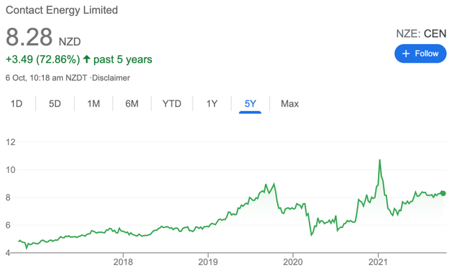
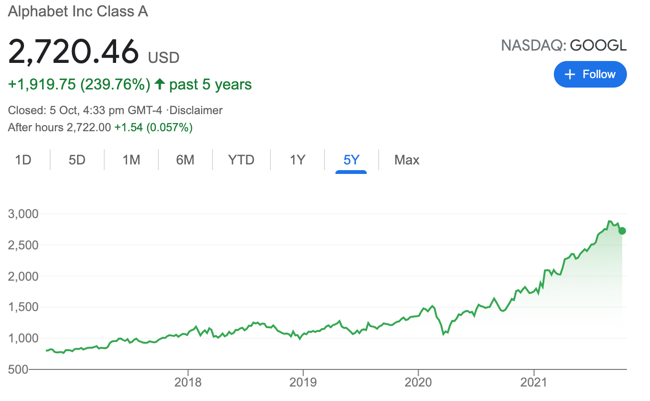
The graph to the left tracks the Contact Energy share price over the last 5 years. The chart to the right tracks the Alphabet Class A (GOOGL) share price over the last 5 years.
Although not all growth businesses are created equally, those with strong underlying economics have a history of outperforming Yield Plays like Contact Energy longer term. That’s partly because the economics help generates growth, but also over time, the snowball effect begins to take place…
“A good decision is based on knowledge and not on numbers.”
Plato