Where To Next For Interest Rates And The Markets?
Monthly Market and Economic Update – June 2023

Peter Flannery Financial Adviser CFP
“If you have one economist on your team,
it’s likely that you have one more than you’ll need.”
Warren Buffett
Key Points:
- What was unpopular, is now popular again.
- Did you jump about with your investments or follow through?
- Invest in the sector or the business?
- Can we trust central bankers?
- Australia surprises and lifts interest rates, NZ surprises and talks about enough rate rises already (really?).
- What actually causes inflation anyway!?
- Will rising interest rates address the cause of inflation?
THE MARKETS
Is it true?!
Sell in May, and go away.
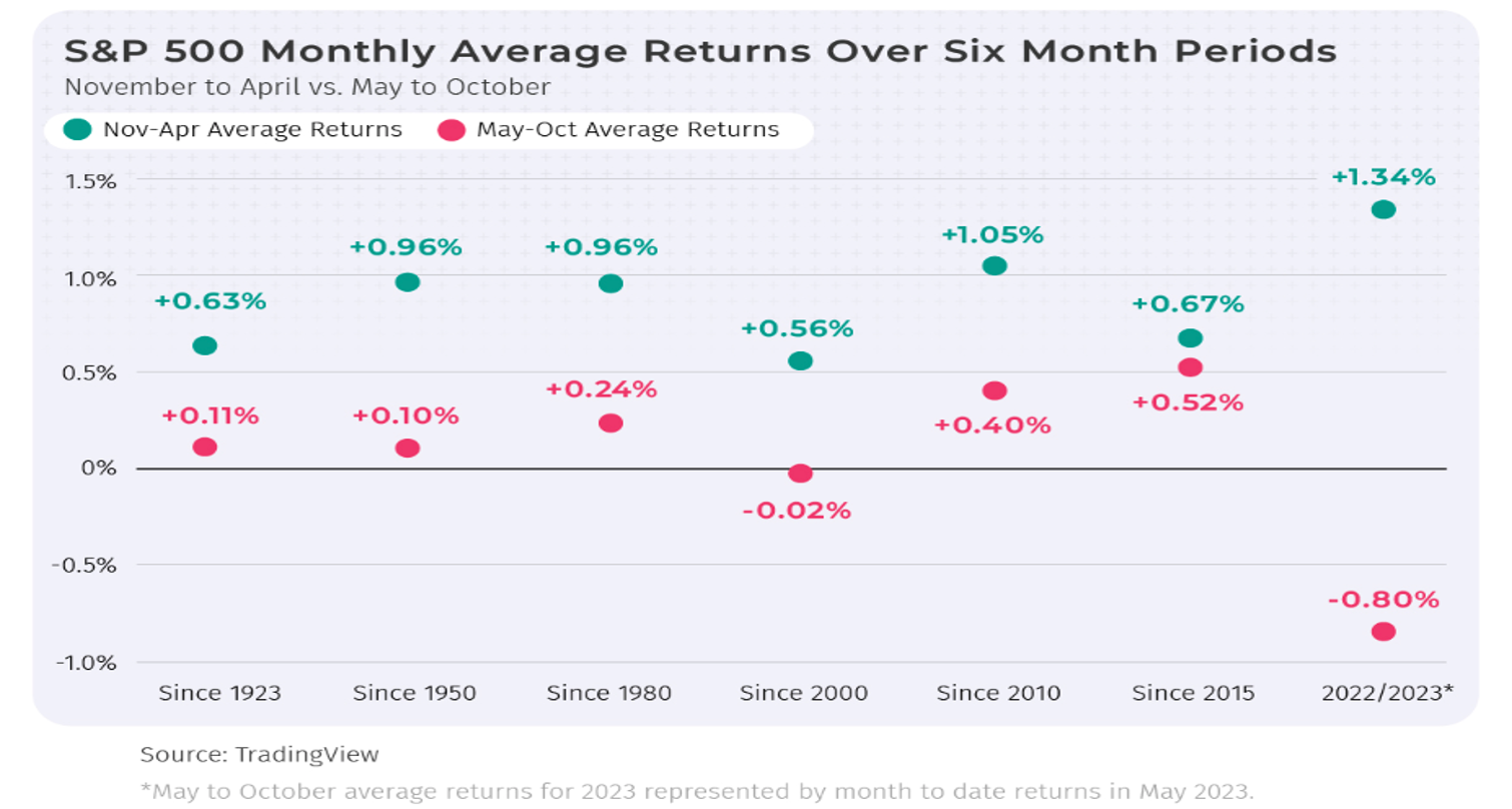
The above graph shows average monthly returns over six months periods for the S&P 500. The green dots show average 6-month returns from November to April. The red dots show average 6-month returns from May through October.
The answer to the question above is yes (it is somewhat true).
So, should we be selling now and going away from the markets?
The answer to that question in my view is no.
Hang on a minute though, how come markets generally perform on average less well from May through October compared to November through April?
The graph below shows the low level of trading over the summer months in the US and then the sharp trading uptick in September.
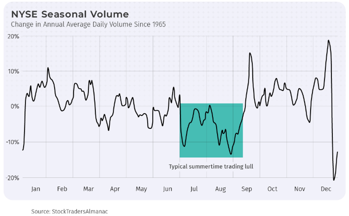
The above graph shows the quiet trading period highlighted by the green colour, and then the sharp upward spike in trading activity shown by the line graph spiking upwards above September.
There are a number of reasons for this activity. The one commonly referred to is the fact that, after a slow period of trading over summer, investors including large fund managers like to lock in their losses for tax purposes at the end of September. Hence the uptick in trading which is strong selling activity and therefore the downward pressure on trading prices. You may recall that some of the most notorious trading price corrections (e.g. 1987) have occurred around the months of September / October.
Cutting right to it, the above graph shows the strong trading activity across September. That is why markets and trading prices can be negative around the months of September and October.
However, unless you like to play the markets (i.e. timing markets), sitting tight and buying across the dip in trading prices is recommended (rather than trying to time markets).
When we extrapolate trading activity (selling out, then buying back in) out long enough and often enough across the markets, it starts to look not unlike what is sometimes referred to as Russian Roulette.
In other words, we may get it right a few times and start to look good. However, we’re going to get it wrong. This detracts from those times when we got it right.
Whilst some investors can be successful at playing the markets, serious investors have learned to avoid trying to time the markets. We can do this quite simply by investing in the business rather than the stock. Also, no need to be moving money about, trading in and out of investments. This reduces portfolio running costs and avoids costly mistakes.
My experience suggests we are better off to invest in a good business, holding for the long term unless there’s a fundamental change in the business. Also, taking advantage of lower prices along the way in order to boost our position when trading prices are more favourable helps manage risk and drive long term investment performance.
If you have the time, Google the 1987 share market crash, take a look at your timeline from, say, 1980 right up to today on any S&P 500 graph and see how small that correction actually is in today’s term. Yes, it was big at the time; however, some perspective always provides a more prudent view.
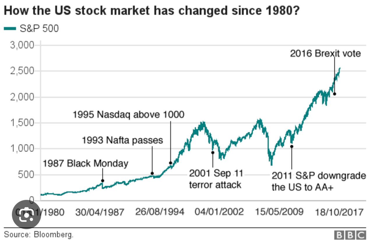
Look for ‘1987 Black Monday’ on the graph above to see the decline in the share market back then.
Tales of the losses incurred in 1987 are legendary and indeed, unsophisticated investors back in the day became permanent casualties at that time in the markets.
It was interesting to note that whilst it took 15 years for the New Zealand share market (the Barclays Index as it was known then) to get back to where to it was prior to the 1987 crash, it only took 18 months for the American share market to get back to where it was before the 1987 share market correction.
Meanwhile, along the way, lower prices as usual provided better buying for quality businesses.
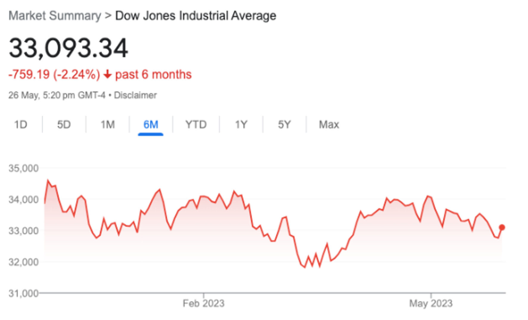
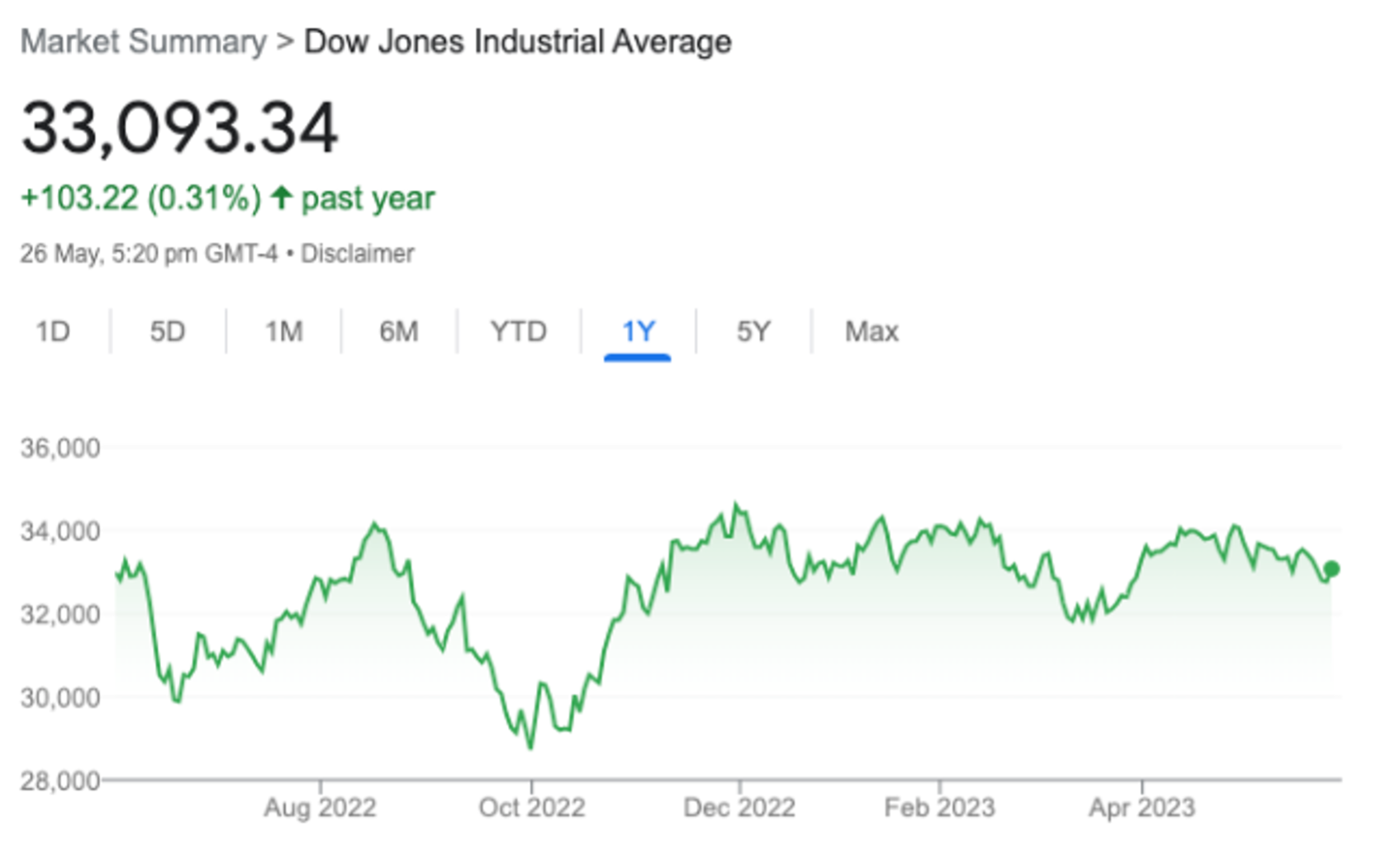
The chart on the left shows the US share market (the Dow Jones) over the last six months. The chart on the right shows the US share market (the Dow Jones) over the last year.
Although markets are feeling buoyant at the time of preparing this update, trading prices, whilst not cheap, are arguably not overly expensive.
Some patience might be required with some buying activity moving forward. Still, because of what’s been going on for the last couple of years, we now have some reasonable buying opportunities with lower trading prices now evident. Of course, we’re looking at specific businesses within the market rather than looking more broadly across the markets. This approach is incongruent with market timing.
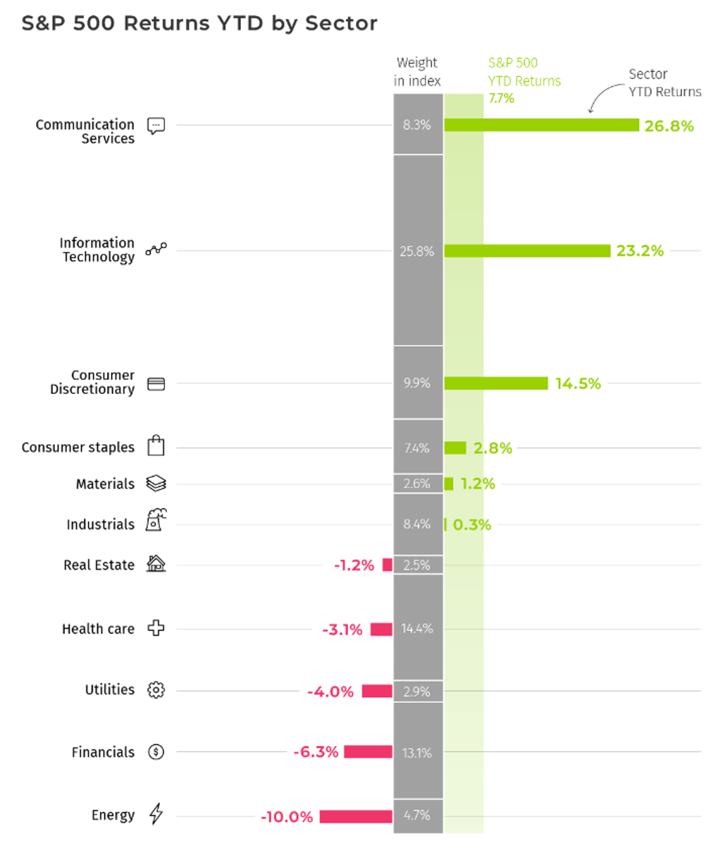
The above graph shows the movement in trading prices year-to-date by sector. Those shown in green are ahead, whereas those shown in red are behind.
The graph immediately above shows how various sectors have moved year-to-date, which is really more a measure of popularity than a signal that those underlying businesses are actually better performers than they were six months ago.
Markets (the voting machine) determine the price.
Happy markets generally drive trading prices higher, whereas unhappy markets drop prices lower.
It is worth keeping in mind that there are a variety of different participants across the market with different agendas and different reasons that drive their respective buying and selling decisions.
Currency
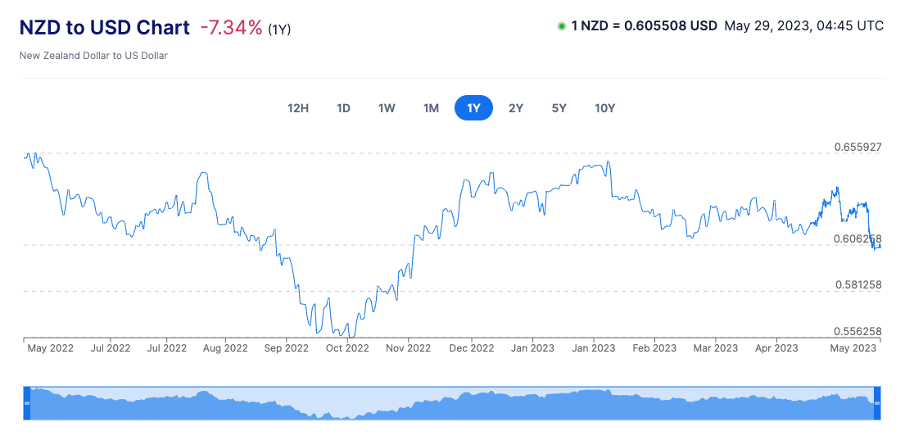
The above graph shows the movement in the cross rate between the New Zealand dollar and the US dollar.
Over the last 6 to 9 months or so, I have held back purchasing some US dollar-based assets to some degree because of the strength in the US dollar, making US dollar-based assets somewhat expensive.
Over the last month or so, we’ve seen the gap narrow again, bringing US dollar-based assets in range or close to.
Toward the end of May this year, the gap widened sharply, although not enough to stop us from nibbling on reasonably priced quality US businesses.
In short, we can continue selective buying of US dollar-based assets moving forward unless, there is a sharp widening of the gap once again.
As for selling in May and going away, that is not our thing.
Buying when prices are lower is.
Quality businesses are not defined by the movement in the trading price.
Sure, a sharply lower trading price can correctly signal that something has changed, possibly for the worse inside a business. However, it’s a question of whether that shift lowers the quality of the business or whether it is a short-term adjustment taking place.
The quality of the business, in the end, determines the trajectory of the trading price.
The Global Economy
By Morgan Edwards – Click here for brief bio
Have Central Bankers Got It Right?
The name of the game across international (and indeed national) economics at the moment is inflation and, of course, interest rates.
As such, an introduction into the basics of Post-Keynesian monetary economics begins our economic update this month.
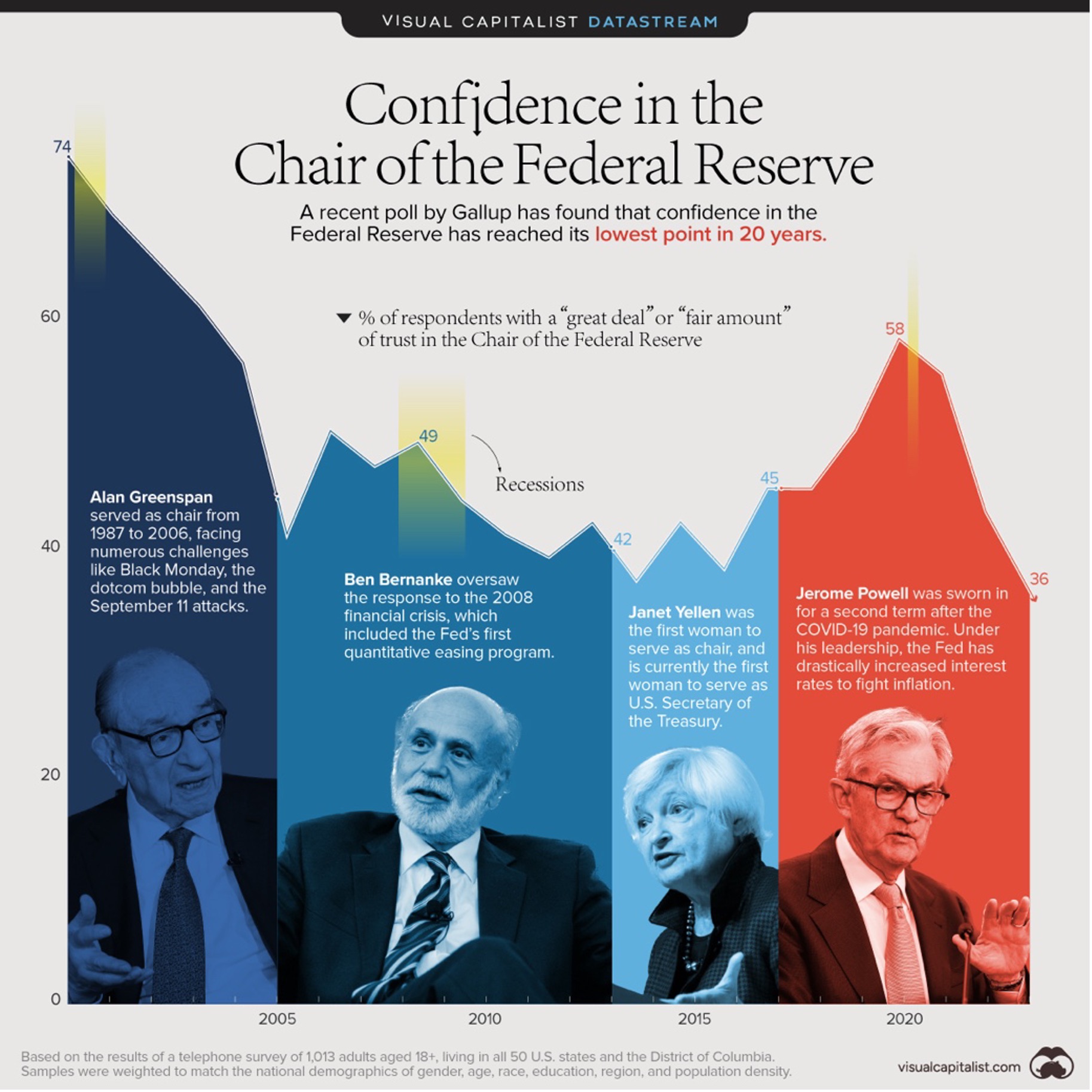
The infographic produced by Visual Capitalist shown above, depicts public trust declining in the Federal Reserve from a recent peak of 58% in 2020 to a trough of 28% currently.
Visual Capitalist note three reasons for this growing lack of trust. These are a negative impact of interest rate rises on the stock market, increasing the burden for those with variable interest rate debt, and the unaffordability of mortgages and home buying.
All of these reasons can be attributed to the Fed’s inability to rein in inflation over the past 18 months or so. This leads us to a question central to economics today and what is guiding much of the global economy currently…
How does monetary policy work and is it fit for purpose?
Such a question, reserved for ECON101 class at high school or first year university, is assumed knowledge to us all (those interested in these issues, at least). It is said that as interest rates go up people become less inclined to borrow from a bank given the elevated cost of servicing the loan through interest payments.
This decreases monetary based demand in the economic system and lessens inflation.
This implies that bank lending occurs adherent to theories such as loanable funds.
This theory states that bank lending is dictated by the availability of money deposited at the bank. Thus, banks are intermediaries of funds between prudent savers and imprudent borrowers. In essence, deposits create loans and people become more prudent as interest rates rise as they desire to save.
So far so good (?)
So far so good – except if you listen to the Bank of England (BoE), Bundesbank, our own Reserve Bank, and of course Post-Keynesian monetary theory.
The BoE noted in their 2014 paper ‘Money Creation in the Modern Economy’ that ‘whenever a bank makes a loan, it simultaneously creates a matching deposit in the borrower’s bank account, thereby creating new money. The reality of how money is created today differs from the description found in some economics textbooks.
Finally, in January, the NZ Reserve Bank published a bulletin entitled ‘Money Creation in New Zealand’. This paper echoes the insights of the BoE and Bundesbank, noting that ‘[t]he other important determinant of commercial bank lending is people’s demand for loans. Banks can only lend money to customers who want to borrow, have enough collateral security, and can afford the repayments’.
Two things
There are two things to note here.
First, it can be inferred that interest rate changes may not directly impact the demand for credit (debt) as demand for credit is determined by the desire of the consumer to borrow.
Interest rate changes are not an ‘inducement’ on citizens and therefore cannot force someone to borrow. I once brought up this point at the New Zealand Association of Economists (NZAE) Conference in 2022 and an audience member asked if I was being serious when I made this point.
Further to this point, if you take the insights of ‘Money Creation in New Zealand’ to their logical conclusion given their basis in Post-Keynesian monetary theory born from the likes of Basil Moore, Hyman Minsky and Wynne Godley, you will realise that even the Reserve Bank is saying that interest rate changes may not impact on inflation.
Second and perhaps most important, are interest rates even effective in fighting inflation?
For the logic of underlying interest rate decision making to be correct, there must be a clearly defined link between interest rate changes and the rate of inflation.
To date, no real correlation exists outside of logically flawed theory and intellectual convenient statistical analysis.
Reputable and robust statistical analysis of this relationship deems that it is of second order importance. That is a fancy statistical way of saying ‘not that important’.
Is the logic correct?
This brings me to my central point – is the underlying logic of monetary policy correct?
I would argue that gaping holes in the theoretical basis of interest rate decision making, and its sheer unpredictability, make for interesting intellectual conversation but extraordinarily unintellectual policy creation.
Interest rate setting relies on the notion that credit based demand, and therefore other tangential elements of that demand (i.e., spending restrictions from elevated mortgage payments) are a precipitous cause of inflation.
However, as the data over the globalisation era depicts, the key determinant of inflation is market dynamics, where credit based demand is one half of the story.
In other words, supply and demand of goods and services results in inflationary dynamics.
The United States of America
Economic news from the US has been dominated by talk of the debt ceiling caving in upon Joe Biden’s head.
Know this, however, that this is a political issue and not strictly an economic issue. The reason for this is a result of the ‘debt ceiling’ being imposed by lawmakers (i.e., a social construct), rather than it being an unquestioned ‘law of economics’.
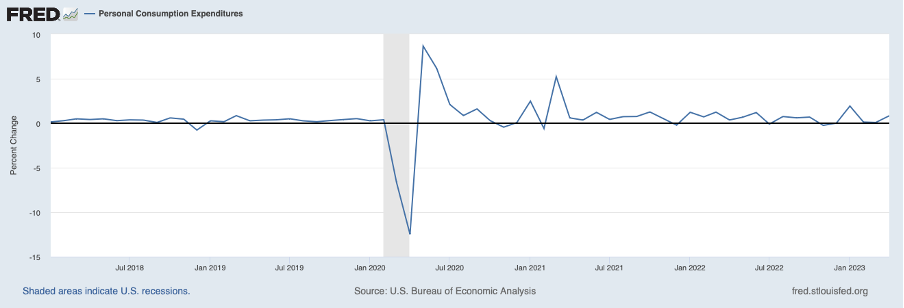
The graph above depicts personal consumption expenditure (PCE) data from 2018 to the present. PCE is the Fed’s preferred metric of inflation, and it 0.8% in April. This is above the 0.08% rise in February and March.
The benefit of using this data allows us to see more ‘real time’ changes in US PCE. The US Fed will be watching it closely. Let’s see if inflation continues to change over the coming months.
China
‘Choppy sideways’ continues to be the case in China, where the Financial Times (FT) report that China’s economic recovery is losing steam. Here is a rather useful panel of graphs sourced from that article:
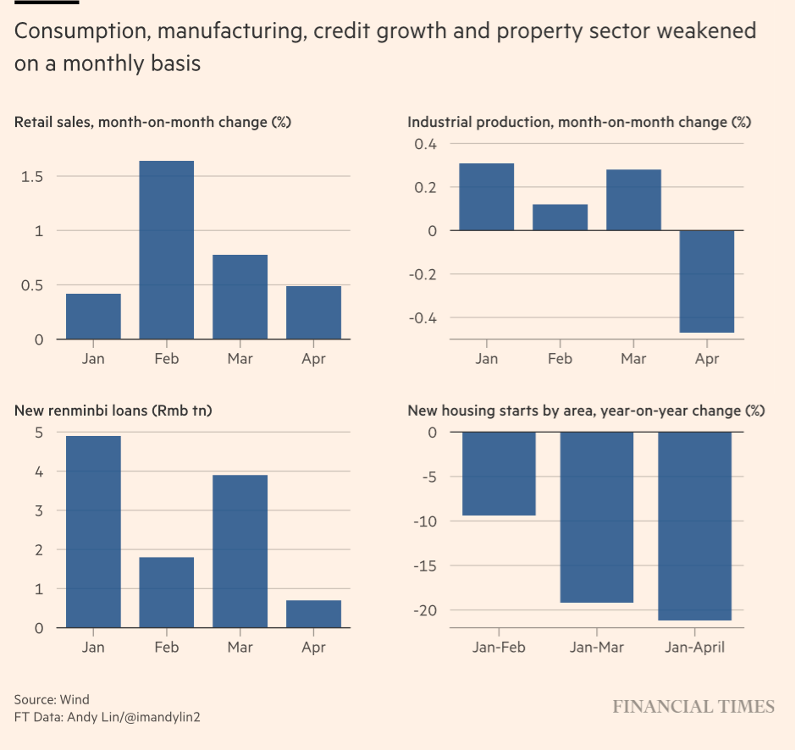
The graphs shown above demonstrate a strong decline in these respective variables.
However, I would like to draw your attention to the graph on the bottom left-hand side (New Renminbi Loans (Trillion RMB)).
RMB denominated credit has declined precipitously month on month, and it will be interesting to see where this figure is at next month.
As noted earlier, credit is the most significant driver of economic activity in modern economies.
Changes in these figures will (or should) therefore aid in guiding analysts’ predictions on the near to medium term outlook for China’s economy.
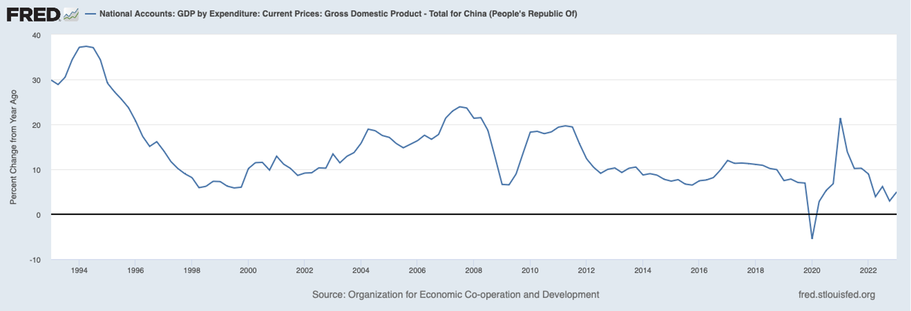
The graph above depicts China’s annual percentage change in GDP with an annual change of 4.96% evident in Q1 (first quarter) 2023. Note that the difference in percentage from last month (quoted as 4.5%) or from other sources you may have seen is a result of this being derived from RMD data.
More pointedly, the graph exemplifies the downward decline of percentage change in Chinese GDP. Note that the ‘spike’ in GDP growth circa 2020 is broadly consistent with the increase of credit at that time (according to Federal Reserve Economic Database/Bank for International Settlements data).
Britain
In the UK, inflation continues to remain ‘sky high’, with inflation at 32-year highs.
As (I hope) you remember from last month, energy prices in the UK also continue to remain sky high, with these input costs feeding into costs of production within the UK economy.
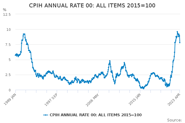
The graph above depicts the latest CPI inflation data for all items from the Office of National Statistics (ONS). It clearly demonstrates inflation remaining at historically high levels. I may be repeating myself from last month, but if only the Bank of England could produce an infinite source of clean energy.
Europe/Eurozone
In keeping with this economic update’s theme of inflation and interest rate rises, the European Central Bank (ECB) raised its key interest rate on 5 May.
It appears the complex decision faced by Madame Lagarde was surmountable.
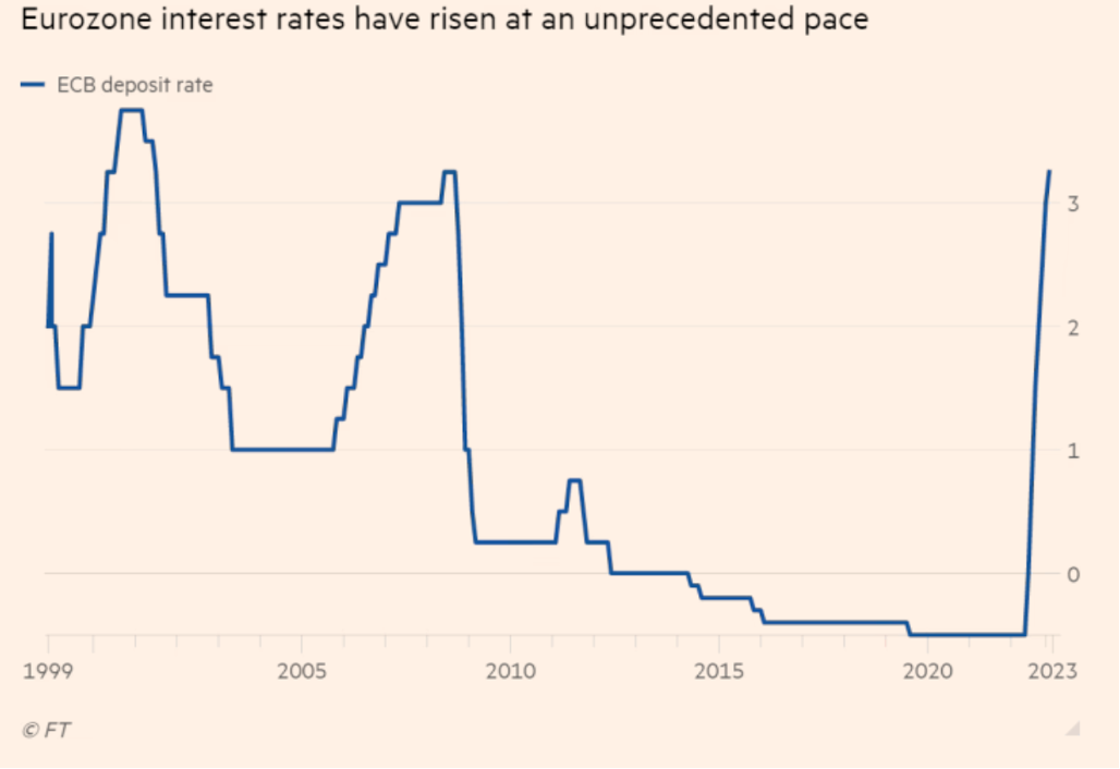
The graph shown above, ripped from the Financial Times, clearly demonstrates the vertical trajectory of the ECB deposit rate to levels not seen since the pre-2008 era.
Next month, we’ll check in on the main components of inflation (if there is data available for it).
Australia
Guess who raised interest rates… again?
On May 2, the Reserve Bank of Australia (RBA) increased interest rates to 3.85%, with warnings more hikes could be necessitated given the persistence of inflation.

The graph above comes from the Australian Bureau of Statistics (ABS) and depicts CPI inflation in Australia from April 2019 through to April 2023. Sustained elevated inflation is visible in the graph, although it does appear to have peaked…for now.
New Zealand
Much of the economic discussion in New Zealand this month was dominated by the Budget and the May Monetary Policy Statement (MPS).
Despite the lunacy from credit rating agencies (pre-2008 ‘risk free’ AAA rated securities, anyone?) stating that New Zealand’s credit rating may be downgraded, we keep our attention on the expected path of the OCR.
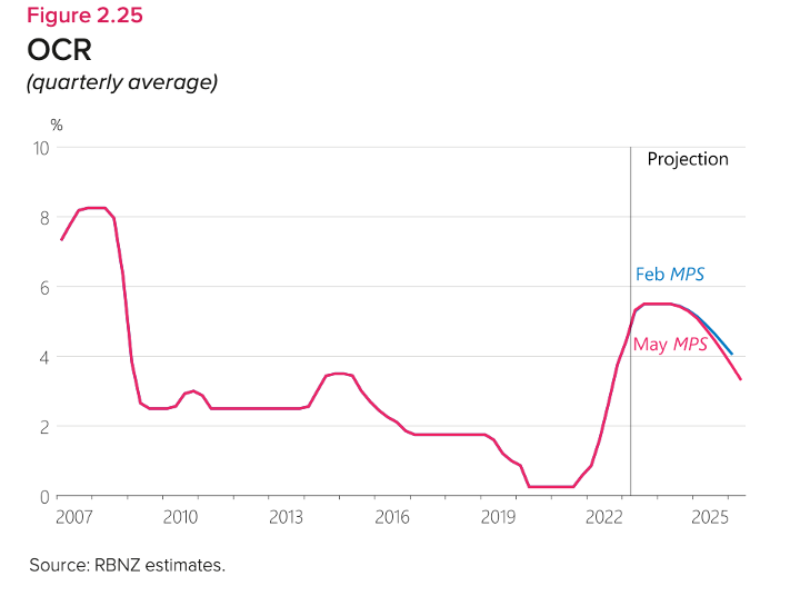
As you’ll see in the graph above, the RBNZ intend to keep the OCR at/above 3.5% until 2025.
This will be an interesting metric to watch (duh), given the impact of credit (or lack thereof) on inflationary dynamics.
As the BoE has discovered, changes to interest rates do not tend to limit input costs or cause gas to appear in the North Sea.
Housing – NZ
According to ANZ, house prices look to be reaching the bottom of their falls and may rebound from here.
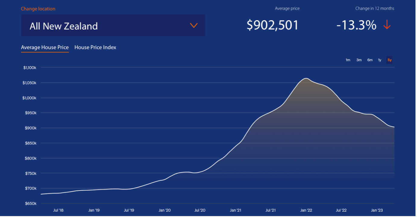
The graph above, sourced from CoreLogic, shows the decline in the value of house prices for all New Zealand from their peak in January 2022 – a 13.3% decline between April 2022 and April 2023.
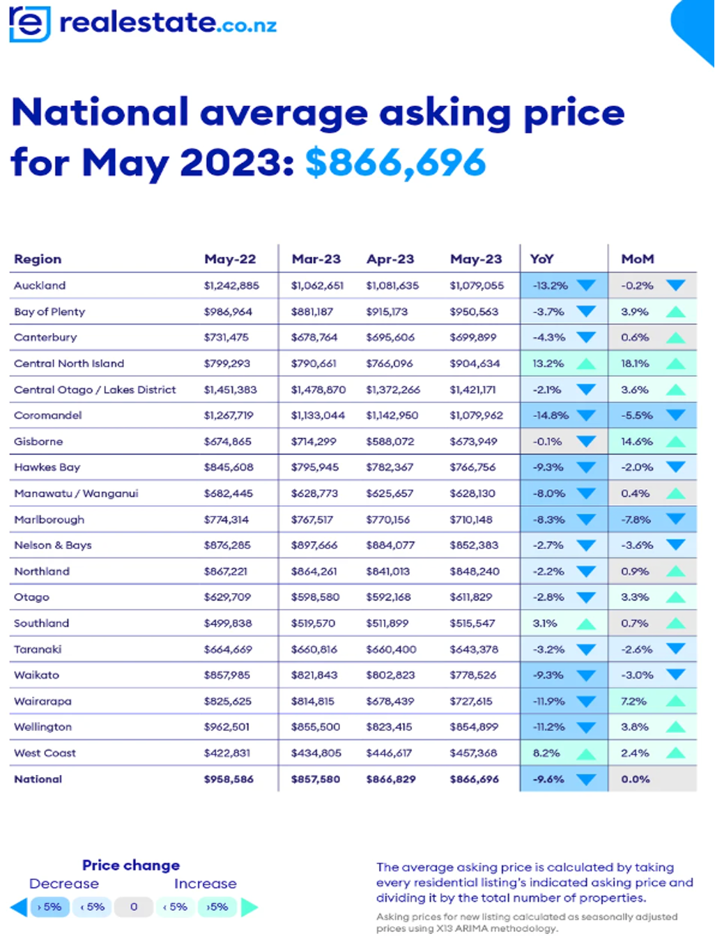
The table above outlines the year on year and monthly movement in house prices across New Zealand.
ANZ’s insights will ultimately be influenced by the role of private credit, given that there is a near 1 to 1 correlation between credit and house prices in New Zealand.
Final Thoughts
Interest rates globally continue to trend upwards, with slowing household spending but no strongly correlated decrease in the rate of inflation.
While no one would reasonably expect inflation to abate instantly given the massive disruption to production and supply chains, understanding its root causes would not only serve to aid policymakers, but also society as a whole.
This is especially true of the least well off who bear the adverse burden of interest rate increases.
The importance of the point is that if inflation were to persist, then central banks would persist in pursuing their respective tightening cycles regardless of the perceived impact of interest rates on inflation or wider society.
Given the misunderstanding that inflation is pre-eminently caused through overstimulation of monetary demand and that interest rates are the best course of action, then we can expect that inflation will persist as inflation is caused by a mismatch in supply and demand.
It is important to note here that the massive increases in credit witnessed during the COVID Crisis resulted in elevated asset prices (i.e., housing). Therefore, the present inflationary environment can largely be attributed to supply chain shocks.
Ironically, the dysfunction of the international trading system was and continues to be a result of international trade policy (based off of another ECON101 staple, comparative advantage) and the breakdown of stable trading networks at the beginning of 2020.
However, time will tell how this plays out.
Until next month!
