Was That The Share Market Bouncing Up!?
Monthly Market and Economic Update – August 2022

Peter Flannery Financial Adviser CFP
“If you have one economist on your team,
it’s likely that you have one more than you’ll need.”
Warren Buffett
Key Points:
- Spiking inflation, then rising interest rates. That is now.
- What is the order of things? How does it all play out?
- What is coming next?
- Has the global economy made any real progress over the last 25 years?
- How does the New Zealand dollar look compared to the US dollar?
- Latest key NZ stats.
THE MARKETS
Did the markets just stop falling and start rising!?
Yes, that is exactly what just happened (last week of July 2022).
However, we are in the midst of a credit cycle shift and so don’t expect the markets to track upwards in a straight line, at least not just yet. Volatility will continue however what we’ve just seen is markets rebounding on what it considers to be news that was less bad than it was expecting. Another case of bad news being good news, once again!
So, where are we heading then?
The order of things
Looking ahead we can see inflation showing signs that it’s looking like topping out, possibly over the next six to twelve months or so, if not sooner. Therefore interest rates will rise at a slower pace and at some point flatten out. There is even some possibility of interest rate cuts over 2024, or sooner if recessionary conditions run deeper than currently expected.
So, the order of things are: spiking inflation, rising interest rates, leading to fears about recessionary conditions as those interest rates bite and then with the slowing economy, earnings and earnings guidance being scaled back somewhat.
As I’ve mentioned elsewhere, the market sees slowing economic growth as code for companies making less profits which in turn is code for the discounted cash flow analysis model reducing the current valuation and therefore the current share price. That is all code for… SELL.
Important and useful data although very much play the market sort of stuff.
We need to know about this and watch it. However, this is not what determines how we go about investing (at WISEplanning). This type of information provides some insights around pricing levels and what the drivers of near-term pricing levels could be. It doesn’t tell us anything about the ability of any business to use its capital and achieve long-term growth for investors.
The point I’ve made before is that markets get very hung up on the near term data and the now.
For example, if prices are rising and everything sounds good, some players in the market believe that this is possibly going to go for a long time. Others see it as quick profits. This to the market means ‘let’s invest like crazy’!
When markets become doom and gloom, markets take the opposite view – SELL!
Let’s take a closer look…
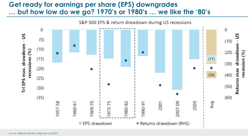
The above graph shows the impact of earnings on market returns for the S&P 500 in America. The light blue bars show a reduction in earnings (look to the left side axis) and the dark blue diamonds are showing what happened to markets (trading prices) and how they declined (look to the right-side axis).
So, looking at the bar graph above we can see to the right of the graph (the light brown bar), that the average decline in earnings over a number of market downturns is 17% and market prices themselves declined by an average of 34%.
When we think about the order of things and what comes next, we know that inflation is not yet under control but showing some signs of perhaps topping out. It is early days yet though. The next inflation readings over the upcoming four to six weeks will hopefully give us a clearer picture.
We know that interest rates have been rising and that New Zealand and America have led the way. Further interest rate increases are ahead. Clarity over that inflation number will give us a clearer picture on how much further to go with interest rates. We are progressing.
In terms of markets and trading prices, depending on which measure you use, the US market has declined by circa 25-35% (refer to that brown bar on the graph above). This could suggest that market pricing declines may not quite be there yet, if the average is anything to go by (?).
You’ll notice in the middle of the graph the dotted line which highlights the point that the 1973-1975 and 1980-1982 downturns perhaps show some similarities to what’s going on now. Of course, what goes on in the past is not exactly what happens in the future but does offer a reference point for us to think about.
The short of it is that markets are possibly getting close to the low (based on current known data).
As is usually the case, rising prices are not a straight line and are camouflaged by volatility.
So, we have seen market prices bounce up between 5% and 10% over the last month. My thinking about this is that, I don’t believe we’re there yet with regards to a solid track upwards for market prices.
The lagging indicator to watch
We are moving closer to the market low as I’ve said, however the lagging indicator that we’ll be watching is ‘earnings compression’ (lower profit announcements).
So, spiking inflation leads to rising interest rates and that leads to recessionary worries by the market and an inevitable slowing down of economic activity which in turn can lead to earnings pullbacks or earnings compression.
Under these conditions, we can easily say that a further pullback in the markets is possible because earnings revisions tend to be a lagging indicator. We have seen some already, but I believe there may be more to go.
All that said, I’m not trying to time the markets but rather consider trading price levels along with market pricing direction, as well as the ability of each business to grow long-term.
What should investors be thinking about?
As you know, I’ve been suggesting that we sit tight over most of 2022 with some buying here and there.
For those less advanced investors who favour portfolio pricing stability, it’s possibly too soon just yet to be making too many buying moves.
For those more advanced, we’ll be looking to buy soon. We’ll be doing so progressively in the face of ongoing market volatility.
The Global Economy
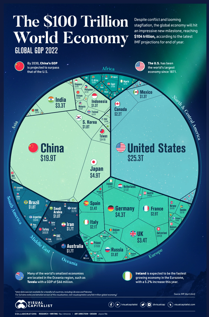
The above image shows the size of the largest economies in the world.
The United States of America remains the largest economy in the world followed reasonably closely by China who is predicted to overtake America by 2030. India’s economy is also growing fast.
As I’ve pointed out previously, the Russian economy at $US1.8 trillion dollars is small.
Sovereign default risk
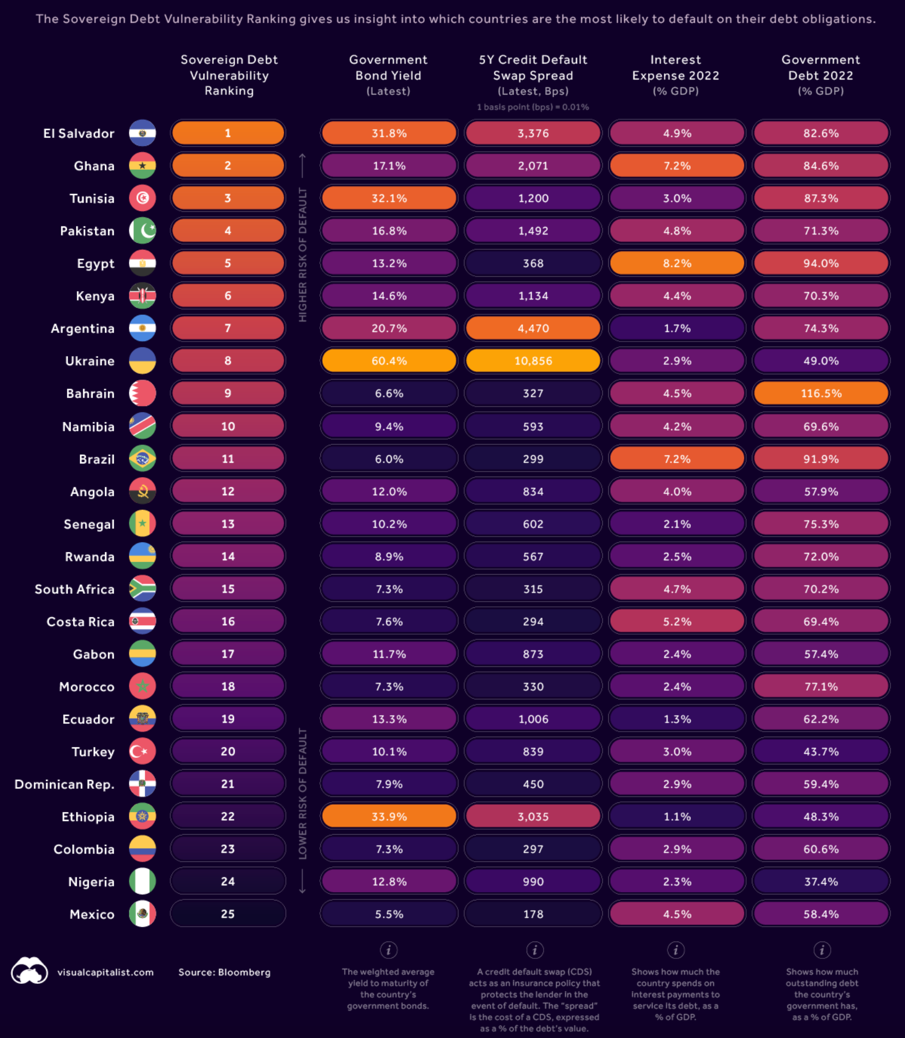
The above table shows the order of countries most likely to default on their sovereign debt.
Levels of global debt have been highlighted by the popular media over the last few years. Levels of debt are elevated and not ideal although the narrative around global debt implosion is farfetched.
When you compare the table above with the first diagram showing the size of various countries’ economic activity, you can see that most of those at risk are smaller economies and therefore represent minimal risk to the global economy should they in fact default.
To be clear, I’m not suggesting that levels of global debt don’t matter. I’m not dismissing global debt as a non-issue. We know though that levels of global debt are manageable.
Indeed, when we compare the banking system, levels of indebtedness of US companies for example and other metrics around debt, we can see that the global economy is better positioned and stronger by some measures than it was compared to the 2009/10 global financial crisis, which triggered a credit crunch and indeed serious global banking risks at that time.
For example, a number of initiatives have been implemented since to strengthen balance sheets around the world. The global banking system is now stronger and better placed to weather tight credit conditions. US company balance sheets are stronger too.
Again, although not ideal, levels of debt are generally manageable and not the real problem as we move toward recessionary conditions in the short to medium term.
Largest countries by economic activity
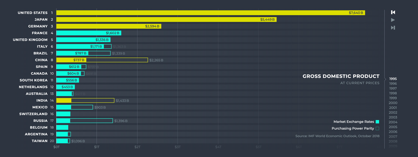
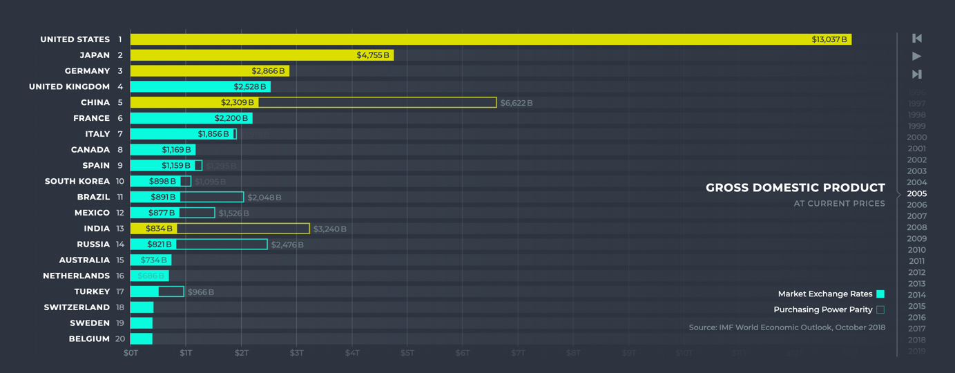
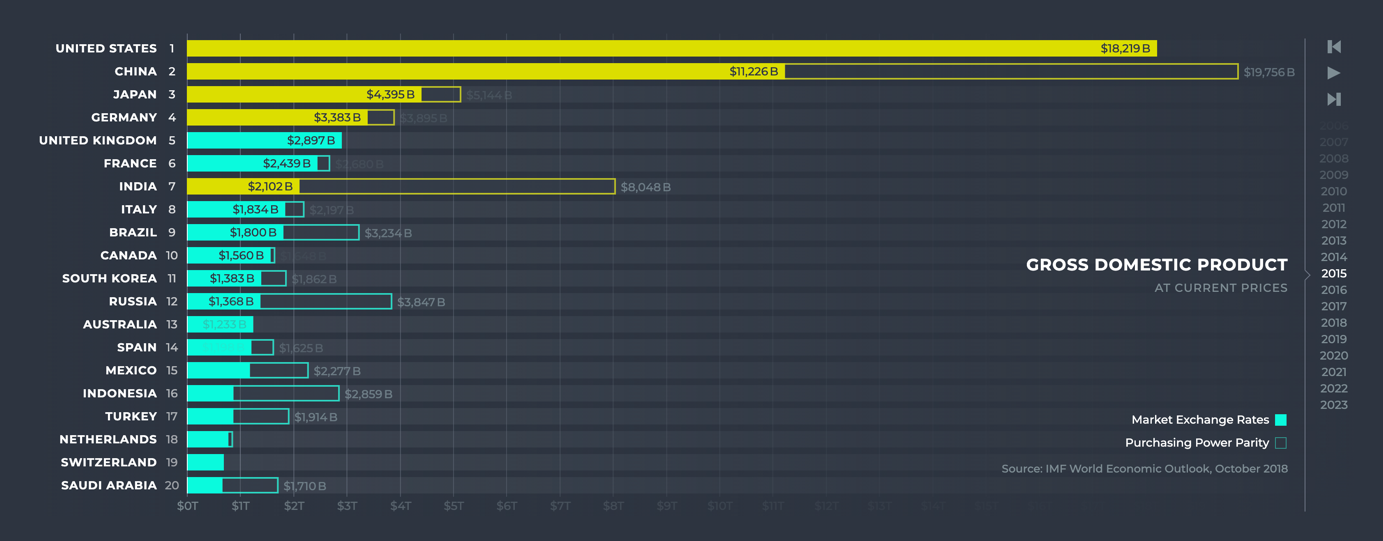
The above three bar graphs show the growth in economic activity across a number of countries around the world since 1995.
The first of the three bar graphs above show the size of the American economy at $7.64 trillion. These and all the countries’ economic activity levels below the United States on that top graph are as at 1995.
Down to the middle graph and you can see the US economy has grown to $US13 trillion by 2005.
Then down to the third of those three bar graphs and you can see the American economy has grown to $US18.2 trillion by 2015.
2022 – $US25.3 trillion.
The point I’m making here is that, whilst there are any number of negatives that we can point to economically over the last few years or so, over that time the lifestyle of most people around the world has improved significantly. The increase in the level of economic activity is evidence of this improvement.
To really press the point home, think about the lifestyle of our parents and then their parents. We’re going back now to days when horse and carts and steam trains are the major means of transportation.
The smartphone back then did not exist and neither did television or the Internet.
This is not to say that the people weren’t happy. Indeed, by some measures, those with less seem to be just as happy as others that seem to have everything!
The point though is that it’s not all doom and gloom. It is easy, almost fashionable to highlight the negative.
Debt levels grow and so does inequality in many countries around the world along with other bad things. Economic productivity could be better and yet despite these problems, economic activity and our lifestyles continue to improve. The global economy continues to grow.
The United States of America
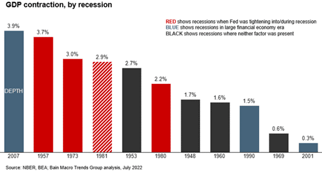
The bar chart above shows recessions by depth since World War II.
Although it’s difficult to tie down the exact numbers, arguably America is already in recession now.
The most common approach to measuring recession is two consecutive quarters of economic contraction. The problem is that the numbers around the economic activity are revised several times and so we won’t know until well into the future what the numbers really are.
The short of it is that, if America is in a recession (probably), it is quite weird given the low level of unemployment.
We talked before about rising interest rates and how that bites into economic activity, slowing the economy down which in turn can slow down some company profits.
Although it’s always difficult to predict the future, there is a possibility that the near-term, recession in America won’t be overly deep and may not even last that long. Some of the thinking around this is:
- The US economy is not overly leveraged compared to for example the global financial crisis about twelve or so years ago.
- US unemployment currently sits at around 3.6% which is the lowest level by some measures since the start of the pandemic and only 0.1% above the 50-year low of February 2020.
- Some key inflationary components may be moderating as we see the prices of several commodities having declined over the last few weeks.
- Consumers in America currently have a buffer of excess savings which provides a cushion against rising costs and will help consumer consumption to ride at least part way through inflationary prices.
That last point above suggests to me that we may have a shallow and brief recessionary phase now from which we will emerge.
There may be some buoyancy and it wouldn’t surprise me if we slip back into recessionary conditions in America again within the next six to twelve months or so. If that is correct then you can expect the market to continue to worry about recessionary conditions or more specifically the impact on company profits.
Right there is ongoing market volatility. That’s a good thing remember because lower prices mean better buying.
China
Despite domestic and international headwinds dampening the overall economic outlook in China, over 80% of China’s thirty-one provinces registered growth (as measured by GDP) in the second quarter of 2022 and over the first half of 2022.
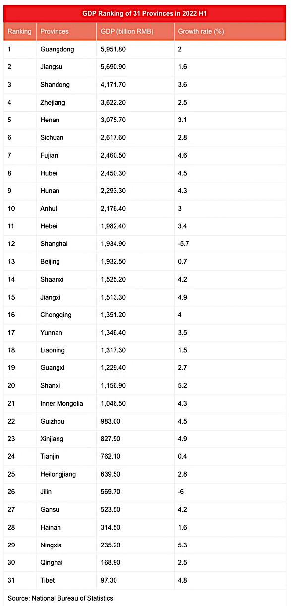
The above table shows the economic activity across 31 provinces in China over the first half of 2022.
China’s eastern regions account for a larger proportion of economic activity as measured by GDP, but the middle and western provinces are growing at a faster rate.
It looks as though China’s economy will grow at around 4% over 2022. It appears that the Chinese government is looking to avoid overheating the economy with too much stimulus.
This is interesting when you consider the headwinds that the Chinese economy has faced, not only from global challenges but also internal challenges, not the least of which has been their Zero-Covid policy resulting in lockdowns of huge numbers of the population.
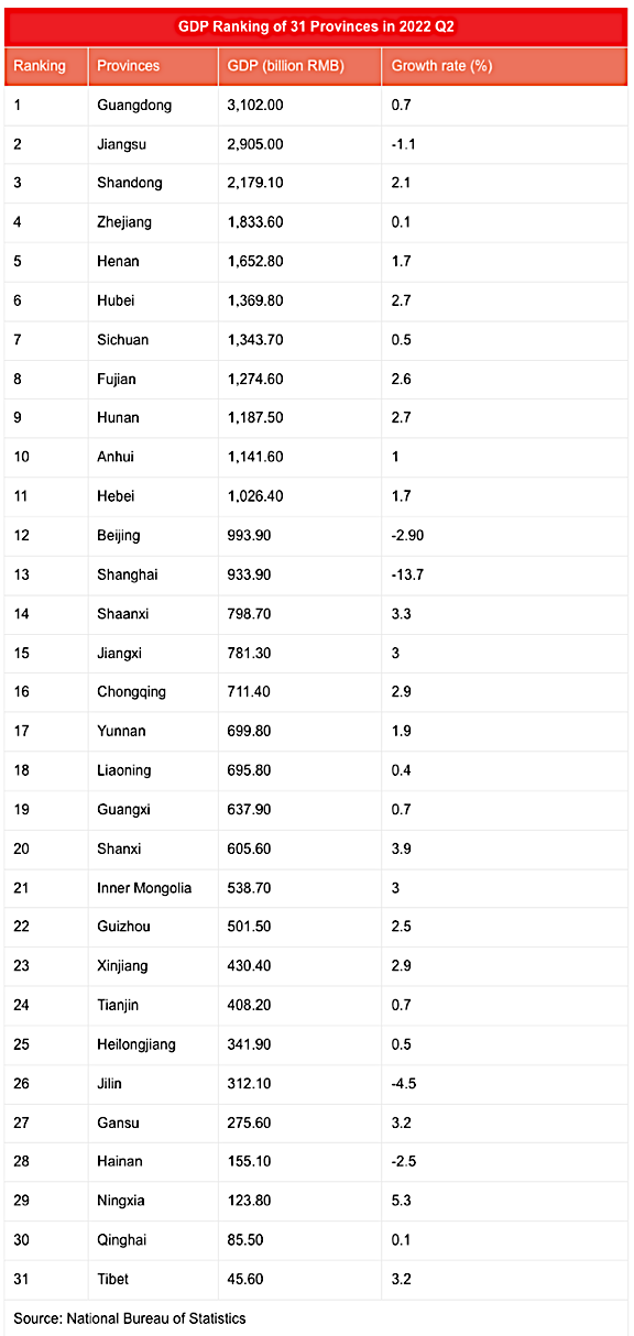
The above table narrows the focus to activity across 31 provinces over the second quarter of 2022.
As the table above shows, Shanghai and to a lesser degree Beijing suffered economic contraction along with Jilin province and Hainan province. Jiangsu also saw its economic activity decline by 1.1%.
Looking ahead to the second half of 2022 the Chinese government’s goal of hitting 5.5% annual growth looks very challenging, especially if it doesn’t want to overheat the economy with significant stimulus. That’s why the 4% estimate is the consensus for economic growth across China over 2022.
Contrary to China’s own estimates, the International Monetary Fund (IMF) projection for China released on the 26th of July this year downgraded China’s growth by 1.1 percentage points to 3.3% over 2022. If this plays out as the IMF projects, then this would be the lowest level of economic activity recorded by China in more than forty years. Time will tell.
Either way, China is managed with an iron grip by the Chinese government and therefore I suspect one way or another economic growth will continue.
Australia
Inflation – Australia
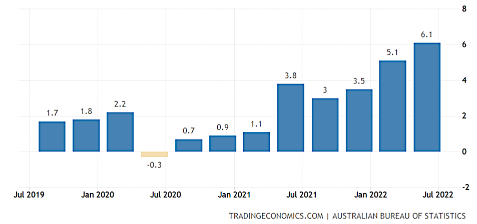
The above graph tracks the rate of inflation in Australia.
Like elsewhere in the world, inflation is spiking in Australia although as the above graph shows, not as much as New Zealand (7.1%), America (9.1%), Britain (over 10%).
The annual rate of inflation in Australia climbed to 6.1% in the second quarter of 2022, up from 5.1% in the first quarter. By comparison this is the highest level of inflation since the second quarter of 2001.
RBA cash rate, loan rates
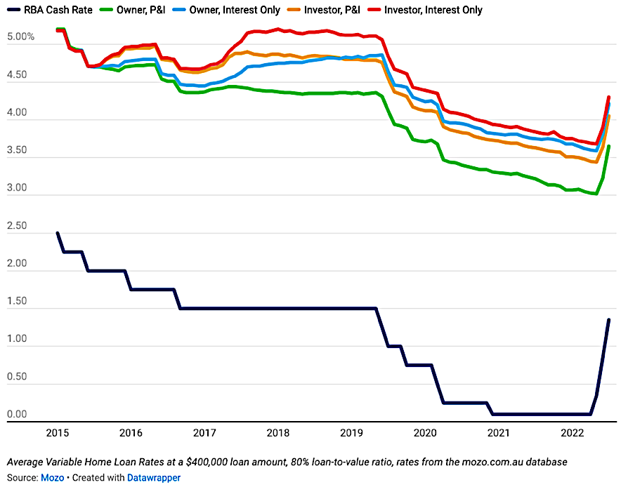
The above graph tracks the Australian Reserve Bank official Cash Rate as well as a variety of interest rates.
Pictures say a thousand words and we can see from the graph above, the spike in the official cash rate in Australia is a similar story to elsewhere in the world, including New Zealand.
Interestingly, the above graph shows the different levels of interest rates depending on whether you are a homeowner or an investor and whether you are interest only or paying back principal as well.
So, wrapping up its July Policy Meeting, the Reserve Bank of Australia lifted cash rates by 50 basis points to 1.35%. This increase marks 125 basis points of interest rate hikes since May and the fastest move in interest rates since 1994.
By some estimates, February 2023 may see the end of interest rate hikes in Australia and by some estimates, possible rate cuts over 2024 in Australia.
Anyway, the Australian economy has held up well, particularly compared to other economies around the world. To some degree, Australia remains the lucky country (except for the ongoing disagreement with China!).
New Zealand
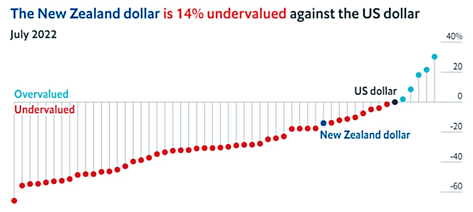
Be careful with the graph above. It is based on The Big Mac Index invented by The Economist magazine in 1986.
By some measures, the NZ dollar could be considered undervalued against the US dollar. The graph above is based on The Big Mac Index. This was intended as a light-hearted way to weigh up different currencies.
It’s based on the idea of purchasing power parity (PPP). The notion that in the long run, exchange rates should move towards the rate that would equalise the price of an identical basket of goods (in this case the Big Mac burger) of any two countries.
It’s not precise, however it has become somewhat of a standard measure that is considered better than some other more academic approaches. Therefore, I would look at this as a rough ‘ready reckoner’ rather than a precise academic assessment to weighing up the exact value of currencies.
We only need to think about the significant scale of the US economy compared to that of New Zealand and we can see that New Zealand’s much smaller, significantly more narrow economy is fundamentally weaker than the US economy, by these and other measures.
Therefore, a New Zealand dollar close to the value of an American dollar seems odd. Still, the market determines the price. That is the case with property, direct shares, currencies and most tradeable goods.
New Zealand Dollar/US Dollar Cross Rate, Dow Jones Index
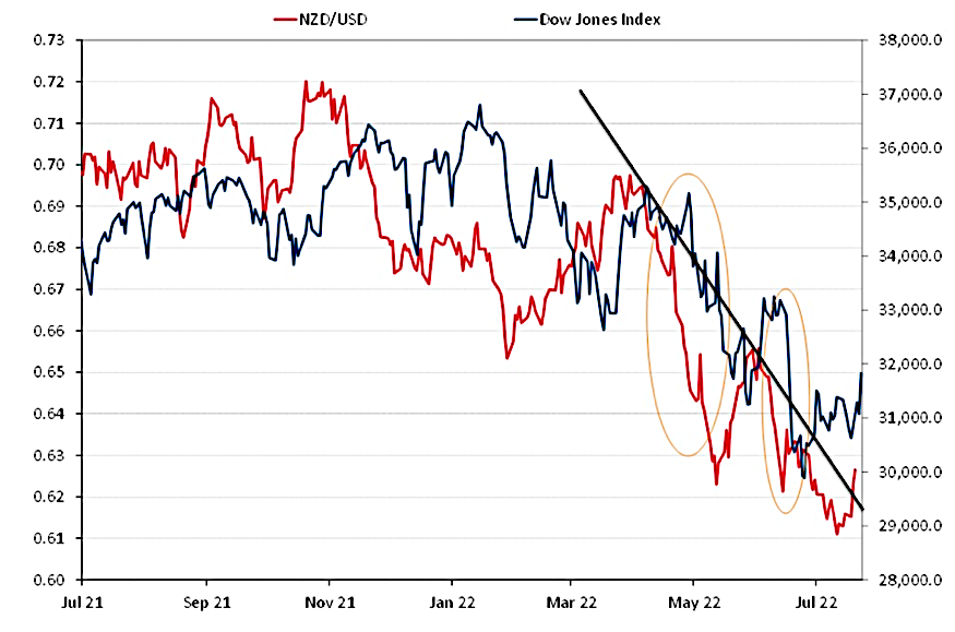
The above graph tracks the New Zealand Dollar/US Dollar cross rate showing the correlation with the Dow Jones Share Market Index in America.
As we can see from the graph immediately above, in a so-called “risk off” environment with markets becoming unsettled, as markets declined (as measured by the Dow Jones Index above) the New Zealand Dollar also weakened.
Interestingly, you will notice toward the right side of the graph the spike upwards for the Dow Jones (the dark blue line) and the New Zealand Dollar strengthening (the red line).
It would appear that the market sees the New Zealand Dollar as being somewhat undervalued against the US Dollar as the market mood improves.
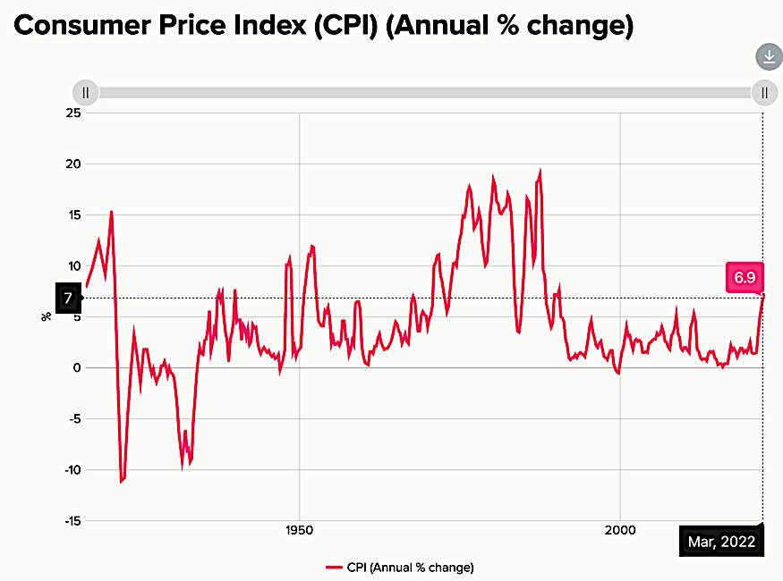
The above graph tracks the inflation rate in New Zealand, going back prior to 1950.
The governor of the New Zealand Reserve Bank (NZRB) continues to raise interest rates to head off inflation.
The most recent interest rate increase in July delivered the sixth straight interest rate hike as the NZRB strives to get ahead of the inflation curve here in New Zealand. The increase by 50 basis points (half of 1%) shifted rates to 2.5%, not seen since March 2016.
As you’ve been hearing for many months now, global supply chain disruptions have continued, the war in Ukraine has led to higher commodity prices and the recent lockdowns in major Chinese cities have meant ongoing bottlenecks in global production and trade.
All of these things helped to push up inflation.

The above graph tracks the 90-day Bank Bill Rate and the Official Cash Rate set by the New Zealand Reserve Bank.
You can see in the chart above to the right that interest rates are spiking upward.
The good news is that the NZRB was early compared to many other central banks, but still has work to do.
There are some expectations that inflation in New Zealand may top out over the second half of 2022, depending on international conditions.
The reality is that New Zealand imports some of its inflation and so if inflation continues to run higher for longer offshore, then we can expect ongoing rate hikes in New Zealand to meet increasing inflation in New Zealand head on.
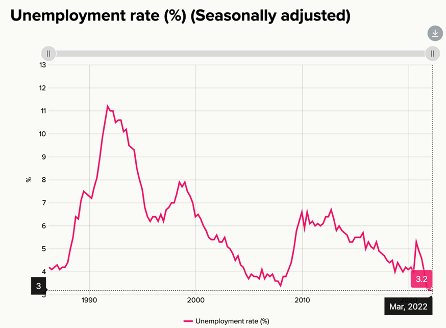
The above graph tracks the unemployment rate in New Zealand.
The labour market in New Zealand remains tight, wages continue to rise and people generally appear to be working more hours.
Obviously, the Coronavirus has created some of the wage shortages with people being forced to isolate and recover from the virus.
Generally, some business owners and employers are struggling to attract new staff, not helped by the Labour Party’s mandate of keeping new immigrant numbers to a minimum for reasons that I imagine they understand.
One wonders however if, outside of their sphere of competence, they can grasp the impact this policy has on business profitability as well as levels of productivity for the whole country?
It’s very difficult for businesses to continue to grow, pay more wages and apply innovative new strategies when they’re struggling to simply process day-to-day work activity (“kicking alligators off their ankles rather than draining the swamp”).
Sure, this approach to immigration may help to tame house price inflation (not their best option) which is not a bad thing, however the question is, ‘is the cure even worse than the symptoms and the illness they are trying to cure?’
Latest Key NZ Stats
- Annual average economic growth – 6% (as per the fourth quarter of 2021)
- Annual inflation – 6.9% (as per the first quarter of 2022)
- Unemployment rate – 3.2% (as per first quarter of 2022)
New Zealand continues to progress reasonably well despite the challenges of Coronavirus, spiking inflation and some economic headwinds that have recently emerged.
To Summarise …
Global inflation continues to rise with some signs that the variable elements of inflation might be topping out in due course.
Interest rates continue to rise globally in order to get in front of that inflation curve.
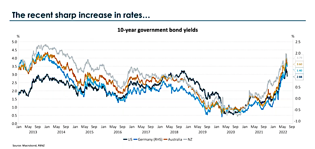
The above graph tracks 10-year government bond yields in the US, Germany, Australia and New Zealand. Note the US and German numbers are on the right-side axis. Australia and New Zealand should be measured against the left side axis.
Inflation rising, means interest rates rising. This brings us to the order of things which is recessionary conditions and lower company profits.
By some measures the US economy may already be in recession now. It’s a bit weird because it’s unusual for unemployment to be so low during a period of economic recession.
Anyway, ahead will be some scaling back of company profits and profit guidance which the markets possibly won’t take kindly to.
That said, recent profit announcements by the likes of Amazon and Alphabet, whilst they were a bit lower compared to previous reports, were not significantly behind what the market was expecting and so we then saw the markets rally. An example of where bad news became good news!
It would appear that if the US economy is in recession, then it could be shallow and brief. BUT, there is a possibility that we may see another recession over the next twelve to eighteen months or so which could lead to some interesting company profit announcements.
If those profit announcements disappoint the market enough, then we could see further downside volatility. That’s okay though. You know what lower prices mean – right?
Short-term, the New Zealand economy appears to be doing okay as does the Australian economy. So far New Zealand has not fallen out of favour with China, although I suspect this is up to China and that could change at any point.
Although I didn’t discuss it this time around, geopolitical tensions appear to be ratcheting up with China and the US verbally sparring which is not good. That said, we are a very long way from major problems, even though Vladimir Putin is continuing to wage war in Ukraine.
Interestingly, I see there is a significant pipeline being built which allows Russia to pump gas directly to China.
Whilst these geopolitical issues are noteworthy, at this stage the ratcheting up of tensions is not significant and a small component of what we would consider when we weigh up our investment options.
Trading prices generally across markets represent fair value although it is a bit mixed. Inside portfolios, some reasonable value now exists which we’ll be looking to take advantage of in due course.
Since the global financial crisis, we have waited over a decade for the current environment. It is here right now.
Although prices have declined from expensive to fair value, still, there is opportunity that will exist inside your portfolio that we will be looking to take advantage of.
It’s not a quick fix though. Markets will remain volatile – good. That is our advantage as we allow favourable trading prices to come to us.
Patience 🙂
