Markets Bounce Back, Are They Expensive Already?
Monthly Market and Economic Update – April 2023

Peter Flannery Financial Adviser CFP
“If you have one economist on your team,
it’s likely that you have one more than you’ll need.”
Warren Buffett
Key Points:
- How is the market positioned at the moment?
- Banking fears linger, should we worry?
- Currency: How is the $NZ / $US cross rate looking?
- The US Fed Dot Plot shows interest rates easing back – when?
- Recession: hard landing or soft landing?
THE MARKETS
What are global price-earnings ratios telling us?
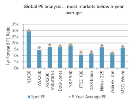
The above graph shows the price-earnings ratio across a variety of market indexes globally compared to the 5-year average.
We are on track. The global economy and the market’s ‘unplanned plan’ is following it’s natural course. I say unplanned plan because, whilst markets are random, there are certain fundamentals at play that will inevitably create certain outcomes.
For example, interest rates rising means asset prices decline. Although at the moment it’s difficult to see, unemployment may also rise in due course. Already we’re seeing wage growth finally turn up after many years of everybody wondering if it was ever going to happen. Wages growth is here, now.
It’s an unplanned plan because the market is random and has no plan as such – and yet, there is an underlying order of things.
But, when you look at the significant amount of “noise” across markets, one might think that all of this is something new.
Sure, some of the nuances are shaped a little differently. For example, global debt is higher than it’s ever been. Interest rates have been tracking at all-time lows over many years in the recent past, although that is now changing. Yes, some of the details look different. The medium to long-term pathway however, might be pretty much already set.
Anyway, as we can see from the graph above, trading prices across share markets are trading at around their five-year average. This suggests by that measure at least, trading prices are not expensive.
However, I suspect there could be some weakness ahead for earnings which may mean that those trading prices are potentially somewhat expensive still.
Cutting right to it, no cause for alarm. Some patience might be required as the plan continues to unfold, ‘choppy sideways’ continues and of course, as we take advantage of those trading prices along the way.
There’s a lot to be said for investing in quality businesses. That way, we can confidently average down (the original buy price) or top up, increasing our holdings in those businesses when the market is going in the opposite direction.
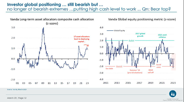
The graph to the left shows the level of cash waiting on the side-lines, which is comparatively high. The chart to the right shows the level of equity positioning (how much capital is allocated to shares (somewhat low)).
So, the chart to the left shows a relatively high level of cash still, and the level of equity exposure by long-term asset allocators is at a relatively low level.
Although at WISEplanning, we don’t invest across the markets but rather inside the markets, we can see that long-term asset allocators across the market are reasonably bearish, although to a lesser degree recently. They appear to be putting some cash to work in the markets, possibly because trading prices are somewhat favourable or, indeed, less unfavourable.
I believe what we are seeing is a cautious approach by asset allocators which reflects that ongoing “choppy sideways” of markets reflecting general uncertainty. Just the way we like it.
Banking Dilemmas
The above graph shows the strong increase in deposits funded by the booming tech sector into Silicon Valley Bank (recently defaulted).
The demise of Silicon Valley Bank has now been widely publicised and demonstrates how quickly things can unfold for banks when they are narrowly focused with their funding and a small number of depositors start feeling vulnerable.
The classic run-on funds is one of the failings of the fractional banking system in which we all trust when putting money in the bank. If you ‘invest’ your money in the bank, then you invest in the fractional banking system. It generally works fine but not always, as we’ve seen with Silicon Valley Bank (SVB) and a couple of others recently.
Rightly or wrongly, the US government stepped up and guaranteed all SVB term deposits and cash. However, they allowed the bank itself to fall over, hurting investors rather than depositors.
The problem is that if they hadn’t done so, we might well have seen a broader market contagion as those businesses relying on their deposits in Silicon Valley Bank to pay staff and fund other activities may all of a sudden have fallen into financial difficulty themselves.
The practical question here is whether this type of thing worries you or do you simply take it in your stride, knowing it’s part of what goes on across the markets from time to time?
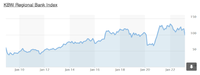
The above graph tracks the total market capitalisation (the number of shares on issue x the share price) of all regional banks across the US.
In short, as the graph shows above, whilst it did become a bit tricky for a while, the US government has put measures in place to protect deposit holders and has said that they’ll consider other measures as required.
There has been no banking implosion as such, even though the media dramatised the situation. It was tricky and indeed, could have become a major banking contagion issue. That did not happen. Still, risks remain, although it appears the situation is under control.
Currency
The New Zealand dollar/US dollar currency cross rate
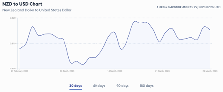
The above graph tracks the movement in the cross rate over the last 30 days.
Previously we were getting close to the point where we could consider purchasing US dollar-based assets. However, the cross rate slipped back down, which meant that, for those wanting to take profits or drawdown off their portfolios, the cross rate was favourable.
For those looking to buy US dollar-based assets however, a bit more patience may be required. You can see from the chart above that the cross rate has gained somewhat over the last 30 days. I will keep you posted.
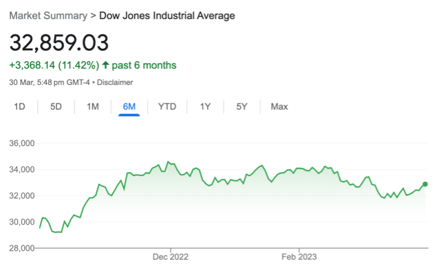
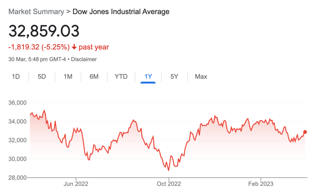
The chart on the left shows the US share market (the Dow Jones) over the last six months. The chart on the right shows the US share market (the Dow Jones) over the last year.
Although there are a number of factors that drive trading prices generally, the markets are watching closely those indicators that drive inflation, interest rate announcements, and talk around inflation by the US Federal Reserve.
The trick for investors is to allow the markets to do what they always do (rise and fall randomly), remaining patient and taking advantage of lower prices along the way.
When negative news moves across markets, some investors become tempted to time the markets (although they’ll tell us that’s not what they’re trying to do at all). The idea in their head is to wait until the bad news passes and then consider going back into the markets. It can work, but it is unreliable.
Anyway, despite all the convincing doom and gloom you can read any day of the week, businesses and consumers still need those goods and services that good businesses provide, everywhere you look.
Sure, they may buy more or less of those goods and services, given prevailing market and economic conditions, but quality businesses that are well-positioned continue to make profits and maintain their competitive advantages usually, even when things become difficult.
When the market mood improves, that’s when the trading price can rise sharply. This is why remaining invested is quite often a winning strategy throughout times of uncertainty and turmoil. Picking up those lower trading prices along the way also works nicely.
The Global Economy
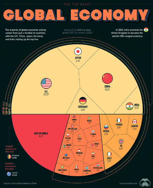
The above pie chart highlights the dominance across the global economy of the top five countries around the world.
America and China dominate the global economy, followed by Germany, Japan, then India. I make this point because sometimes I hear some people suggesting that the US economy could be heading for bad times and therefore, may not be a good place to invest.
As a general comment, that can be true at times. Overall though, as many of you may have heard me mention in the past, America has a unique package. This doesn’t mean that it’s immune to significant events, market cycles, turmoil, and uncertainty.
It does mean though that America, as has been demonstrated in the past over hundreds of years, is highly resilient.
The unique package includes, for example:
- The strong rule of law
- Low population per hectare (lots of resources)
- Strong innovation
- Educated population
- Significant scale
Think about Russia, China, India and other countries. How would you say they compare?
“It’s a brave man that bets against America Inc.”
Warren Buffett
What goes on in the New Zealand economy does matter to us because we live in New Zealand. Moves in interest rates, inflation (cost of living), employment conditions and the like affect us because they are a bit closer to home.
As investors investing internationally, those items in New Zealand have little impact on our investment portfolios.
Global Inflation
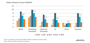
The above graph shows historical and future global inflation.
In short, inflation is a mixed bag but generally remains strong in the likes of Europe and the UK, as well as New Zealand, whereas in America for example, inflation is elevated but may have peaked. Inflation is low in China.
What this all means is that inflation and therefore interest rates will likely remain elevated for longer.
China for example, maintains low inflation currently, although this may rise a bit as the economy continues to emerge from lockdowns related to COVID-19.
Faster growth than expected from China could spark commodity price increases over the second half of 2023, which of course, won’t help central banks globally trying to reign inflation in.
The cost-of-living index – selected countries.
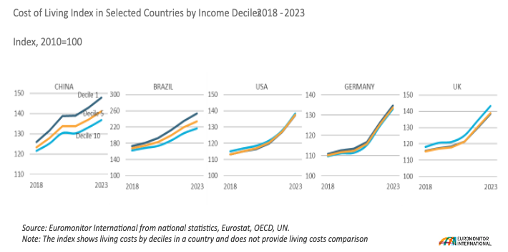
The above graph shows the increase in the cost of living in selected countries.
The unfortunate reality is that cost of living increases mostly affect low-income consumers, particularly in emerging markets. It’s true in other developed countries as well, though. The problem is that low-income earners allocate a larger proportion of their income to essential goods and services.
So, the consensus confirms that inflation (the pace of increasing costs) will remain elevated for longer, as will interest rates. In New Zealand especially, there’s further work ahead for the New Zealand Reserve Bank to rein in inflation, which means more interest rate rises to come.
China

The bar graph to the left tracks the inflation rate in China. The middle graph compares the movement in producer prices with consumer prices—the graph to the right tracks retail sales.
Inflation in China by some forecasts, may increase somewhat to 2.5% in 2023 and 2.3% in 2024. Inflation remains low in China compared to many other countries, which is to their advantage, although the opening up of the economy and the possible relaxation of pent-up demand may drive up inflation to some degree.
On another note, we’ve seen headlines in the media over the last 3 or 4 years about China’s risky property market. So far, so good. No property crash was followed by an economic crisis across China due to a failing property market although risk remains to some degree in this sector.
The United States of America
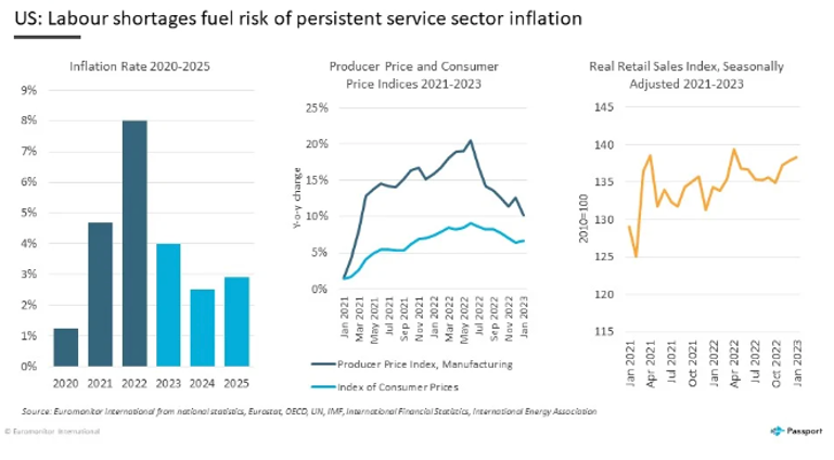
The graph to the left tracks the inflation rate from 2020 through 2025. The graph at the centre tracks producer prices and manufacturing, comparing them to consumer prices. The graph to the right shows retail sales.
Although predictions vary, some estimates suggest that inflation in the US may reach around 4% in 2023 and fall back to 2.5% in 2024. The decrease in inflation might be driven to some degree by lower energy prices along with manufactured goods. Also, increased interest rates may also help to reign inflation in.
Inflation – USA
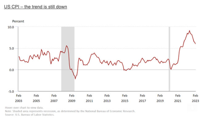
The above graph tracks US inflation.
As you can see, looking to the right of the graph immediately above, the red line is clearly showing the result of month-on-month data, which confirms that inflation has been easing back over the last several months. Of course, that doesn’t mean that inflation has stopped or is even low. Inflation in the US remains elevated but nonetheless appears to be heading in the right direction.
The US Fed Dot Plot from March 2023
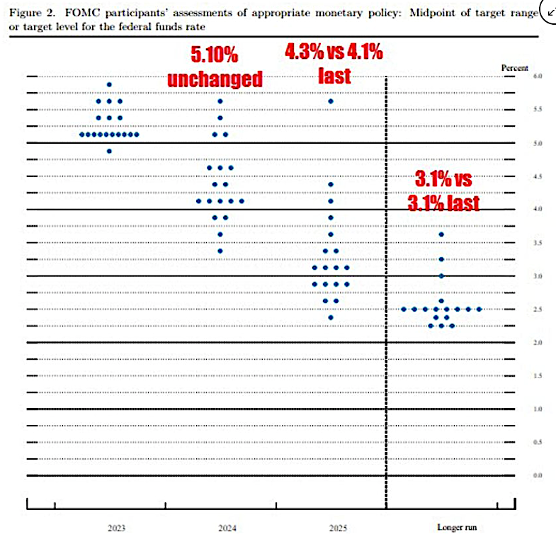
The above graph tracks the US Federal Reserve consensus on monetary policy and interest rates.
Of note is that the Fed dot plot shows 5.10 as the terminal interest rate.
The Fed Dot Plot from December 2022
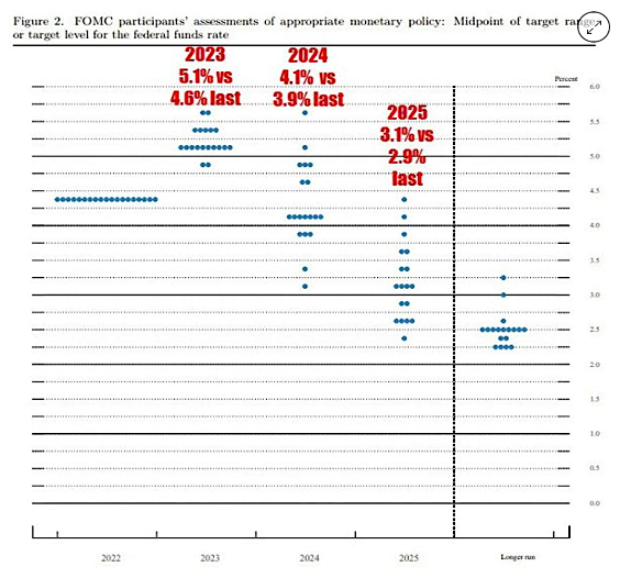
The above graph shows monetary policy and interest rate projections as at December 2022.
What that all means is that inflation remains sticky and therefore, will be elevated for longer. I know, it’s becoming somewhat repetitive!
It also means that interest rates may decline over 2024 and 2025.
Elevated interest rates is a headwind making it more difficult for smaller entrepreneurial businesses to get started. For medium-sized businesses, it’s not as easy to fund the debt they may require to grow, unless they’re one of those rare businesses that can grow without debt.
This highlights the point that investing in quality businesses means that they have less reliance on debt and will likely be more resilient when markets are complaining about uncertainty and volatility.
Britain
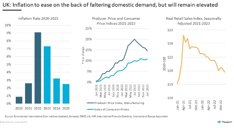
The graph to the left tracks inflation. The graph at the centre tracks producer prices and consumer prices. The graph to the right tracks retail sales.
Inflation in Britain continues to rise. I remember one report not long-ago projecting inflation in Britain to exceed 7%. Their projection was correct. Inflation is at around 10%. Energy prices remain high. Food prices also remain elevated—lots of work for the Chancellor of the Exchequer to do to bring inflation under control in Britain.
Australia
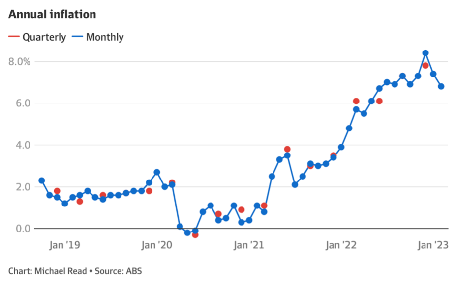
The above graph tracks inflation in Australia.
The graph above shows that inflation dropped slightly to 6.8% in February this year. So, inflation is high but appears to be on the decline in Australia.
Interest Rates – Australia
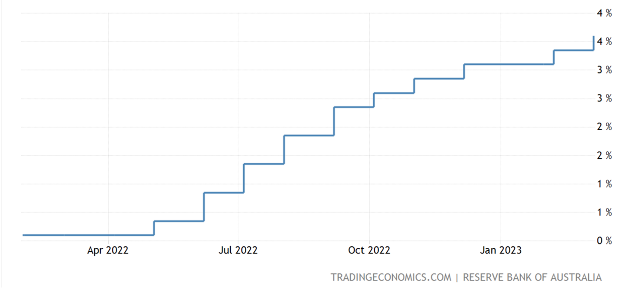
The above graph tracks the Reserve Bank interest rate in Australia.
Interestingly, the Reserve Bank of Australia is pondering a potential pause in interest rate rises. This would allow them time to reassess the outlook for the economy.
It is interesting to note that a number of central banks around the world are now ‘data-dependent’. This means that they’re waiting for data to come out before they decide whether or not to raise rates and if so, by how much. To me, this suggests that interest rate rises may be slowing down and moving towards a peak.
New Zealand
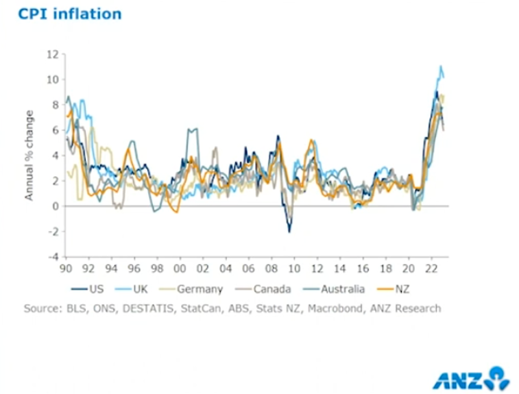
The above graph shows how inflation has spiked in New Zealand and other countries around the world.
Inflation remains a problem for the Reserve Bank of New Zealand and us all. The graph above shows the sharp spike in inflation, which is why interest rates continue to rise in New Zealand.
In practical terms, Mums and Dads will find that food and groceries, among other items, cost more. So the monthly salary or weekly wages won’t go as far.
Those with debt will see the interest rate increase on their mortgage, if not already, within the next 12 months for many. Those who insist on parking their capital in the bank may feel good because interest rates are rising, providing of course, they ignore the fact that the rising cost of goods and services is running at a higher level than the interest they earn, especially when they take off the tax.
In real terms, they’re losing ground every day by “investing” their money in the bank. Okay, for a short-term parking position, but not okay more medium to longer term.
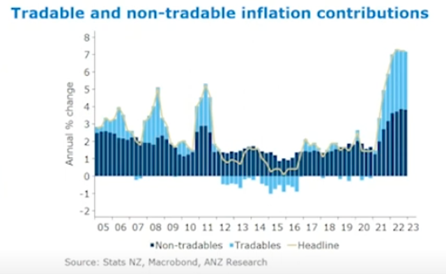
The above graph tracks the so-called tradable and non-tradable components that drive inflation.
The light blue bars show tradable inflation, which is basically anything you can buy from offshore such as imported goods. The so-called non-tradables are goods and services here in New Zealand. The things that we buy here in New Zealand, such as groceries, accounting services, motor vehicles and the like. So, tradable inflation is anything offshore that we import, and non-tradable inflation relates to the goods and services that we buy here in New Zealand. The point here is that both of those components are strong drivers of overall inflation here in New Zealand.
Whilst some commentators are predicting that inflation will fall away quite quickly, the data that I’m looking at suggests otherwise. I expect inflation to remain reasonably sticky and therefore elevated for longer.
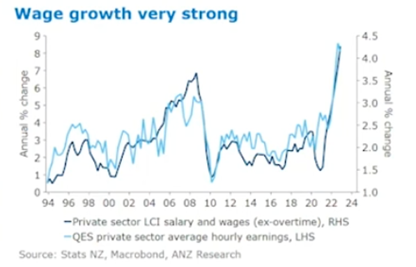
The above graph shows the spike in wage growth.
As we can see in the graph above, wage growth has spiked strongly after many years of everyone wondering where the wages growth is?! It has arrived.
Interestingly in New Zealand, we have by some measures, the highest employment participation ever.
Many business owners are struggling in New Zealand to locate staff. That’s why you’ll sometimes hear on phone messages and see signs on doors of businesses, that service may be slower due to a shortage of staff. We’ve seen some businesses in the hospitality sector close down temporarily and in some cases permanently because they just can’t get staff.
There is some evidence that ads for jobs have eased back a bit but are still very strong.
Interest Rates – New Zealand
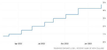
The graph below tracks the official cash rate.
In short, interest rates will need to continue to increase, although there’s some evidence that inflation might be getting close to its peak.
The real issue though, is that inflation may well remain elevated for longer, in which case interest rates may still need to go up a bit further yet and then stay elevated.
Overall though, the New Zealand economy continues to hold up reasonably well.
There’s been much talk about the Reserve Bank engineering a soft landing in New Zealand which is tricky to achieve. It could be that interest rates go up further than needed (we may not be at that point yet), and so a recession may well turn up at some point.
As I’ve mentioned previously, the significance of a recession depends on the depth and length of it. Although tougher times are ahead generally for New Zealanders, so far there is limited data suggesting a serious recession is imminent.
Steady as we go.
In Summary
Whilst inflation in Europe remains on the increase, inflation appears to have peaked in America, at least for now. China does not have an inflation problem at the moment.
There’s an ongoing debate about whether a recession in America will be a soft landing. Although not inevitable, a recession over 2023 in the US would not be surprising. One never knows, although at this stage, it appears that a soft landing is on the cards.
I know that some people worry about a much bigger economic event being a possibility and are feeling cautious.
It’s difficult to predict, and they might be right for all we know. However, there is limited data to confirm this at the moment. This doesn’t mean that it won’t occur. The point I’m getting to is that we can adjust our investment approach to suit what we believe and what fits our investment risk profile.
In my experience, during this phase of the market cycle, it can be useful to be very alert to an overly cautious approach that keeps excessive amounts of cash on the side-lines for too long.
If we invest too early, then we need patience and quality investments. If we are late, it is difficult to catch up on lost ground.
Inflation will likely remain sticky and higher for longer, and so interest rates may need to continue to rise, although perhaps at a slower pace in the immediate future.
Interest rates therefore will likely stay elevated for some time.
Some are predicting interest rate cuts this year although, given the sticky nature of inflation, it’s difficult to see those cuts occurring this side of Christmas. Anything is possible though.
When all is said and done, this is about investing (not economics) and therefore, it is all about investing in quality assets that grow.
It’s also about that balance between the noise of the markets now and your big picture, long-term goals and objectives. Let me know if you need any help balancing that tension.

