One Overlooked Bubble?
Market and Economic Update – Fortnight Ended 14th June 2019

Peter Flannery CFP AFA
“If you have one economist on your team,
it’s likely that you have one more than you’ll need.”
Warren Buffett
The Markets
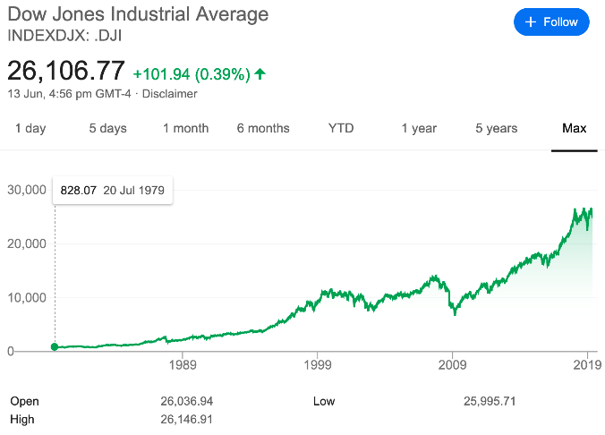
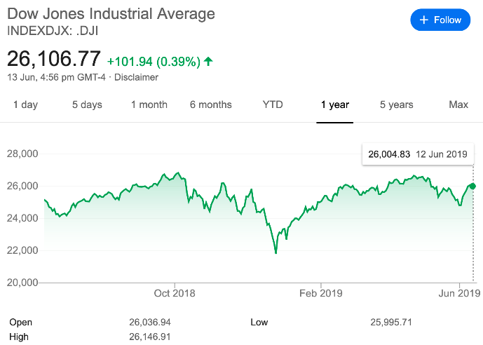
The left side chart shows the American share market as measured by the Dow Jones Industrial Index, starting from July 1979 where it stood at 828.07 right up until today where it is currently sitting at approximately 26,106.77. The right side chart shows the Dow Jones over the last 12 months. Interestingly, whilst the left side chart will always be green, the right side, which is not always green, is indeed green right now.
Are the markets in a bubble? It depends how you measure it and some bubbles are not easily measured because they are difficult to see. For example, the liquidity bubble has been going on for 30 years or longer and is not easy to identify unless you know what to look for. It is also not easy to measure either. This is one of the tricks to investing in that, analysts like to put numbers to everything. They figure if you cannot measure it then it is worthy. The problem is that not everything can be resolved with a mathematical equation. Indeed, once we know a bit more about investing, we realise that balance sheets and income statements have limitations (e.g. they tend to show what has already happened as distinct from what will happen in the future).
One bubble that is not easily identified but is worth thinking about, is the one bubble created by the liquidity bubble itself. This is an environment where companies such as Amazon, for example (it is just the most obvious example that comes to mind), have been able to grow and expand their business because they are innovative and are embracing the leverage of technology. Also because lending over most of that time has been relatively easy.
With easy lending conditions and minimal restrictions on capital flows, we have an environment where technology companies can burn cashflow and capital for many years because they can simply borrow to keep things going. The question is, should lending conditions tighten and capital become less available, how will that impact on many of these tech companies that still do not yet make a profit? Businesses such as Google are now highly profitable cashflow machines that dominate their market. They do not rely on favourable lending conditions and free flowing capital to continue operating or indeed grow their market share. There are numerous tech companies that have listed of late who have seen their share prices fade. For example, Uber, Snap and Lyft have all seen their share prices decline after listing (no surprise to me).
Back in the late 1990s and leading up to the so-called “Tech Wreck” in 2000, technology companies went with the “first mover advantage”, which they now call “winner take all”. Basically, if you can grow the company fast enough you can outpace competition and, once you are large enough, squash the competition anyway. Of course, for every Google or Facebook there are many failures – thousands. Some noticeable failures in recent times include the likes of MySpace, Yahoo and Nokia.
So, the liquidity bubble in my opinion is alive and well. The question is whether any tightening in lending or tightening in capital flows might slow down the growth of companies like Amazon and Netflix, and if so, do investors quickly get bored and bale out? What is the high trading (share) price based on? At the risk of stating the obvious, when trading prices that rely on a set of circumstances (e.g. easy lending conditions, the promise of never ending fast growth) to remain unchanged, then face a removal of some of the conditions that have supported their trading price, how low can the trading price go then becomes the real question? One thing is for sure, the distance from peak (of the share price) to the bottom can be significant in this situation.
Economic Update
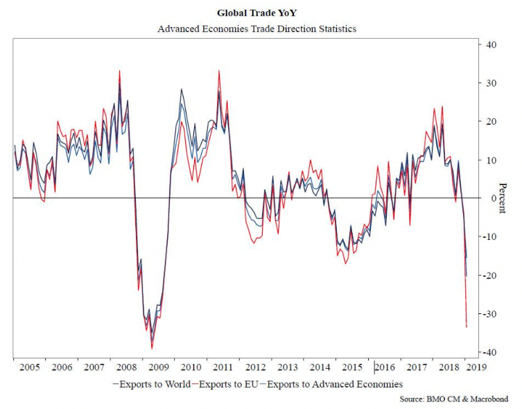
Basically, the above chart measures trade flow across the global economy (mainly developed/advanced economies).
The chart above measures exports globally (the weakest since 2009), exports to developed economies (also the lowest since 2009) and exports to the European Union (close to 2009 lows). The above sharp decline in trade flows appears to be directly related to the trade dispute between America and China. In simple terms, this chart reflects the growing apprehension across numerous markets with the obvious observation being the extent of the sharp decline. It is not the end of the world quite yet. Certainly, something for us to keep an eye on.
So, we have Donald Trump targeting Huawei, which means there is a good possibility that China may look to target some American companies operating in China. Apple and Starbucks come to mind, and there will be numerous others that China will no doubt have on a list. Something else for us to watch …
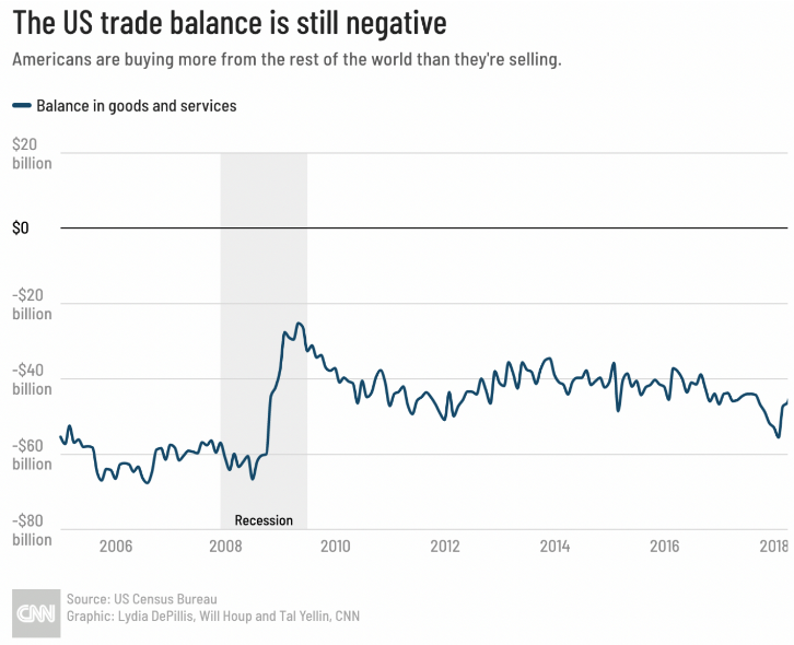
The above chart shows America’s ongoing trading deficit.
Trade is one of Donald Trump’s main initiatives because he feels America can do better on a number of fronts, as the chart above shows. Trade disputes and trade in general is now looking like a key driver of global economic activity on the negative side of the ledger. Right now though, trade does continue to flow across the globe, although at a slower pace. The real question is, where does it get to in due course? Will the implications of the trade dispute between China and the US be the cause of the American economies longest run of economic growth almost ever, coming to an end?
This brings us to Jerome Powell of the US Federal Reserve and “the fed funds rate”. As we all know, interest rates have continued to track ever lower as a result of sluggish economic growth over many years.

The above chart shows 30 year mortgage interest rates and 10 year Treasury interest rates since 2006.
Interest rates have been tracking down in most countries around the world with some now having reached all-time lows – ever. As you know, my view is that this is about the firm grip of deflation, which remains firmly in place around the global economy.
What I find interesting, as mentioned elsewhere, is Jerome Powell (Governor of the US Federal Reserve) changing tack by stopping interest rate rises last year, as well as stopping the quantitative tightening that was underway. It appears that it is now only a matter of time before there is an interest rate cut in America. As usual, this will make the share market punters happy and also homeowners and property investors will like it too. That means asset prices climb yet higher still.
We also have the European Central Bank (ECB) thinking along the same lines too. Mario Draghi appears also to be concerned about the slow-down in growth across Europe and is thinking about interest rate cuts as well as restarting “asset purchases” (printing money / fiscal stimulus). Not surprising because the European economy has been fragile anyway and of course is now caught up in, not only Brexit, but also Donald Trump’s tariff targeting. Europe is also in his sights too (as well as China and other countries).
The Chinese government, only too well aware of the tensions between China and America, are looking to put together a two year plan to help boost the growth of consumer spending in China. The idea is to help the Chinese economy to reduce its reliance on exporting toward growth that is driven more by domestic demand. The Chinese government have said that they will look to promote the upgrade of such things as home appliances, motor vehicles and other consumer products. With regard to motor vehicles, China is looking to promote smart vehicles and with regards to appliances it is looking to promote green technology and so you see, trade tariffs are not all bad! Interestingly, recent data shows that in the first quarter of 2019 consumer spending accounted for around 65% of the economic growth in China. Although more recently retail and motor vehicle sales have declined a bit, the government is looking to reverse these trends with its new initiative.
Global Producers Manufacturing Index (PMI)
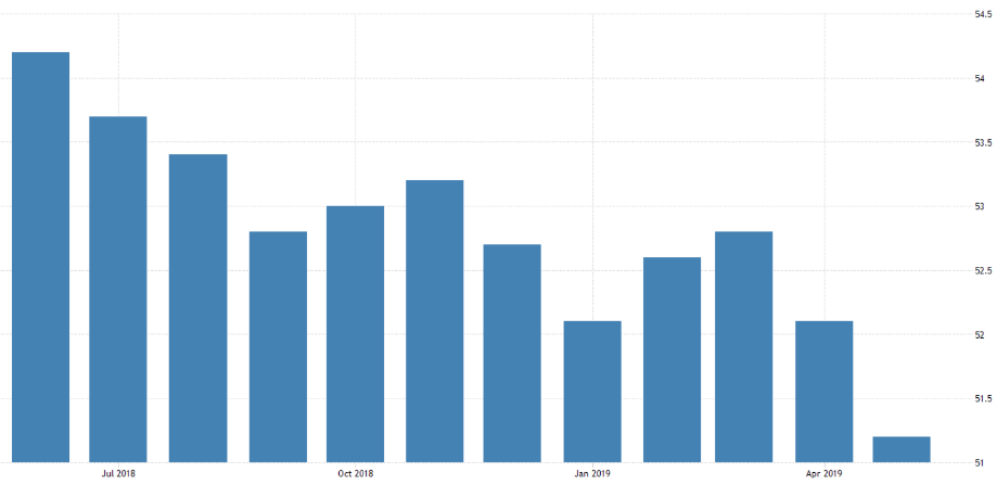
The above chart shows global manufacturing growth. Above 50 means expansion and below 50 means contraction.
The composite global PMI decreased to 51.20 in May 2019 from 52.10 in April of 2019. This manufacturing index is considered to be somewhat of a leading indicator around economic activity. The higher the number, the faster the growth and vice versa. The declining trend may suggest problems lay ahead for the global economy potentially (but nothing is certain).
The PMI for the US and Europe has been tracking in a downward direction. In the UK, the PMI fell sharply from 53.1 in April this year to 49.4 in May, indicating a contraction. Weak demand is the cause, which is due in part to customers stockpiling products in anticipation of the original Brexit date. Now, of course, they do not need new orders and indeed need to sell off existing inventories that have been stockpiled. At the risk of stating the obvious, the continued uncertainty around Brexit is also probably having a negative impact on orders too. Let’s face it, it is difficult to know what to order when you do not know whether Brexit will be a deal, or no deal affair.
The PMI for Germany has also been declining and is sitting at around 44.3 (contraction). Manufacturing for France and Spain, however, remain mildly positive. Even China’s PMI remained unchanged from April through May at a level indicating that there is barely any growth in activity in China. This does not mean that all of these economies are sinking into a dark pit. It does mean that there is little growth to speak of and in some areas, activity is declining. Short term it will not matter but the longer it goes the more challenging this will be for individual economies and likely the global economy as a whole.
Australia
Official Cash Rate Australia
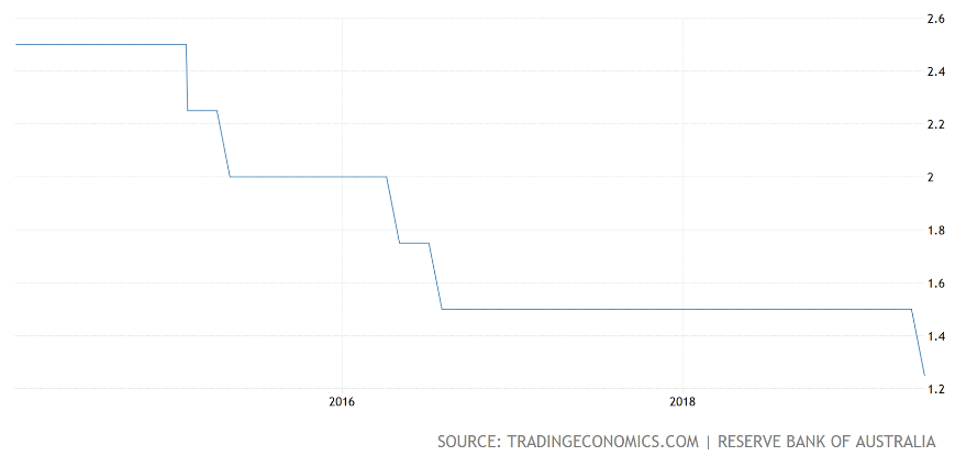
The above chart shows the recent interest rate cut (to the right of the chart).
After much speculation, the Reserve Bank of Australia lowered the official cash rate by 25 basis points (one quarter of one percent) to a new record low of 1.25% at its recent June meeting – lowest ever. This is the first cut in borrowing costs since August 2016. The idea is to support employment growth and to help boost inflation. I imagine the Reserve Bank Governor in Australia will also be taking into account global activity and in particular the risks that may flow out of the current trade dispute between America and a number of its trading partners (it is not just China). In most economies around the world, including Australia, inflation remains subdued.
Employment growth in Australia has been quite strong over the last year as the participation rate increases even though the vacancy rate remains high and there are some reports of skill shortages in some areas. The unemployment rate has been steady at around 5% for the last few months (apart from a slight uptick to 5.2% in April this year). Unlike many other countries, employment growth has seen a pick-up in wages growth in the private sector in Australia, although overall wages growth, like many other countries, remains sluggish.
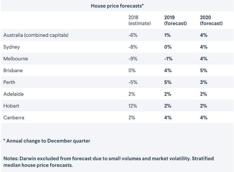
The above chart shows forecast housing price movement across the main centres in Australia.
Housing price declines across the ditch in Australia have been reasonably well publicised although it is of little interest to most Kiwis (unless of course you own property in Australia). The recent interest rate cut by the Reserve Bank, I suspect, will underpin property prices as will the recent election result. Property owners may take some cheer from both of these events. Although it is always difficult to know, it is possible that the eventual recovery in prices may take a while. Market sentiment has been damaged and remember the market determines the price. Further, property prices generally, at the end of the day, are tied into economic conditions, notwithstanding that short term influences such as interest rates and supply and demand can exaggerate prices either on the upside or the downside. One thing we can safely say is that residential property prices in Australia are not going to crash and burn although there may be further downside to go yet before prices stabilise. However, stabilise they will and inevitably prices at some point may rise once again, although it would not surprise me if this is further into the future than we might expect because of pending global economic conditions.
New Zealand
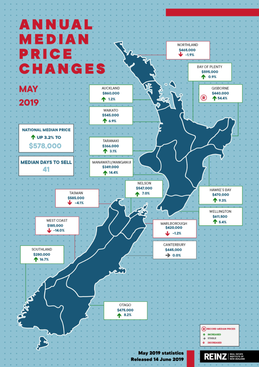
The above chart shows property price movements in the main centres over the last 12 months.
As the chart above shows, property price rises around the country are mixed with Gisborne showing a new record, which looks like a late run when we look at other centres around the country. Property values increased 1.8% over the 12 months ended 31 May 2019, up 6.5% for the same period if we exclude Auckland. Auckland itself in aggregate is down 3.3% for the 12 months ended 31 May 2019.
Another factor that is quite interesting, is to see rents increasing in some areas. By some measures, rents are going up more than twice the rate of inflation although it depends where you rent as to the extent of the rent increase. Rents in Wellington, for example, are up 7.5% over the last 12 months (slightly down on the 11.3% annual growth for the period ending the previous month). The South Island, excluding Canterbury, has seen rents rise by 7.1% and the North Island, if we exclude Wellington and Auckland, has seen rents increase 5.7%. Rents only increased by 1.3% in Auckland and by 2.9% in Canterbury. By contrast, as a point of interest, food is up only 1.7% with fruit and vegetables 2% cheaper than they were a year ago – believe it or not.
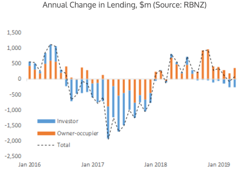
This chart shows the change in lending patterns, breaking it down between investors and owner occupiers.
Recent updates from the Reserve Bank of New Zealand (RBNZ) show mortgage lending in April this year was $5.45 billion, an increase by around $80 million from the $5.38 billion 12 months ago. Recently, investor lending appears to be trending down. When we examine the owner occupier lending more closely, we can see that high loan to value ratio (LVR) lending to first home buyers continues to grow.
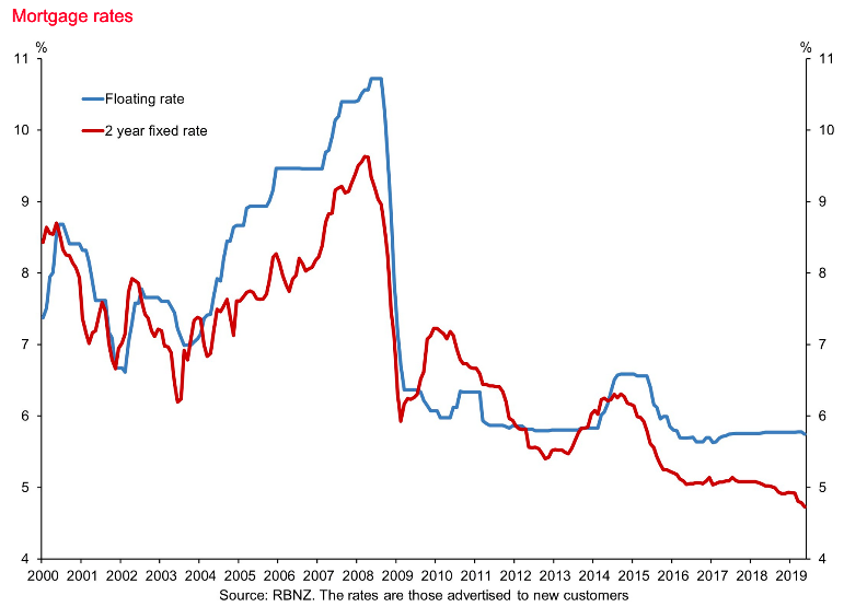
This chart measures the floating mortgage rate and two year fixed rate for borrowers here in New Zealand.
The substantial interest rate declines for borrowers after the 2008 global financial crisis have slowed down but continued and now, we are more or less 10 years down the road. Interest rates (apart from the US, who are also having a rethink now anyway) continue to remain flat or are declining. The challenge for the uninitiated, I believe, is that when these trends continue for many years they can seem as though they are normal. Ever declining interest rates is not normal. It is, however, the current environment and from what we can tell, likely to continue over the next six to twelve months at least. That is good news for borrowers but of course on the other side of the coin, bad news for retirees who still insist on drawing a meagre income off term deposits to make ends meet in retirement.
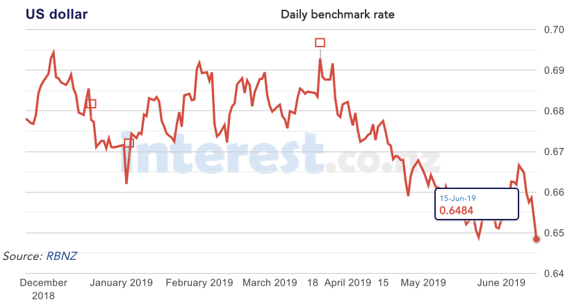
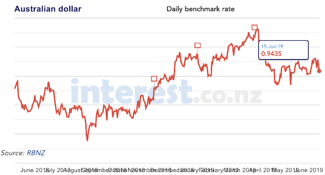
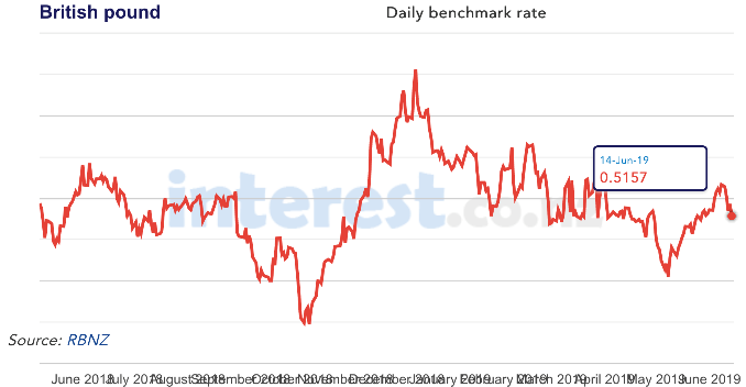
The above three charts show the cross rate between the US dollar (the top chart), the Australian dollar (the left side chart) and the British pound (the right side chart).
The New Zealand dollar, however, has strenghtened from 0.9205 12 months ago to 0.9435 to the Australian dollar. The US dollar has strengthened over the last twelve months, with the cross rate sitting at 0.6886 as of 18 May 2018 and currently the US/New Zealand dollar cross rate is sitting at approximately 0.6484. These changes in the short term do impact on the returns that you will make as an investor although to some extend they can even out over time. There is a good argument that suggests the New Zealand dollar is strong against many currencies around the world, which of course makes it not a bad time to be building off shore assets.
As for the global economy, trade tensions are taking centre stage right now. This may take time to play out and the implications of it remain unclear at this stage. Hopefully, it will create some volatility for us!
Do you get the chart above? No … me neither!!