What Is The Market Now Worried About?
Monthly Market and Economic Update – October 2021

Peter Flannery Financial Adviser CFP
“If you have one economist on your team,
it’s likely that you have one more than you’ll need.”
Warren Buffett
Key Points:
- Evergrande seemed to spring out of nowhere, will they survive?
- Inflation has spiked, is it really transitory like the Fed says?
- Interest rates are up too.
- Check out the Fed dot plot to see where interest rates might be going.
- What does rising interest rates mean for your investment portfolio?
- The US household wealth continues to grow.
THE MARKETS
Volatility, finally!
The US market was down by approximately 5% (depending on which Index you measure) over the month of September. That’s true to form looking back over a number of years in the past – not unusual.
As you know, some of the biggest market corrections have taken place over the months of September and October.
Whilst this volatility is a good starting point, it’s not enough to make trading prices cheap, only slightly less expensive.
The markets can be amusing to observe. Over the last 10 years, markets have generally been highly resilient against all manner of news, some of which has been particularly negative and previously would have seen markets decline sharply.
Still, the markets either ignored it or simply took the bad news in its stride as it continued to focus on rising prices and other factors. Markets have been very happy with prices rising with limited volatility over the last 10 years.
That said, markets can worry a lot, sometimes too much. The popular media, of course, is there to give a hand. They make sure that the markets are left in no doubt as to the dire consequences of new information to the negative as it unfolds. A brief list of current market worries might include:
- Global supply chain constraints. It takes over 70 days to ship goods from China to America (the West Coast), which is an increase from around 40 days in early 2020. The coronavirus continues to add to delays.
- Debt-ceiling uncertainty in the US. The recent deadline of September 28 2021 passed with a band-aid, only to be further debated over the next couple of months.
- Evergrande – one of the largest property development companies out of China, is facing potential default. It’s not over yet.
- Transitory inflation is lasting longer than the Fed anticipated. Some worry this could lead to more permanent inflation and ultimately to the possibility of stagflation.
- Along with rising inflation comes rising interest rates. Whether it be the US government, moms and dads servicing mortgage loans, businesses with high levels of debt, this indeed is not just a US problem, but rather a global issue. 10 year treasuries have recently increased above 1.5% although the Fed has yet to move on interest rates. It’s a question of when, how fast, by how much, and then, of course, what the impact might be?
- Future earnings growth and stretched trading price valuations. Earnings growth and trading valuations are directly linked. The markets have been buoyed (particularly in the US) by strong earnings growth numbers. However, can they continue? The concern is that if earnings growth is hurt by, for example, an increase in corporate tax, we could see trading prices decline sharply.
These are some of the items that the markets worry about.
One item that I keep an eye on is economic growth because, at some point, it is linked to trading prices. This is not something that the market (and popular media) thinks about too often. The short of it is that economic activity and growth support trading prices across the market generally. It doesn’t mean that individual businesses within the market cannot fail when things are booming or do well against the struggling economic background.
What generally happens overtime at some point though, is that the markets get ahead of themselves (like at the moment), and an event or unexpected news is sudden enough or worrying enough to spook the market, causing trading prices to sharply decline.
That said (not that I’m attempting to predict the future), steadily rising interest rates could cause trading prices to track sideways or even move slowly in a downward direction over many months.
The last time I saw this was 1994 when the US Federal Reserve, without too much warning, raised interest rates causing markets to decline for, what at the time seemed like an eternity for some investors ( approx. nine months). Of course, if you have that long attention span, it doesn’t matter.
On the other hand, if an investor watched their portfolio daily or weekly, only feeling good when prices rose, I can imagine how difficult that may have been for them. As I joked with one of my clients recently, “If you watch your portfolio every day, there is the risk that you may become very unwell!”.
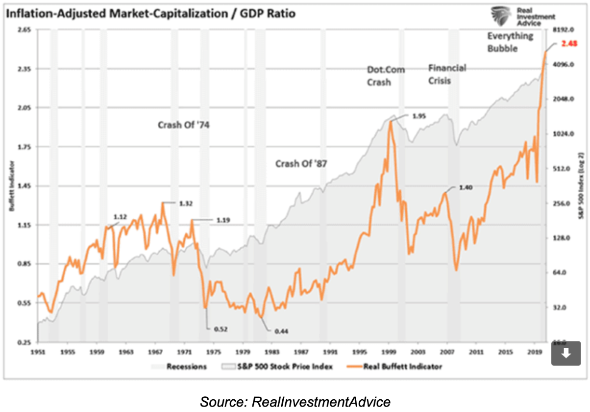
The above graph tracks the Buffett Indicator, which, in simple terms, compares the capitalisation of the American share market against economic growth as measured by GDP.
I don’t watch the movement the Index above on a daily basis, worrying about when the next share market crash might emerge. Some investors think they should be looking for indicators that give them the signal to sell everything just before markets crash.
Indeed, fingers crossed, I am looking for some meaningful volatility, particularly over the next month or two. Anyway, it is a useful gauge as to the overall landscape, and in conjunction with other metrics as part of an overall suite of indicators, the Buffett Indicator can be interesting and useful.
When you invest for long enough, part of the learning curve is the realisation that timing markets is problematic, especially if we believe that timing markets somehow gives us control.
Buying on dips is a different approach, as distinct from timing markets as though we can somehow know when to get out and when to get back in again. Very few investors have achieved this consistently in the past.
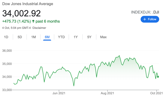
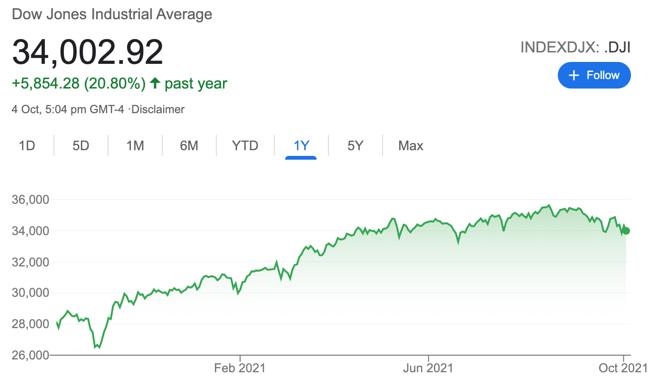
The chart on the left shows the US share market (the Dow Jones) over the last six months. The chart on the right shows the US share market (the Dow Jones) over the last year.
What about Evergrande in China?
This one is not clear cut or straightforward. There are some unanswered questions.
Simply, will Evergrande default, and if so, what does it mean for the Chinese economy and therefore the global economy?
My understanding of this situation suggests that the Chinese Communist Party is not interested in saving Evergrande but do have some interest in helping reduce the resulting fallout should Evergrande fail.
Although it’s difficult to gauge, my best guess would be an 80% – 90% possibility of failure against a 10% – 20% possibility of survival.
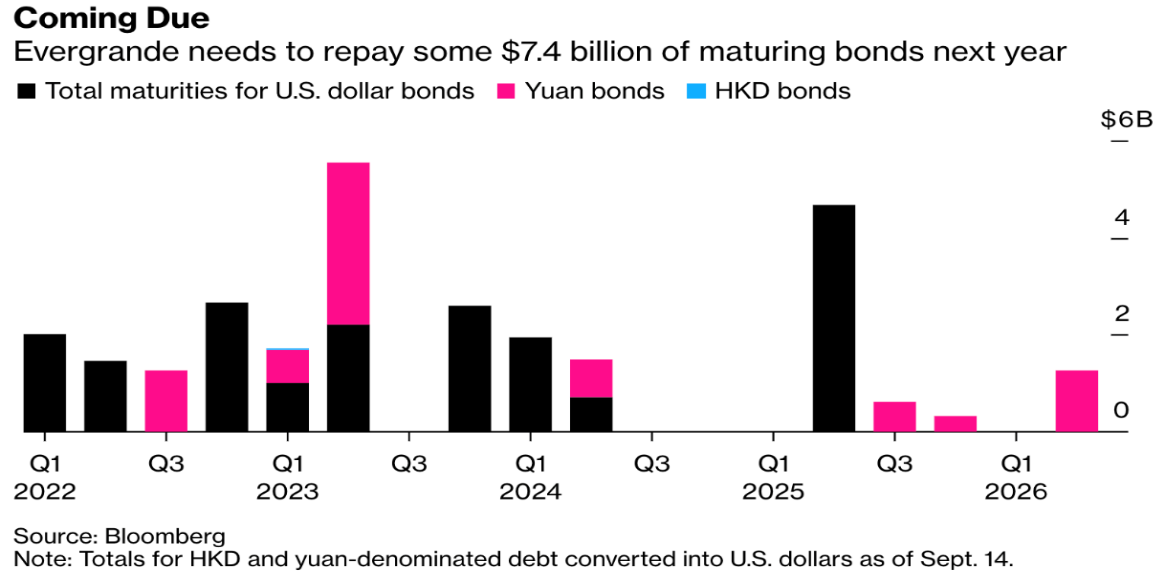
The above graph tracks the debt repayment schedule for Evergrande, crucially showing the significant debt to be repaid over 2022 and 2023.
Although unlikely, Evergrande could survive. They will need to be creative about how they fund the rollover of debt as each lump of debt comes due for repayment.
Although I’m not sure it’s enough, they are diversified into other areas and so, if those other investments are generating positive cashflow, that might help. Cashflow in this situation becomes critical (as is the quality of the balance sheet), and any cashflow they can generate from activities outside of the property division will definitely be useful. The question is whether it’s enough?
The market would react quite sharply I believe, to the news of Evergrande’s default, although I don’t believe it would necessarily lead to a global contagion. Possible, but in my opinion, not probable.
What’s happening in New Zealand?
We continue to battle the coronavirus, and slowly but surely, control is emerging. However, vaccinations are undoubtedly well behind where they could have been. I think we all know that the coronavirus will be with us for the foreseeable future. It will be a miracle if it does not spread to the South Island as restriction levels lower, freeing up frustrated humans – and delta.
Interest rates are rising in NZ, and the government recently introduced new measures for property investors that mean tax-deductibility of interest will be phased out over the next few years but still available on new builds.
New Zealand’s economy, thanks to the Reserve Bank of New Zealand, the fiscal and monetary support implemented over the last 18 months, has remained relatively stable, all things considered.
Big events for investors don’t always start in New Zealand. They usually come from offshore.
The Global Economy
US Federal Reserve interest rate “dot plot”
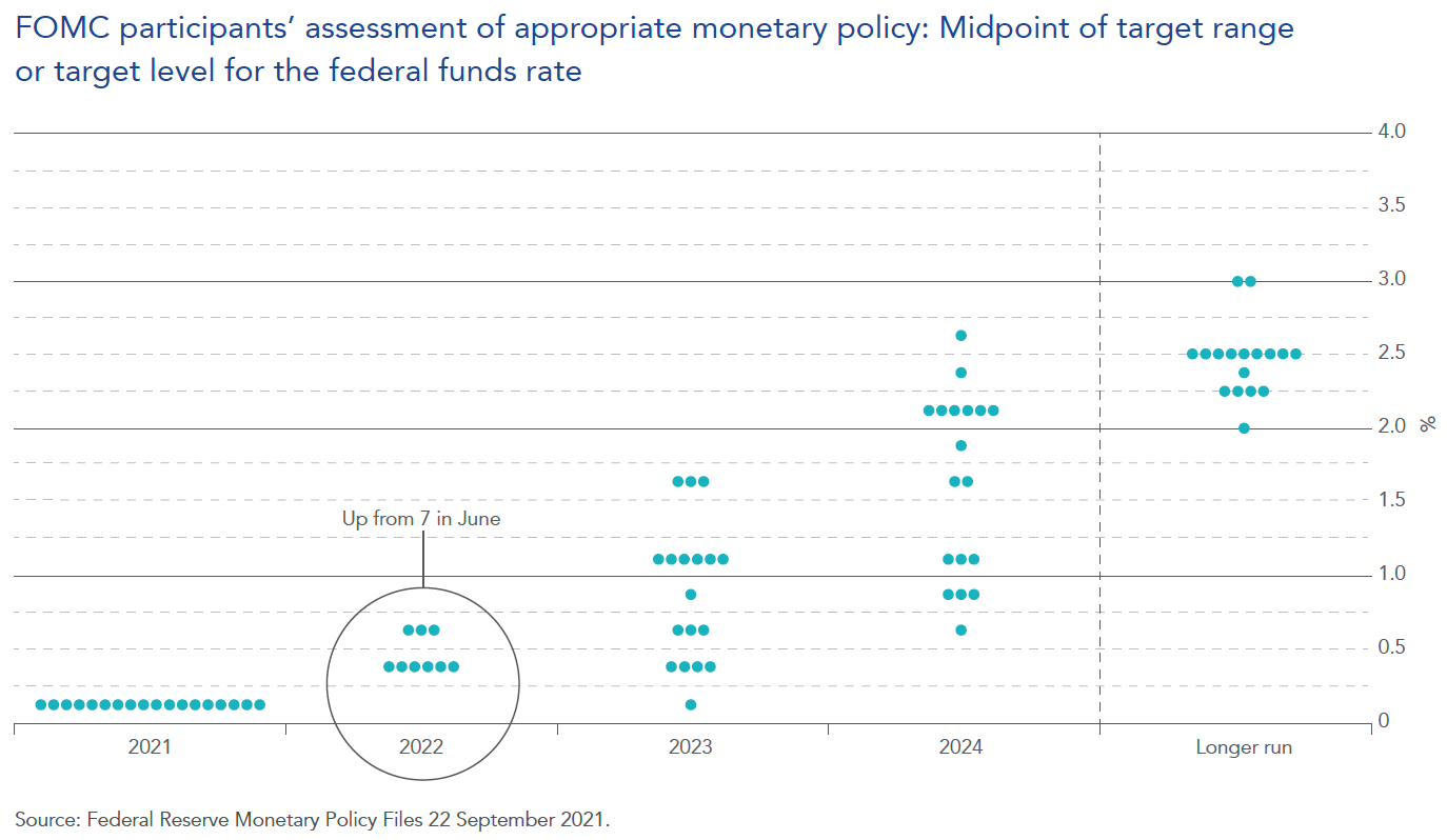
The above graph is known as The Fed dot plot. It tracks the consensus views of all the Federal Reserve directors that make up the controlling committee of the Federal Reserve in the US. In simple terms, it tracks what they are thinking, about where the official cash rate might be heading. Like any projections or consensus, it is a projection rather than a fact.
Generally, interest rates determine asset prices.
That’s why it’s useful to keep an eye on the US Fed dot plot. It’s not a guarantee of anything but does indicate the collective thinking about where the official cash rate might be heading in the US. This is important because it does have a bearing on interest rates globally and here in NZ.
There appears to be growing disquiet among the US Fed directors who are looking to begin the tapering process prior to Christmas and raise interest rates sooner than Jerome Powell has indicated in the past.
For example, in September, US Federal Reserve officials kept rates unchanged but indicated rate increases might be coming sooner than some are expecting in 2022 (rather than 2023).
The most recent dot plot showed that 9 of the 18 FOMC members are expecting a rate hike in 2022, up from 7 in June’s projection.
The United States ISM Purchasing Manager’s Index (PMI)
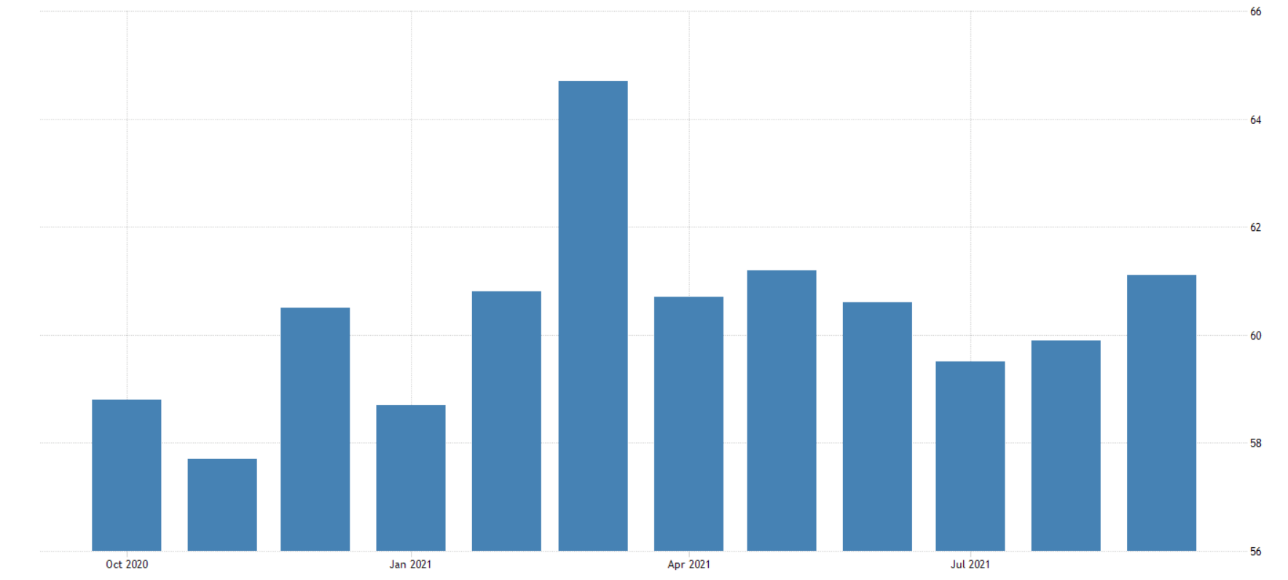
The above graph tracks purchasing intentions in the US. ISM means Institute For Supply Management. PMI means Purchasing Manager’s Index (PMI). This Index is a result of the survey of approximately 300 manufacturing firms across America, taking into account their business intentions. It is considered a key indicator of the state of the US economy. A reading above 50 means expansion, whereas a reading below 50 means contraction.
Manufacturing in America continues to expand. That’s good news for the American economy and, therefore to some degree, the global economy.
This ongoing expansion will be needed because there will likely be some headwinds from a slowing Chinese economy when we take into account the recent crackdown on big tech in China along with other sectors of the Chinese economy.
Although anything is possible, it is difficult to see global economic collapse because of China’s actions. It appears that the Communist Party is looking to reduce capitalist excesses in favour of everyday citizens.
Therefore, a seriously troubled Chinese economy is not necessarily to their advantage.
However, as we know, the Chinese government is happy to take direct and decisive action with what appears to be minimal regard for the consequences and the collateral damage in the short term, in order to achieve their bigger picture longer-term goals.
Evergrande is a company that most people had not heard of until the last few weeks, when it looked as though it was going to default on one of its payments to bondholders.
Evergrande is a symptom of bigger picture troubles across China’s property market. It would seem unlikely that Evergrande is the only property company in China having problems given the excesses of this market that have developed over many years.
More excitement for the Chinese economy and, therefore, the global economy lies ahead. Are you worried about that prospect or excited?
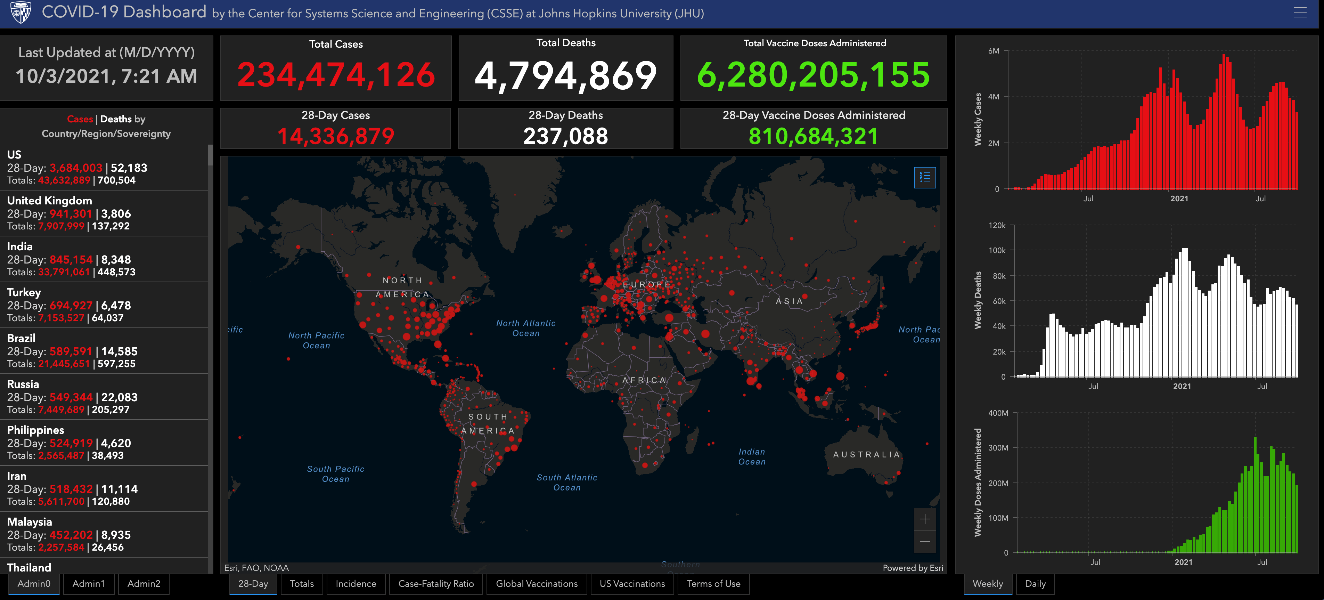
The above dashboard tracks a variety of indicators about the coronavirus globally. Increase the size of your document on screen to read the small print.
The coronavirus just will not lay down and go away. We now have the Delta strain, which has proved surprisingly infectious and resilient.
Although far from under control, developed countries around the world have established some control over the spread of the virus.
It appears that the likes of the UK and the US might be a better place than the likes of New Zealand and Australia for example, because they have some natural herd immunity given the spread of the virus throughout the population and are more advanced with vaccinations across their population.
New Zealand has the advantage of being an island out in the middle of nowhere, but then we don’t have the same degree of herd immunity, and our vaccination rollout is well behind where it could have been.
I’m not an epidemiologist; however, some rough ‘back of the envelope number crunching’ suggests that New Zealand may need 90% – 95% vaccination to have real control over the spread of the virus ( along with other measures).
Whilst others may have different numbers, the reality is that, without that natural herd immunity and how easily spread the Delta strain is, in order to avoid hospital overwhelm, even with other measures, if we want to avoid ongoing lockdowns which the population has less and less appetite for, a very high level of vaccination across the total population will be required along with those other measures.
Otherwise, it’s either lockdowns or potential hospital overwhelm, not to mention the pain, suffering and death that the coronavirus might inflict on some members of the population.
To me, it seems a bit like having to remember to take bags to the supermarket to carry the groceries out to the car. Having a mask in my back pocket and in every vehicle has become the norm. Wearing a mask is somewhat inconvenient. However, there are many worse things.
The United States of America
American household wealth continues to grow
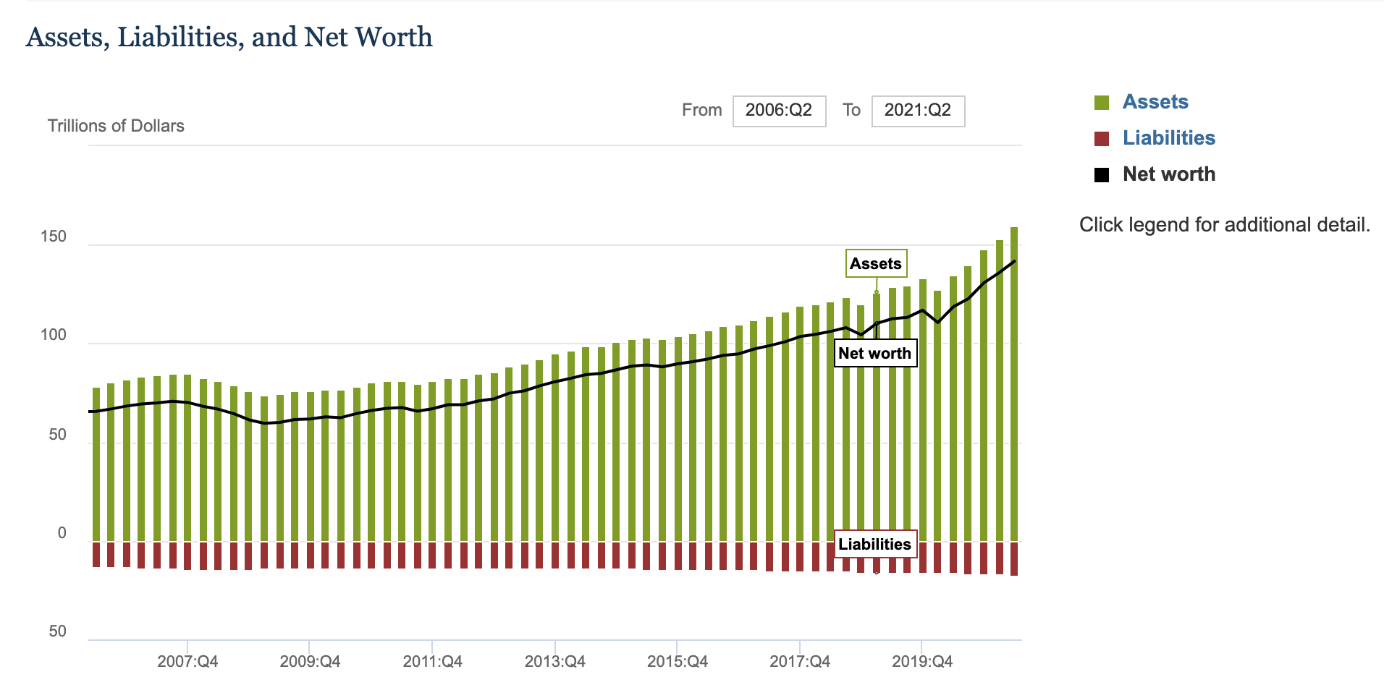
The above graph shows household debt, total assets, and the net worth for households across America.
Household wealth across American households continues to grow. The latest number shows that total assets worth US$159 trillion, liabilities amount to $17.7 trillion, which means a net worth of $142 trillion. I know you’re wondering, how come everybody’s saying that America owes so much debt, but this graph doesn’t show it? The reason, of course, is because these numbers are about household wealth mainly and therefore exclude corporate debt and government debt.
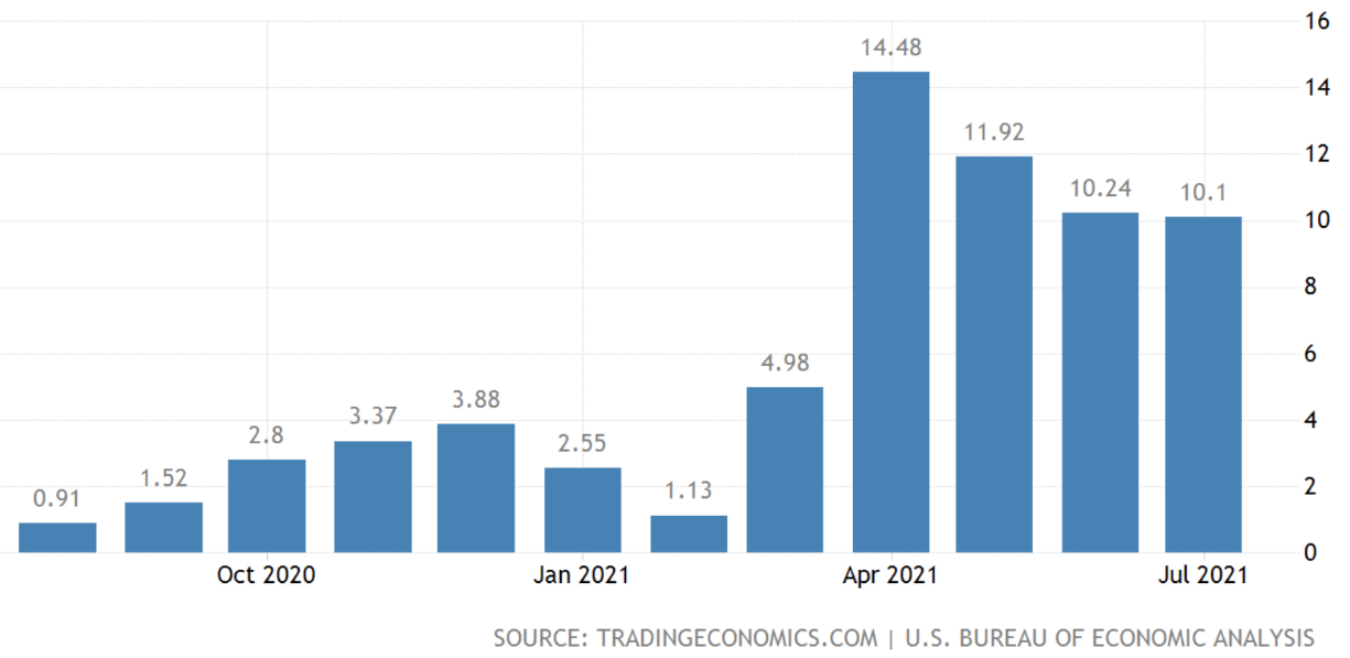
Inflation – USA
The above graph tracks the inflation rate in America.
Inflation can be quite complex and difficult to predict. The above graph shows a slight easing of inflation. However, the jury is still out with regards to whether or not the current level of inflation is transitory or permanent. As you know, I reckon quite a bit of current inflation is transitorily, caused by supply chain disruption and demand. However, I also believe there is underlying permanent inflation that will stick around once the transitory component eases back.
What about owners’ equivalent rent?

Owners’ equivalent rent is just simply what a homeowner would charge to rent out a house on the open market. The graph above tracks national rents with a 4-month projection against owners’ equivalent rent (left-hand side). Rents across America are rising.
I mention owners’ equivalent rent (OER) because the services sector in America makes up around 60% of the consumer prices index. The largest contributors are housing costs and wages. The biggest housing weighting in the US (CPI) is owners’ equivalent rent (OER). This represents approximately 25% of the entire CPI and has increased somewhat recently. Earlier on in the pandemic recession, rent freezes helped to push rents down. However, rents appear now to be rising and could continue. Therefore, it seems logical that the OER may follow in the not-too-distant future.
Anyway, the transitory inflationary components are lasting longer than the Fed expected and may still ease back. However, the more permanent components such as rent and wages costs may continue to rise.
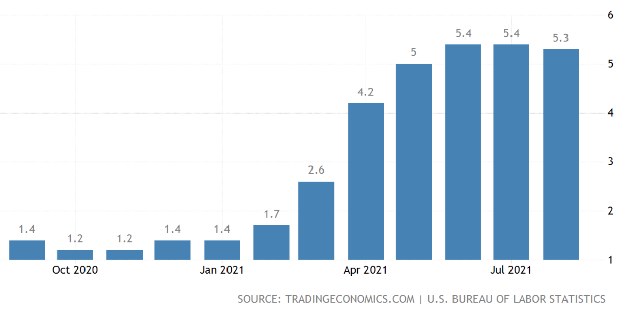
Wages growth – USA
The above graph measures wages growth in America.
Looking more closely at the graph above, you can see how wages growth was subdued until the April 2021 bar at 14.48. That’s the annual increase over the previous 12 months. So, even though those bars appear to be declining from April 2021 to July 2021, bear in mind that the July 2021 bar is showing 10.1% wages growth over the previous 12 months. To be clear, wages are not declining but are rising, just at a slightly slower pace. The point here is that we haven’t seen much in the way of wages growth for many years, and there it is now.
So, it will be interesting to watch those transitory and permanent inflationary components, which I suspect may take a number of months to show signs of clarity. However, by then, it will be equally interesting to see how things are looking with regards to those stickier inflation components such as rent and wages.
China
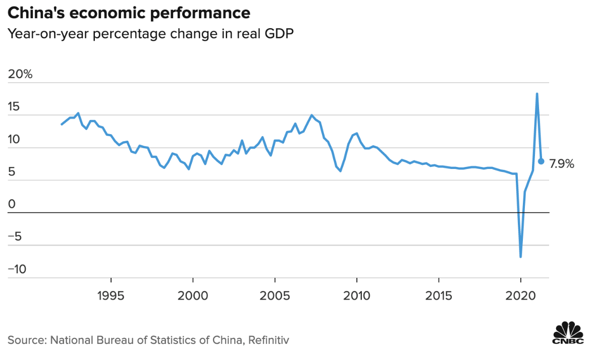
The above graph tracks China’s economic growth as measured by Gross Domestic Product (GDP).
China’s economy continues to grow at a reasonably solid pace, particularly when compared to other economies around the world. However, there could be a slowdown coming.
Evergrande has obviously hit the news and signals the possibility that a slowdown in real estate development and rising property prices, might be on the agenda quite soon. If we take a quick step backwards and get some perspective on what’s going on, whilst it is difficult to gauge because one never knows what’s really happening in China, it appears though that the Communist Party is adopting a somewhat Marxist approach.
In very simple terms, this may mean attacking ‘the excesses of capitalism’ and making some examples of companies and individuals at the top. It could be that the Chinese Communist Party intends to bring those Communist/Marxist policies back from behind the scenes to be more visible moving forward.
It would seem unlikely that the Chinese government would want to crush the Chinese economy because they only hurt themselves. They need economic growth to continue; however, they neither need nor have any desire for those ‘capitalist excesses’ that emerge.
They’ve also counselled the population about too much time on technology and other excesses that the Communist Party deems inappropriate for good standing Chinese citizens. The question on investors’ minds revolves around what impact a Chinese economic slowdown might have on the global economy? Without getting into the detail here, I imagine the markets could be easily spooked by unexpected negative news about Chinese economic growth.
By some estimates, the Chinese economy is estimated to grow by 4.8% in the third quarter of 2021 compared to the previous projected 5.1%. 4th quarter estimates came out at a 3.2% projection compared with the previous 4.1% projection for the quarter.
Whatever the numbers, it will be interesting to see how the markets respond.
As a side note, I noticed with interest the Chinese government imposed some stringent energy consumption limitations on companies that directly affected the likes of Apple and Tesla. In short, both companies had to cease production temporarily for a few days whilst they dealt with those restrictions.
It appears that there may be some shortage of coal, or the Chinese attempting to reign in pollution, among other measures. The point here is that the Communist Party is not at all concerned about the short-term consequences of implementing its policies.
It will be interesting to watch to see whether further power shortages impact production and therefore the supply chain. As the Chinese economy emerged from the virus pandemic recession, it looks as though the sharply increased demand for goods and services also placed significant demand on energy resources.
So, in addition to Communist Party policies being implemented to minimise capitalist excesses and possibly reinstall some Communist/Marxist values, the Delta strain of the coronavirus has also slowed down economic activity as the virus remains difficult to eradicate, even in China.
Interestingly, China is also following the path of the US and Britain to some degree (notwithstanding the fact that they are ahead of the curve anyway) by allowing their economy to open up in the face of an increasing spread of the virus, hoping that increased vaccination rates will help curtail further Covid outbreaks, allowing their economy to continue down the path of reopening.
China is facing off against some market excesses (e.g. booming property prices, big tech billionaires) and is also looking to reinstall some traditional values across the population, which will impact specific sectors (e.g., big tech, education, property) and potentially flow on to the global economy.
As I mentioned elsewhere, it’s difficult to see global economic collapse. However, markets won’t like it, and indeed, there could be a ripple effect of slowing economic growth around the world to some degree.
The United Kingdom
Going for the vaccination and herd immunity combo
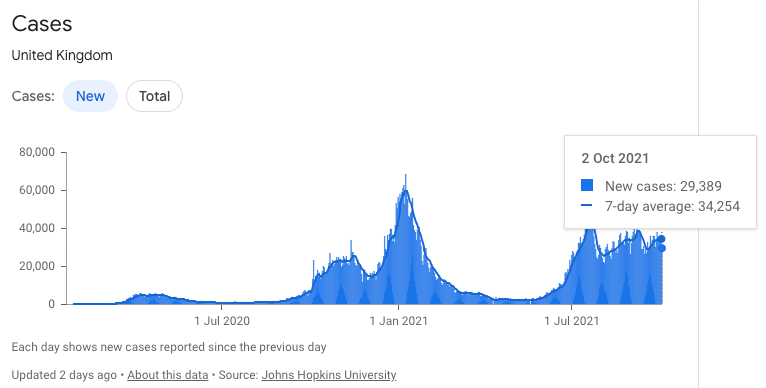
The top graph shows the number of new cases along with the 7-day moving average. The bottom graphs offer further information.
The decision in Britain has been made; all bets are on the nose of vaccinations and herd immunity. With the level of infections across Britain increasing, the silver lining is that there is a degree of natural immunity, which along with vaccinations and other measures, is basically the plan for controlling the spread of the coronavirus.
I am no epidemiologist, and I cannot predict the future. To me though, this approach actually has a chance of working. It’s not the perfect solution; however, it allows the economy to open up and, more importantly, for people to get jobs and get back to some sense of normality with less hardship, whether monetary or mental. There is, of course, collateral damage.
Those that are not vaccinated are likely to catch the virus. Those who have secondary health conditions can run serious risks if they are unvaccinated and catch the virus. It will be interesting to see how this plays out in Britain.
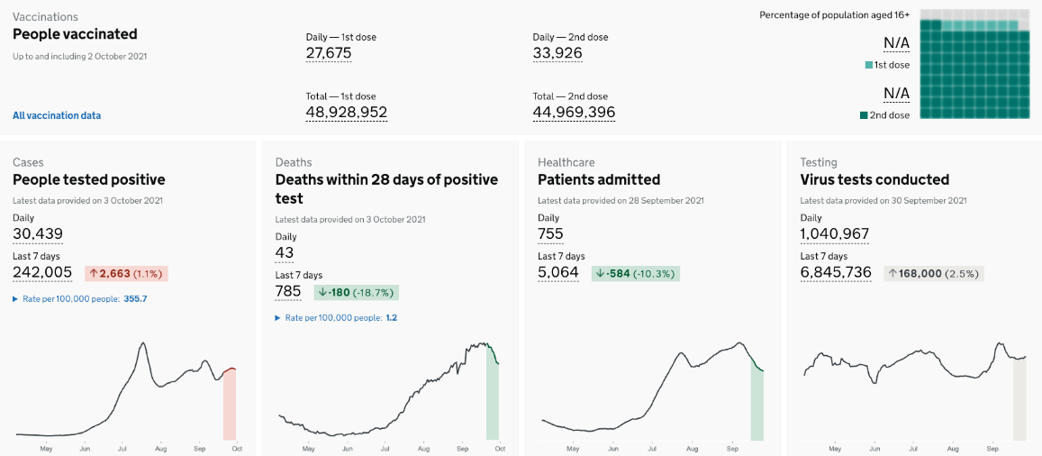
The graph to the left shows improving economic growth. The chart to the right (with the green bars and the black line) shows improvement in government debt.
So, in theory, then, as the economy opens up, economic activity and growth recover, which is good for everyday citizens across Britain and also (in theory) helps reduce the significant amount of public and government debt.
Europe
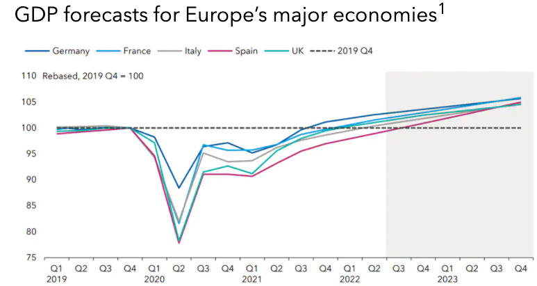
The above graph shows projected economic growth as measured by GDP for Europe’s main economies up to the final quarter in 2023. Of course, these are projections and not guarantees as to how things may indeed work out.
The European economic recovery is well underway. This is especially the case for the likes of Italy and Spain. As European economies have opened up, services activity has recovered strongly without the coronavirus restrictions holding things back.
This is particularly important for Spain and Italy as their economies are reliant on the tourism/hospitality industry remaining open for business.
By some measures, it is expected that European economies could regain their pre-pandemic economic growth levels (as measured by GDP) by around mid-2022.
Interestingly, with government stimulus packages and some benefits protecting household incomes, consumers across Europe have not been able to spend at the same rate, and therefore, savings rates have increased.
I wouldn’t be surprised if the pent-up demand once released leads to further growth and the possibility of inflation, which is not altogether bad (to a degree) for Europe. That’s because this economy has struggled to grow in the past and hovers around 0-2% growth, at times touching on zero growth, risking deflation. That’s not a problem right now.
Like elsewhere of course, it is thanks to significant European Central Bank support.
Europe is growing, and in my view, it’s more a question of how sustainable this economic growth is in the medium term.
In another words, take away the stimulus and the pent up demand spending, how will economic growth be tracking then? Back to the real world, as they say…
Australia
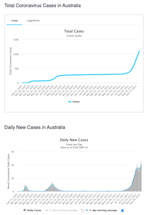
The top graph tracks total Covid cases across Australia. The lower graph tracks the number of daily new cases (the grey bars) and the 7-day moving average (the blue line).
The coronavirus appears to have the upper hand across Australia. Of course, it’s just a statistic when you look at it, like you are now. However, it takes on a whole new meaning when you know someone trapped on one side of the ditch or the other, who suddenly needs to get home.
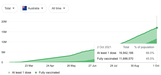
The above graph tracks the total vaccination rate across Australia.
Like several other countries around the world, Australia appears to be (by design or not?) going for natural herd immunity (!) along with vaccinating the population and other measures. So how is economic growth in Australia looking?
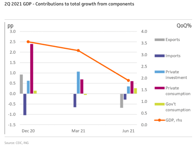
The above graph tracks economic growth as measured by GDP (the orange line referencing the right-side vertical axis). It also shows the main contributions to total economic growth.
The above graph goes to the end of June 2021, and the most recent activity regarding coronavirus, of course, is in the 3rd quarter and not shown on the above graph. In short, economic growth will likely slow due to coronavirus spread. We might even see a negative number for economic growth in the 3rd quarter of this year in Australia. Time will tell…
Again, this matters not because it is the end of the world, but because New Zealand and Australia still trade with each other and if they are struggling, then it can flow across to New Zealand to some degree. We all look forward to Australia getting control over the Delta strain of the coronavirus.
New Zealand
New Zealand and the coronavirus battle continues…
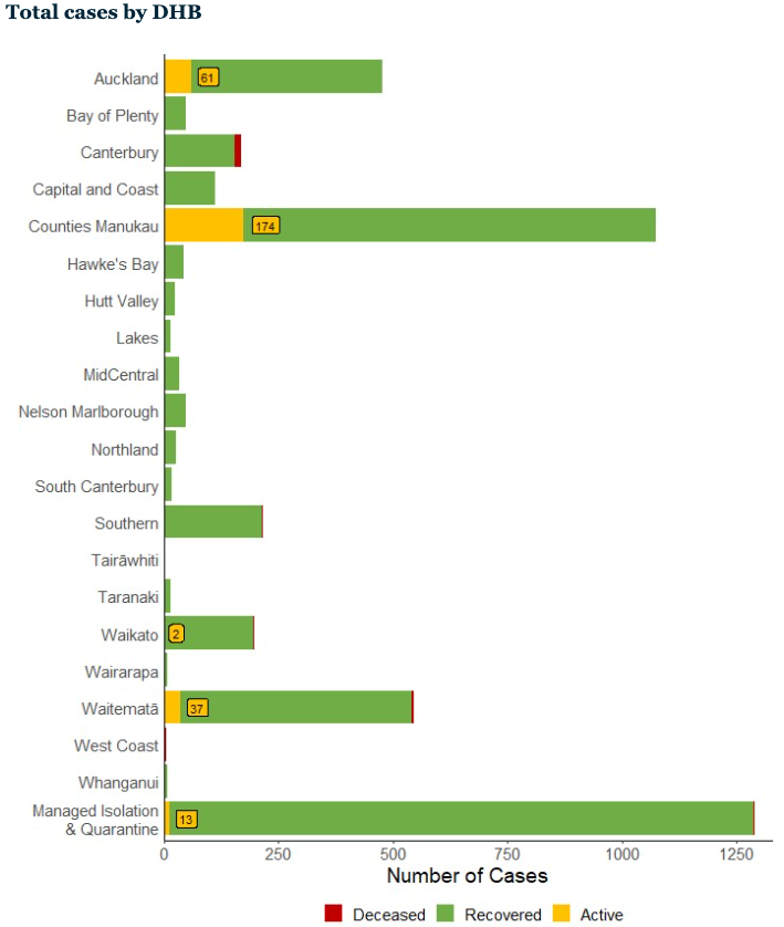
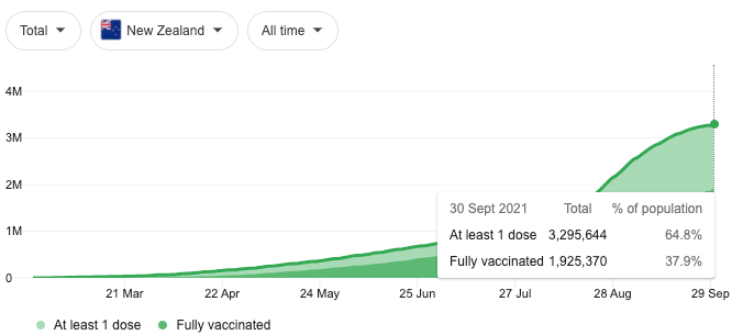
The top chart shows the daily infection rate in New Zealand. The second and middle chart shows the total number of cases by location, including the number of recovered and deceased. The third and lower chart shows the percentage of the population that is double vaccinated.
New Zealand continues to battle the coronavirus. Whilst some are opposed to what the government is doing, overall, the team of 5 million is engaged, and most of us are on the same page.
Anecdotally, when carrying out my duty as a Rotarian at The Riccarton Market in Christchurch (an outside mall if you like), you can count on one hand those that felt disaffected or entitled about the rules for getting into the market (sign in using the tracer app and wear a mask). Still, overall, people were obliging, happy to comply and indeed pleasant.
I realise you’re probably tired of listening to information about the coronavirus. I raise it here again because New Zealand is a small, narrowly based economy that has yet to make the transition from trading real goods internationally to a more technology/information-based economy which we have the potential to do. In short, we are vulnerable.
Fiscally, New Zealand is in a reasonable position even now after the significant increase in debt compared to many other countries around the world. This doesn’t mean that we are necessarily in the best shape we could be fiscally, but it’s not seriously bad, all things considered.
The bottom line is that it would be good to see some forward planning and what opportunities there are for us all to make the best of this situation and get on with it. A bit more transparency from Jacinda and the gang would be good – what do you reckon?
Like other countries, New Zealand seems to be following the line of a strong vaccination rate across the country (90% anyone?).
In my opinion, this is likely still not high enough; however probably the best we can hope to achieve.
I mention that simply because the Delta strain of the coronavirus is highly contagious. Further, there has been some noise about other mutations that have yet to achieve real mention in the popular media, but therein lies the real risk.
As we all know, the smart option is to contain the Delta strain to minimise the chances of a mutation. In that situation, we either face further Level 4 lockdowns which I know are becoming unpalatable, or a greater level of collateral damage, illness, hospital overwhelm, death, job losses…which affects real New Zealanders. We just don’t want to go there, and we don’t need to (it doesn’t mean that we won’t!).
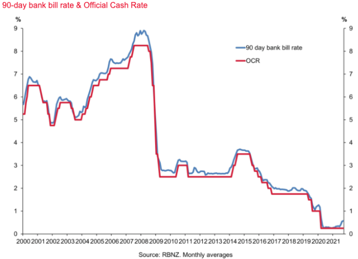
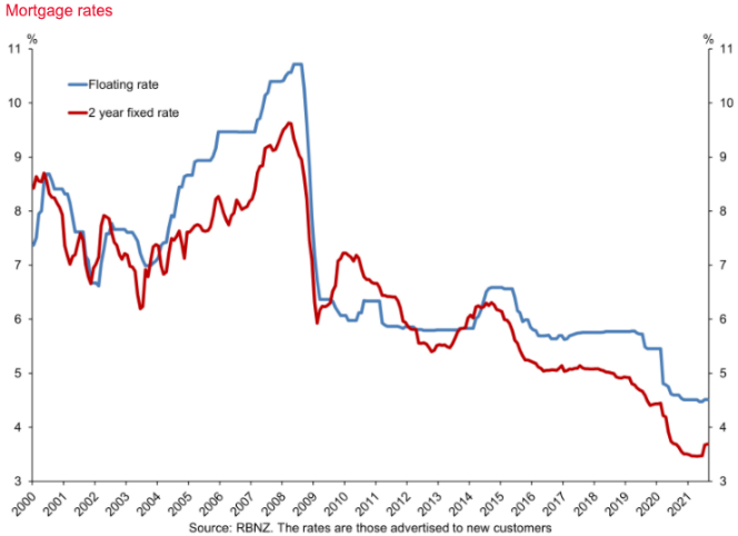
The chart to the left tracks the 90-day bank bill rate and the official cash rate. The chart to the right tracks the floating mortgage rate and the 2-year fixed mortgage interest rate.
Interest rates in New Zealand have been on the rise. Compared to what we’ve seen for quite some time, the rise is notable. The real question … is there more to come? The answer to that I suggest is more than likely. To what extent, though, is difficult to gauge.
It’s difficult at this point to see 10% per annum mortgage interest rates anytime soon.
Whilst if inflation offshore gets out of control, then a 10% interest rate is possible (all of a sudden). Right now, though, there could be another 100 basis points (1%) or possibly 200 basis points (2%) increase that may unfold over the next 12 to 18 months—my best guess rather than a prediction.
As the above table shows, residential property prices have continued to boom in light of low-interest rates. I suspect if we fast forward 12 months, even 6 months from now, there might be a different story emerging(?).
As I outlined above, New Zealand mortgage rates appear to be heading in an upward direction.
Banks, dictated to by the New Zealand Reserve Bank have much more stringent requirements for anyone taking up a loan in New Zealand. Sure, those who have the equity and the income to service debt as per the bank’s requirements, will simply jump through whatever hoops need to be jumped through to obtain the funding.
Those hurdles will be significant for those on the fringes, and in some cases, their funding will be out of reach.
Perhaps the bottom line if we were to try and simplify things, could be that rising interest rates may certainly slow down property price increases. If significant enough, we might even see a flatlining of residential property prices for longer than we might prefer.
At the risk of stating the obvious, residential property prices may well rise in an upward direction in a seemingly unstoppable manner when all of the conditions needed for this to happen are in place.
The question to ask yourselves, though, could be, “What happens to residential property prices when that favourable set of conditions is disrupted and not so favourable?“
Perhaps another question worth thinking about is, how that might impact you and me individually? For many, it simply won’t matter. For those with significant debt, it will likely matter.
That aside, New Zealand and the team of 5 million appear to be mostly pulling together in the same direction. That willingness to pull together and comply for the greater good, along with help from the New Zealand Reserve Bank and some other initiatives, has seen New Zealand work its way through the spread of the coronavirus relatively well. It’s not over yet; however, we are generally on the right track.
To Summarise…
The global economy continues to recover from the pandemic recession, although it’s not over yet.
The reality is that developed and more advanced economies will fare better than other less well-positioned and developing economies in different parts of the world. Still, it’s not until the whole world has the coronavirus or whatever strain mutates next under control, that international trade can get back on track returning to “normal”.
Supply chain disruption remains significant and has caused pent up demand and what has been referred to as transitory inflation to emerge. I think that transitory inflation will subside. However, we’ll also see more permanent inflation emerge. The unknown is the degree of inflation.
Markets have been somewhat more volatile over September, and indeed, depending on which Index you use, the sharemarket in the US is down between 3% and 5% for the month of September.
I suspect there is further volatility immediately ahead, and from an investment point of view, we’ll be looking to simply ride it through and, where cash is available, take advantage of lower prices.
As a point of interest, many of my clients have provided some feedback around the information they receive, including this Market and Economic Update. The consensus appears to be that whilst they appreciate the thoroughness of the research, analyses and the detail that is generated in some of these reports, overall, they are happier with a more summarised version.
If you have a different view than that, let me know; otherwise, we’ll look to condense The Market And Economic Update into a more summarised version that will be quicker to read. The idea is, if you would like more detail, then you can always email in, and the team can get back to you.
Although whether it’s by habit, because I’ve been doing it for so long or because I like to keep one eye on the environment in which we invest, I would be somewhat uncomfortable investing blindly without knowing what’s going on around us.
It’s not so much the typical data such as inflation, wages growth, interest rates, GDP and the like; it’s more about what drives those numbers. It’s what’s going on below the surface that really matters.
We’re not trying to be economists. This simply matters because we are investors.
One of the biggest challenges that many investors face is volatility or, indeed, tolerating it.
I don’t see the ‘black swan’ swimming anywhere nearby currently (Taiwan?). There are plenty of ‘grey swans’, and therefore that means volatility.
It’s just a question of whether you’re in the camp that tolerates volatility or in that other camp that understands it and looks forward to more of it. I know which camp I am in … are you with me?!