Will Surging Commodities Scare The Markets?
Monthly Market and Economic Update – May 2021 (A Closer Look)

Peter Flannery Financial Adviser CFP
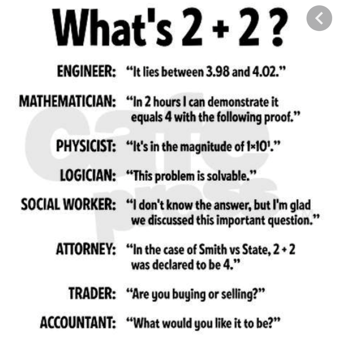
“If you have one economist on your team,
it’s likely that you have one more than you’ll need.”
Warren Buffett
THE MARKETS
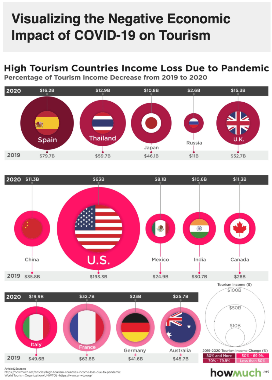
The above diagram shows the impact of the coronavirus on tourism and a number of countries around the world.
- Spain suffered the single biggest decline in terms of spending because of COVID-19 from 2019 to 2020 when we measure it as a percentage of the total. It decreased from $79.7 Billion to $16.2 Billion which is an 80% decline.
- America endured the single biggest overall decrease going from $193.3 Billion to $63 Billion which was a 67% decline.
- Many countries around the world experienced significant losses in tourism spending with many enduring thorough drops of over 50% or more.
- Some countries are still flip-flopping in and out of lockdowns and travel bans with India currently struggling against a huge tide of increasing coronavirus infections.
- As I and others have mentioned over the last several months, it won’t be until third-world countries around the world are vaccinated and the spread of the virus has significantly declined that we can know if we are indeed on top of the coronavirus and that global economic activity will once again return sustainably to pre-pandemic levels.
Key Points:
-
Economic recovery sounds good, is it?
-
Where to for markets and share prices?
-
Is inflation coming?
-
Interest rate rises can follow inflation.
-
Sharemarket corrections can follow interest rate rises.
-
Then what?
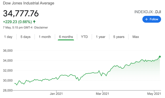
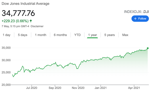
The chart on the left shows the US share market (the Dow Jones) over the last six months. The
chart on the right shows the US share market (the Dow Jones) over the last year.
Markets around the world have generally recovered and grown beyond where they were prior to the outbreak of the coronavirus. The 20%, 30%, 40%, and 50% returns achieved since March last year sound good but of course, are on the back of a significant decline as the markets worried about an emerging pandemic.
Not as good as it sounds although that said, the fact is, markets have recovered as they always do and certainly, they are on track looking beyond the coronavirus to other events.
For example, any mention of inflation coming from the US Federal Reserve tends to scare the market instantly as we’ve seen a couple of times of late. That’s because rising inflation may well mean rising interest rates which is a double-edged scare for the markets.
Generally, interest rates can have a significant impact on trading prices whether it be direct shares, residential property, commercial property, or other investments. Ironically, it’s somewhat of a market-driven phenomenon because the market reasons that they can achieve lower risk returns from other assets such as bonds and fixed interest when interest rates rise high enough.
There have actually been times when term deposits and bonds did have a window of genuine real returns, but it doesn’t last. Right now, of course term deposits, bonds and other fixed interest type of investments offer little in the way of investment return for investors.
Where is the black swan?
In short, I still struggle to see it. This does not mean it’s not there however and inflation out of the US followed by rising interest rates is a potential black swan. The US Fed has therefore stated many times, they will need to be measured about the use of interest rates to combat inflation. That said, a challenge they could face is inflation bolting to such an extent that they have no choice but to respond with a strong spike in interest rates. It’s a possible scenario but not one that I would regard as likely at the moment.
Although I mention it only in passing, I have mentioned over the last several months that China will possibly increase their rhetoric, taking a firmer stance against what they might claim is other countries meddling in their affairs or inaccuracies that they reject.
New Zealand’s stance, as per Jacinda Arden is one of sticking with our values as Kiwis but could be a fine line if the Chinese government decides that New Zealand has taken a step too far.
Expect China to be more vocal in the future. They are already a superpower and have significant resources. They are also a very important economy within the global economy.
Interestingly too, the trade imbalance between the US and China continues almost as though Donald Trump’s efforts have achieved little in the way of results. As America emerges from the coronavirus pandemic, the budget deficit looks like it will only increase. This could be a potential point of conflict in the future between the US and China.
Anyway, no black swans swimming close by at the moment.
Currency movements
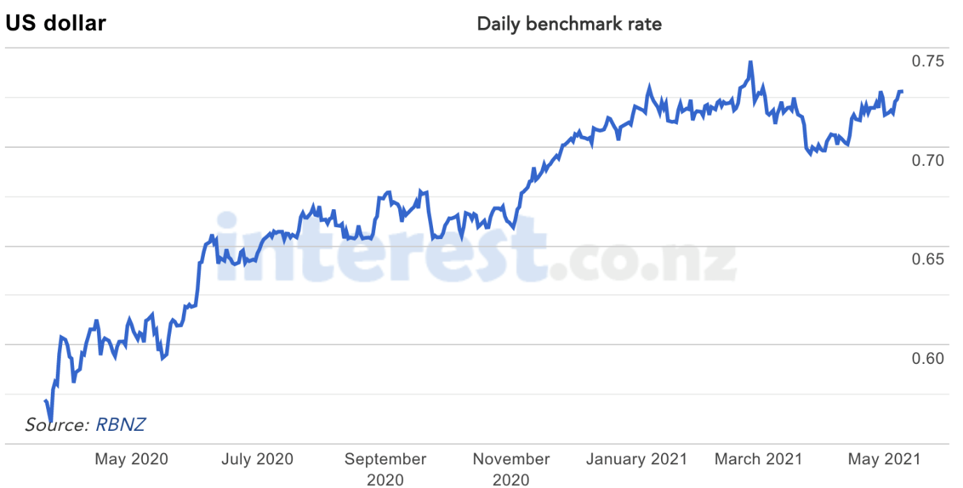
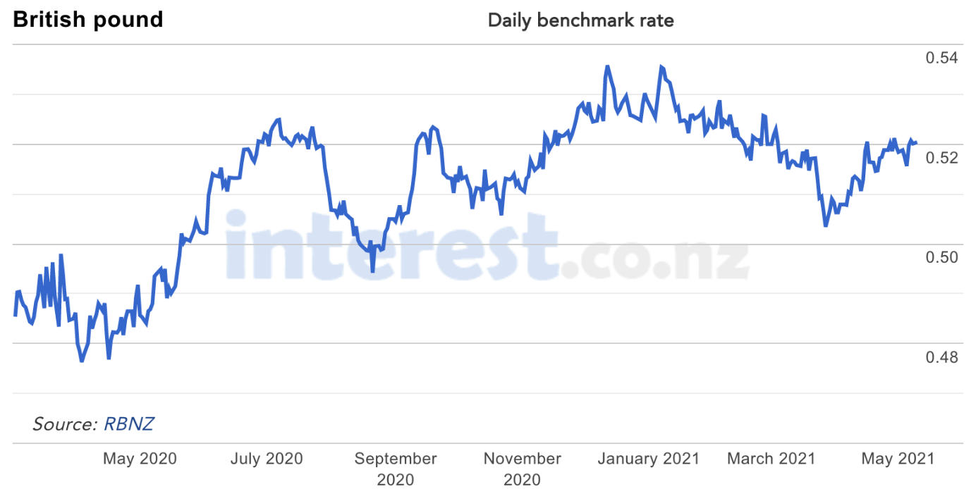
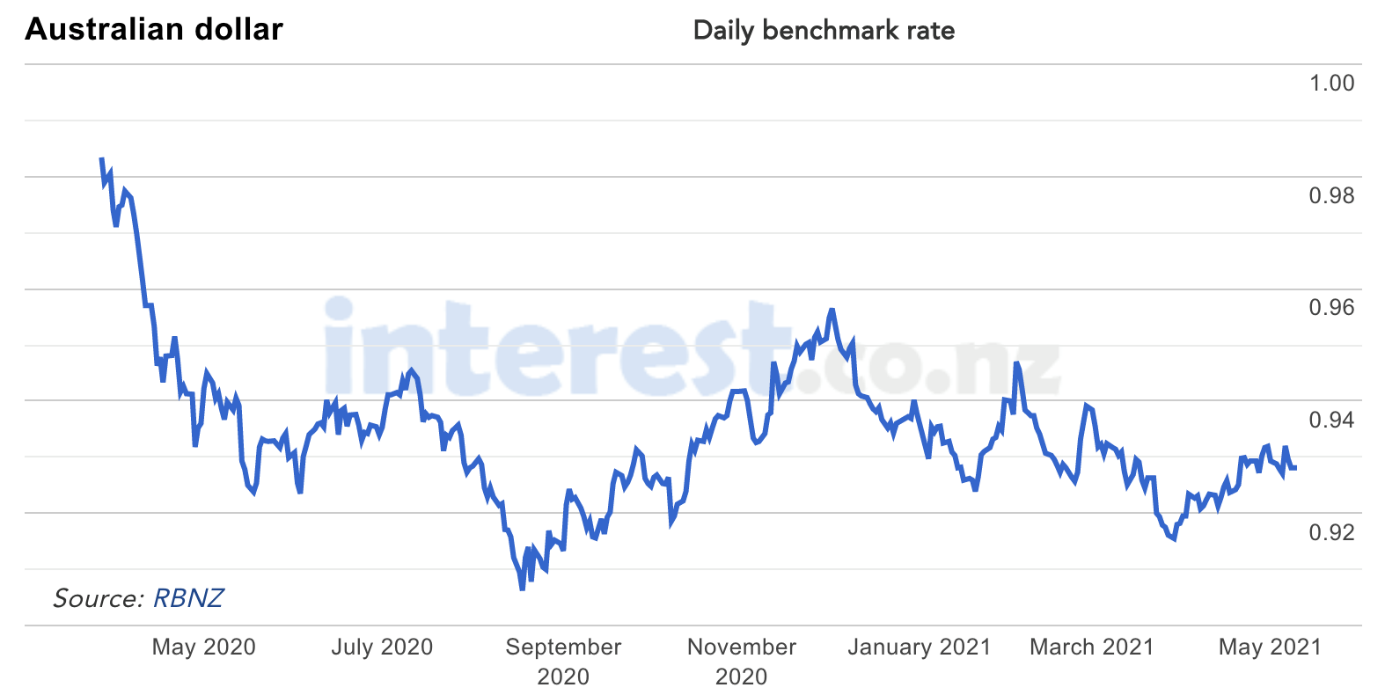
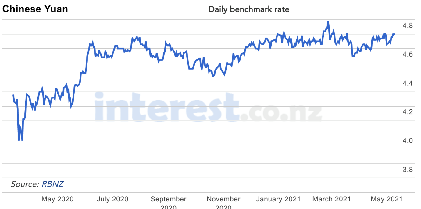
The above four graphs show the cross rate between the New Zealand dollar and other currencies being the main countries that New Zealand trades with or we invest in at WISEplanning.
On another note, New Zealand, thanks to leadership from Jacinda Ardern and her team, has done well in responding to the Coronavirus.
Although it looks promising, the odd infection popping up in the community remains a concern. Everyone knows this is a tricky virus and nothing less than 100% adherence to process around containment will do.
Clearly, as America continues to muddle along (this may change now with a new president) and Britain struggling with a prolonged lockdown, New Zealand has dodged the proverbial bullet by not having to undergo the second round of Coronavirus infection spread. New Zealand is reasonably well positioned. Of course, it has come at a cost, which is $100 billion or so of support and counting ( although it is not all gone yet ).
Interest rates and exchange rates have an impact on the total return for investors although I tend to regard exchange rates as a shorter term, less critical item but certainly one that nonetheless is worth watching. Interestingly, the NZ dollar/US dollar cross rate declined from around 0.66 cents (to the American dollar) to a low of 0.56 New Zealand cents to the American dollar as of March 23, 2020. Since then, the cross rate has rebounded to currently sit at around 0.72 cents.
The NZ dollar/AU dollar cross rate by comparison has traded in a more narrow band and currently sits at around 0.93 New Zealand cents to the Australian dollar.
It might be worth watching the governor of the New Zealand Reserve Bank ( Adrian Orr), the US Fed Chair ( Jerome Powell ) and interest rate direction.
Usually, an increase in interest rates can sometimes mean a stronger currency for that particular country. Other words, if the US Fed raise interest rates, then the markets like the idea of investing in investments in their currency because their interest rates for example have increased.
Similarly, when the NZ Reserve Bank governor Adrian Orr raises interest rates, markets like that too because they can invest in bonds and fixed interest and compared to many other countries, achieve a better rate of return however slight. Anyway, that’s part of a line of thinking that goes on across the markets from time to time.
New Zealand Residential Property
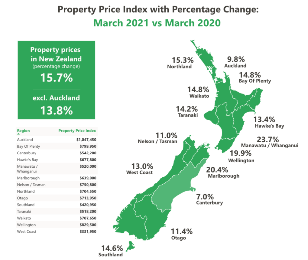
The above chart from Trade Me shows the movement in asking prices across New Zealand
comparing March 2020 with March 2021.
Residential property prices continue to increase around the country with every region showing a year-on-year increase in the average asking price. These asking prices though do not reflect properties for sale that were never sold or sales that were not complete.
Nonetheless, it offers a general guideline as to what is going on with residential property prices. Interestingly, over that period, new records were set in most regions, except for Nelson/Tasman, Otago, West Coast, and Northland. According to Trade Me stats, demand was up to 26% year on year, whereas supply was down by 9%.
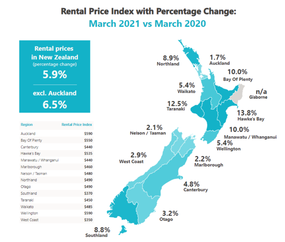
The above chart shows the change in average rent across New Zealand, comparing March 2020 to March 2021.
Trade Me stats shows the median weekly rent increase across New Zealand in the chart above with the biggest increase seen in Hawkes Bay where rent increased by 13.8%. In that area rent reached an all-time high with an average of $535/week. According to Trade Me statistics, demand was up by 28% when compared with the previous year whereas supply was up by 17%.
The recent housing policy changes in New Zealand have seen some economists predict that rents will increase as results of those changes. I suspect that might depend on the demand for rentals on a region-by-region basis.
SPACS
SPACS are a new way for companies in the US to sidestep the usual expensive listing costs on the share market.
The acronym stands for Special Purpose Acquisition Companies.
Very simply, investors can invest money in a SPAC giving someone the license to invest those funds within a certain period of time (e.g., two years). Some investors prefer this approach because it is less onerous in a number of ways compared to the usual process involved in listing through a share market regulator – less safe for investors too.
On the other hand, though, it is seen, particularly by fundamental investors as speculative and has been treated with caution (except for those of course with self-interest and those speculators looking to make a quick dollar).
I noticed Warren Buffet’s comment from his recent meeting (this time held in Los Angeles rather than Omaha due to the pandemic) where he mentioned that “If you put a gun to my head and tell me that I must invest money within two years I’ll invest in a company, no problem – it might not be a very good one but I can certainly invest in it if that’s what I have to do”.
The point here is that private equity is full of managers with lots of money and an imperative to get the money invested as soon as possible for investors – quality is not usually the primary consideration.
Speaking generally, this type of approach could become standard in the years to come, particularly if investors make money, although it might lose favour if over time real returns are not achieved.
Investments such as SPACS, cryptocurrencies, share market and currency trading, are types of investments where you can from time to time here about spectacular gains that are made. It’s great…. until it isn’t.
Big Tech Rotation
Recently after some innocent comments from Janet Yellen (the ex-US Fed Chair) about how interest rates may need to rise to counteract inflation should that occur at some point; the large well-known tech companies were sold off by about 2-3%. Not a major amount of volatility and Janet Yellen quickly came back to soften those comments which appeared to have been taken a bit too literally by the market.
So, big tech rotation has been talked about across the markets for some time.
The idea is that those well-known companies such as Facebook, Apple, Amazon, and Alphabet (Google) along with others such as Netflix are seen by the markets to have had a stellar run for a long time and therefore, the theory goes that the smart money will be rotating out of big tech stocks into value stocks such as those businesses operating in banking, healthcare, and energy sectors.
There could be some merit to it however it is very much a “play the market” approach which can work but just as often does not. The reality is that, in the short term anything is possible with trading prices. That’s because market sentiment and other activity drives trading prices up or down.
A case in point is the one I just mentioned with the markets getting a bit carried away with some innocuous mutterings from Janet Yellen.
Is it coming?
Perhaps more to the point is, is there going to be a big sell-down in big tech companies?
The answer is…. we don’t know. One thing we do know is that there is likely a fair amount of capital invested in those large tech companies because they are so popular, so well-known, and in the news constantly.
Also, we’ve watched the trading prices rise reasonably strongly over the many years. Therefore, if those who are investing in a “play the market” kind of way get the slightest sense of a correction in those trading prices, they will try to beat the market by selling out first which of course will mean that others will likely follow.
By the way this is against the backdrop of solid reports over the last week or two. I’m not talking about the fact that the market is comparing results in March this year compared to March last year which is almost silly when you think about what went on in March last year (market correction).
The short of it is, I would be looking for more of a fundamental problem with any of these businesses in which we’re invested that relate to their underlying economics rather than superficial market banter which is related more to the trading prices and the financials, which matter less in the long run.
The Global Economy
What about inflation?
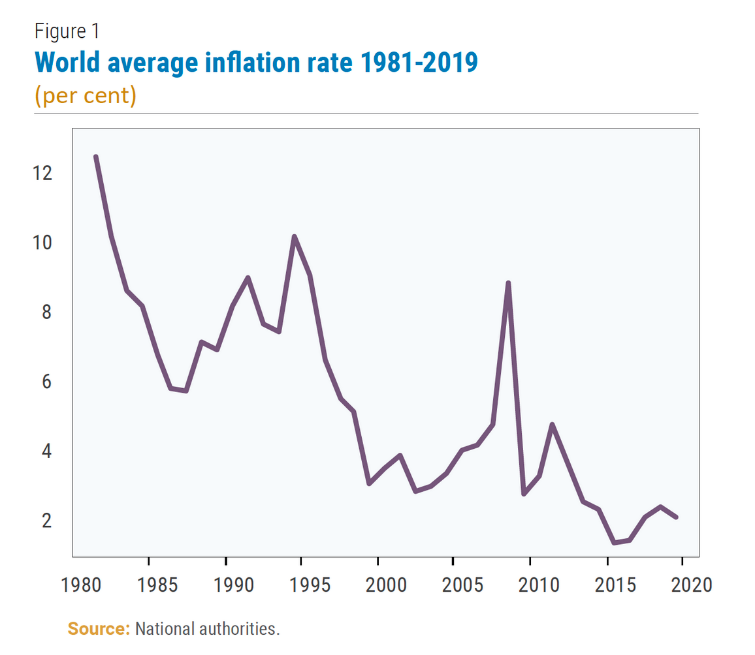
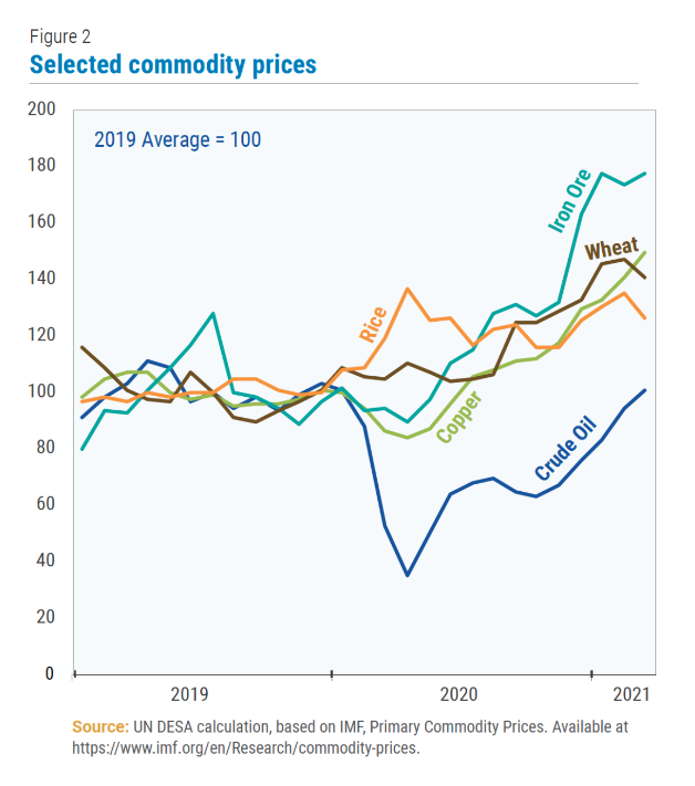
The above graph on the left shows declining inflation over 1980 through 2019 and the graph on the right shows the increase in the trading price of a few selected commodities.
Is inflation on the rise? There is some evidence to suggest that indeed this is the case although to what degree and over what period of time is difficult to gauge.
There is some evidence that inflation is potentially making some sort of comeback although so far it has not been significant. Interestingly, the last bout of global inflation was over 2007 and the first part of 2008. At that stage, average inflation globally reached 8.9% in 2008 and then declined to 2.6% over the last decade.
The main contributing factor from 2007 to 2008 was the swift surge of international commodity prices. Rises in the price of oil, wheat, and rice were contributors as demand increased sharply.
Looking ahead, the chart on the right above shows increases in the price of rice, iron ore, wheat, copper and crude oil.
The recovery of the manufacturing sector globally, for example, has created strong demand for base metals.
Also the world appears to be facing a somewhat persistent shortage globally of semi-conductor chips.
Going back to 2020, this shortage was thought to be as a result of supply-chain disruption however it has continued in 2021 and looks as though this tight supply/demand tension may run over 2021 and beyond.
In the United States for example, this has meant a shortage of motor vehicles which in turn has flowed on to a spike in the price of used cars and rental car services. So, thinking inflation, other factors to watch in the future would include the likes of shipping costs, central bank monetary policies, and wages.
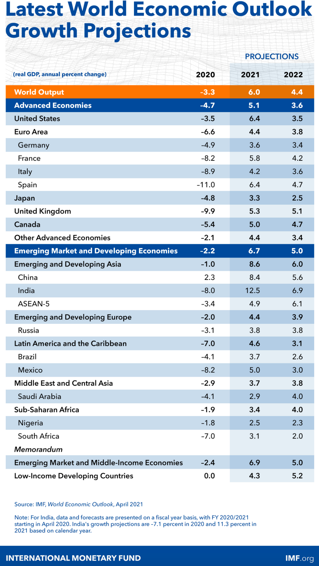
The above table shows economic growth (and contraction) over 2020, 2021, and 2022. Just to put economic activity into some perspective, even 1% contraction in an economy is a lot of pain for certain sectors and many people within that economy. Therefore a 5%, 7% or 10% contraction is significant and equals lots of pain for many sectors and lots of people. Of course, it’s not pain for everybody as some don’t really notice it, while others actually benefit by the circumstances that surround the contraction.
What we know is that the economic contraction because of COVID-19 was sudden and deep when compared to the global financial crisis over 2007 and 2008. For example, global output declined by about 3x as much as during the global financial crisis and in half the time roughly.
Economic Recovery Path
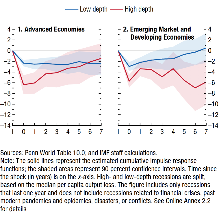
The above two graphs show the depth of economic contraction and the pathway
to recovery for advanced economies compared to emerging market and developing economies.
We can see that a larger bounce back can occur after deeper recessions, but permanent real economic productivity losses still result in some emerging and developing economies.
Developed economies generally have a deep but short-lived recession which are associated with the so-called V-shaped recovery, hence limited permanent output loss after a few years.
Emerging and developing economies on the other hand can experience protracted downturns and economic activity losses for many years after the initial event started.
Also, we saw higher levels of unemployment in emerging and developing economies, a greater level of school closures when compared to many developed economies.
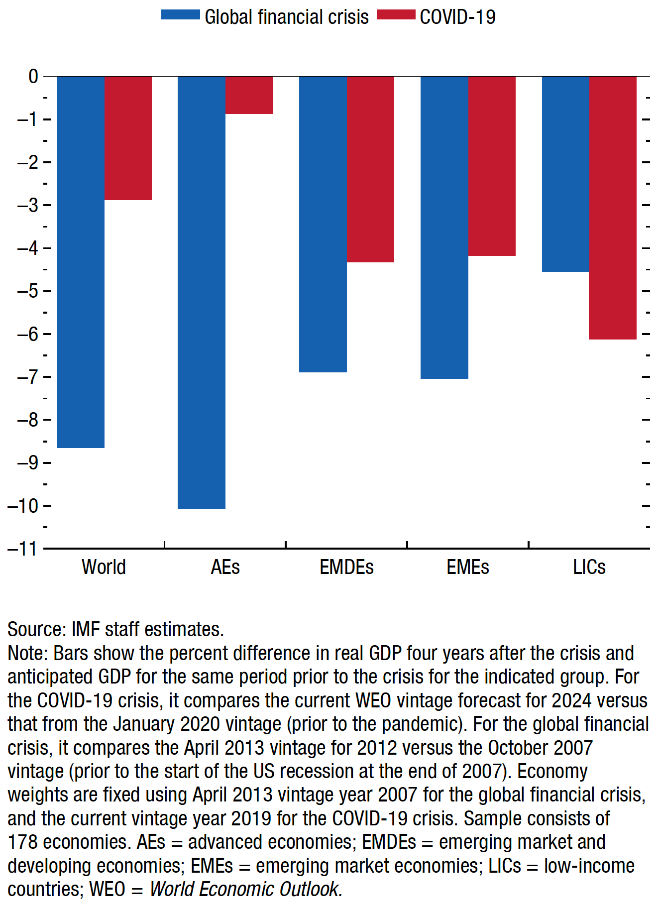
The above graph compares the depth of economic contraction for the recent COVID-19 pandemic with the global financial crisis.
In general terms, the so-called ‘economic scars’ from the COVID-19 pandemic recession are expected to be less than those from the global financial crisis although emerging market and developing economies may be hurt more than advanced economies on average.
Those economies that are most tourism-dependent were obviously compromised more because of their inability to service tourists through tourism and hospitality services. This was the case for most economies but more so for those developing and emerging economies reliant on tourism.
Hotel and Restaurant Sector Damage
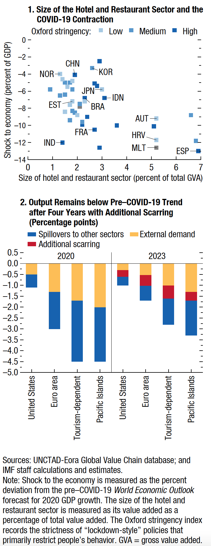
The top graph shows the size of the hotel and restaurant sector (the horizontal axis) in different countries and
the impact on the economy (the left side vertical axis). The lower graph shows the
impact of the coronavirus comparing specific variables in 2020 with 2023 projections.
In what has been described as the perfect storm, hotels and restaurants have been particularly hit hard by the coronavirus.
In America for example, employment in the sector fell by almost 40% from February through May 2020. Some countries though fared better than others with the Pacific Islands for example being significantly impacted by the coronavirus.
Thanks to a stellar effort from scientists in the laboratory developing vaccines to help reduce the impact and the spread of the virus, along with solid central bank action, the global economy is beginning to emerge from the clutches of the coronavirus recession.
It’s not over yet as we know, with the likes of India and the Philippines still struggling to contain the virus. Until they’re successful, ( and with help from the rest of the world ) other economies are still not safe. There’s work to be done yet.
The United States of America
America – GDP
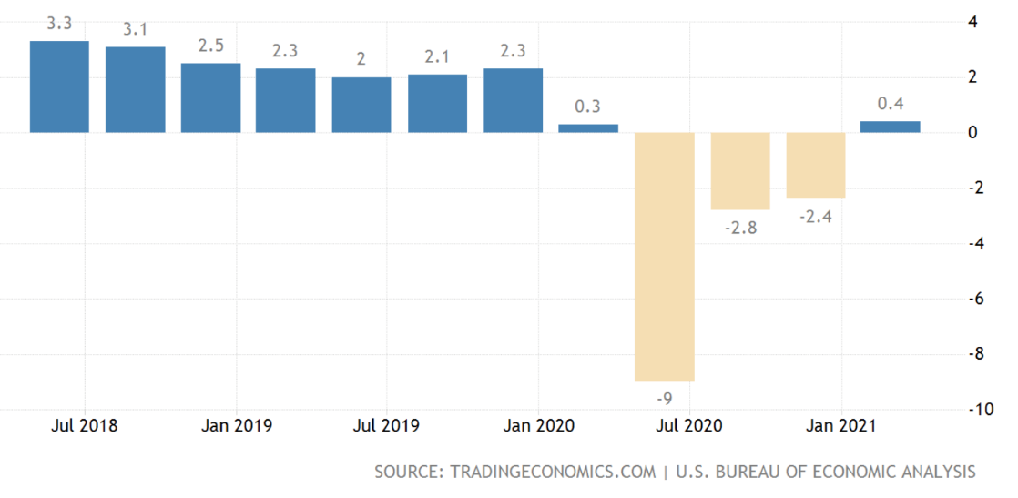
The above graph shows economic activity in the US from 2018 through 2021 – ouch!!.
Economic growth in America is recovering. It would be interesting to see where things might have been, had a different President been in the White House since the coronavirus emerged.
Anyway, as I reported last month, the outlook of economic growth over 2021 looks like a sharp improvement with some estimates of around 6.5% economic growth for the US economy. That is significant although of course it is in the back of another significant contraction in economic activity and is therefore only catching up.
A bit like those investment reports reported from April 2020 through April 2021 showing stellar results however when you average it out over a two-year period, we can see that those big returns indeed are just catching up from losses only one month prior.
So, in simple terms, whilst there’s more to it than this, the combination of “jabs in the arm”, “monetary and fiscal stimulus” ( e.g., circa US$2 trillion of financial support ) has helped to stabilize the American economy, support underlying economic activity, helping the American economy to get back on track.
This doesn’t even include further stimulus that may well be applied to infrastructure spending that is likely to be signalled at some point over 2021.
This all means then that the likelihood of a US recession anytime soon is now down to somewhere around 10-15% probability. Except for any unexpected event it looks as though it is full steam ahead for the American economy, albeit supported by monetary and fiscal stimulus and other measures.
Unemployment – USA
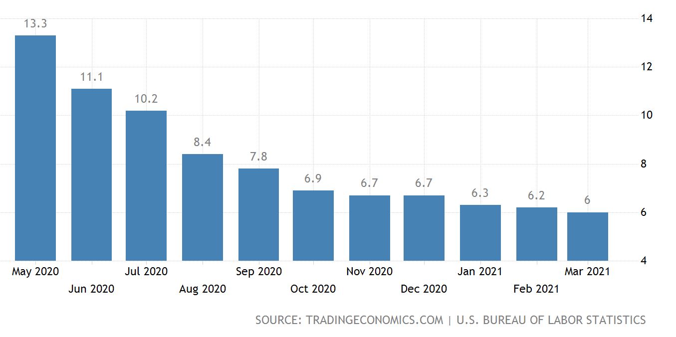
The above graph shows unemployment in the US.
Unemployment in the US peaked at 14.8% in April 2020, which was the highest rate over the 73 years of tracking history.
As the graph above shows, unemployment has declined significantly although there are still many people left on the side lines because of the coronavirus. For example, hospitality has not fully recovered.
By some estimates, although unemployment has declined to around 6%, this still leaves almost 10 million people unemployed as at March this year.
The real problem that’s difficult to see on the surface is the fact that some of those laid off during the pandemic have not been redeployed for one reason or another, making them long term unemployed and less employable than they may have been without the pandemic.
One way to look at this is that the worker loses income, and the American economy loses their proactivity.
Inflation – USA
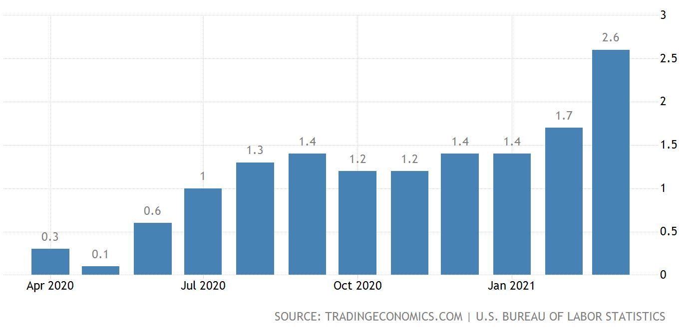
The above graph tracks the inflation rate in America.
Although inflation has been notably quiet for quite some time, there is evidence that inflation might be waking up.
Earlier I showed the rise in commodity prices globally. In the United States of America, we are seeing a pickup in spending which will likely push prices higher, in turn pushing inflation higher.
In addition, house prices have been rising although the US Federal Reserve are saying that they believe it will be a short-term issue and not a prolonged threat.
Amusingly, the narrative around inflation includes words like inflation worry, inflation concern, etc. I regard those characterizations as emotive because inflation is a natural component of any economy. It can of course create capital dislocation and for those not well-prepared, they can become casualties unexpectedly.
For example, inflation and rising interest rates generally go together. It doesn’t take much to work out how many Americans (Kiwis too for that matter!) would be significantly compromised should interest rates go up even 2 or 3%.
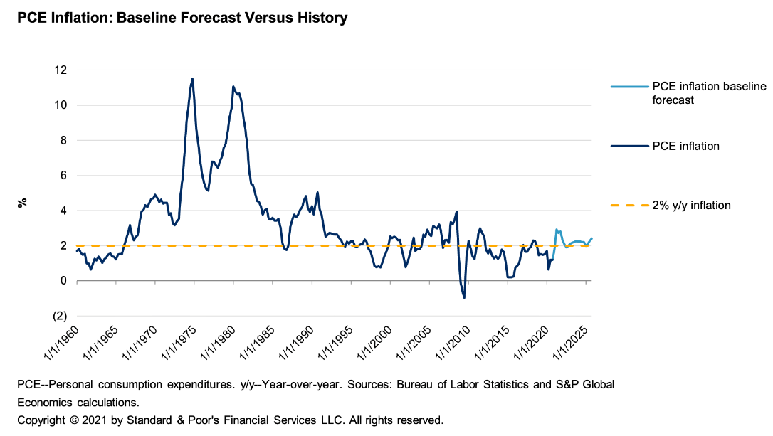
PCE (Personal Consumption Expenditure) inflation outlook is shown on the graph above. Look at the 1970’s, 1980’s …
When we take a closer look at Personal Consumption Expenditure (PCE) and Core PCE, both were tracking at around 1.5% over the 2020 calendar year. Some forecasts suggest PCU inflation could average around 2% over 2021 and 2022 after coming in at 1.4% over 2020.
So, inflation in the US looks like it may spike up temporarily and then potentially flatten out although as I mentioned before, global commodity prices could be worth watching …
Interest Rates – USA
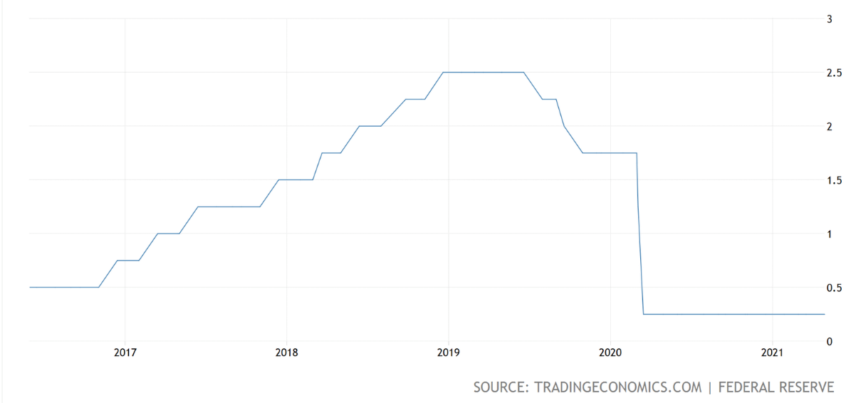
The above graph tracks the US Federal Reserve funds rate.
At this point in time, the US Federal Reserve has indicated that when core inflation ( actual and expectations ) starts to average to 2% consistently on a 12-month rolling average basis then they may consider raising interest rates for the first time in this economic recovery possibly early 2023 all things equal.
It’ll be interesting to see how things play out. Listening to what Jerome Powell has to say is worthwhile too …
China
China and America lead the global economy out of the pandemic recession with China possibly taking the lead.
As China and the United States lead the global economy out of the coronavirus pandemic recession, there has been some debate around which of the two economies is leading. Whilst there’s been some commentary from the Wall Street Journal suggesting that America is leading the way, the facts paint another picture.
China’s containment of the virus appeared to be more effective and much earlier than the American effort. Not only that, but growth projections for China also sit at around 8% or so whereas America is lagging at around 6%.
These are great numbers but on the back of significant contraction are only catching up. By some calculations, the United States economy is approximately 3.5% below its pre-pandemic size as of 31 December 2019. At the close of first quarter of 2021, China’s GDP was 27% greater than it was on 31 December 2019 – definitely leading the way.
Economic Activity – China

The above graph tracks economic activity as measured by Gross Domestic Product (GDP) in China.
China continues to grow as we can see from recent data. For example, China’s value-added industrial output increased by 24.5% year on year over the first quarter this year with factory activities continuing to pick up.
Also, major industrial firms continue to increase their output and have achieved a 14% growth compared with the first quarter in 2019. This means an average growth rate of 6.8% over the past 2 years.
Investment by the state sector increased by 25.3% during the January to March period this year with private sector investment rising 26%.
Manufacturing Purchasing Managers Index (PMI) – China
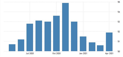
The above graph tracks the expansion or contraction in the level of purchasing by manufacturing organisations in China.
The index in the China has come in at 51.9 for April which shows that the economy is continuing to steadily recover. However, challenges such as chip shortages, rising freight costs, inefficient international logistics and even simple things like the shortage of containers could hamper the pace of growth in the future.
Further, a slowdown in manufacturing supply and demand along with rising cost pressures could also represent challenges to some degree moving forward.
On the other hand, robust consumer confidence continues to boost service industries with the lifting of some travel restrictions earlier this year.
Non-Manufacturing Purchasing Managers Index (PMI) – China
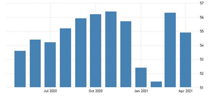
The above graph tracks non-purchasing managers index data.
The official NDS survey for non-manufacturing (PMI) shows a drop to 54.9 in April 2021 from a high of 56.3 in the month prior. Still, this was the 13th month in a row of growth in the service sector as the coronavirus unfolded and the Chinese economy rebounded.
Although employment shrank over that time, confidence however remains strongly positive.
Unemployment – China
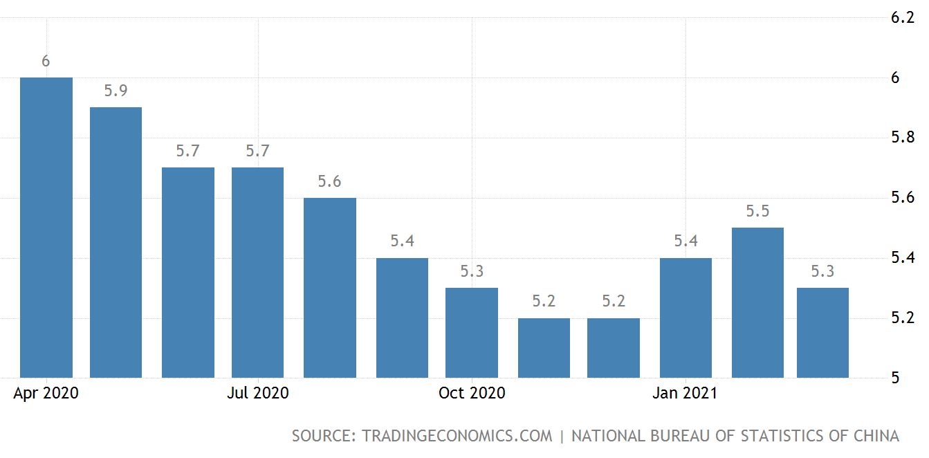
The above graph tracks unemployment in China.
Unemployment in China continues to improve although there remains evidence of many large businesses suffering from a shortage of labour alongside a high number of unemployed university graduates.
In the first quarter of this year, China’s official unemployment survey showed unemployment at 5.4% which is a decline of 0.4 percentage points from a year earlier when the coronavirus first emerged.
Economic Forecast – China
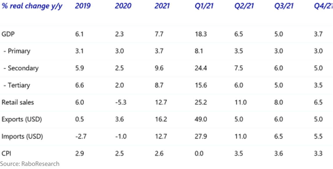
The above table shows projected economic activity and growth along with an estimate of inflation as
measured by the consumer price index (CPI up to the 4th quarter of 2022).
China is strongly on track with its economic recovery post-coronavirus however it may face some headwinds in the future. For example, China is facing an aging population which by some estimates, could see the population start to shrink as early as 2030 onwards. Also, the debt load whilst not high compared to many other countries at 335% of economic activity ( GDP ) will weigh on the economy in the future.
China is a superpower and as such carries significant weight across the global economy. However, increasing tensions with a growing number of countries could hurt exports and if things become too tense, may limit much needed imports.
This of course can lead to weaker productivity growth in the future.
As mentioned elsewhere I expect China to be more vocal in the future which increasingly looks like a deliberate strategy to show a front of force ( or not ‘lose face’ ).
Europe
Economic Activity – Euro area

The above chart shows the contraction in economic activity over 2020 and the
projected economic activity over 2021.
The European economy was struggling prior to the outbreak of the coronavirus and continues to limp along now, which is a good result all things equal and would have been much worse without support from the European Central Bank. According to the International Monetary Fund (IMF), Europe’s economy appears to be on track to return to its pre-pandemic crisis levels in 2022 however, this outcome is dependent on the region’s COVID-19 vaccination campaign.
The assumption is that, assuming vaccines are widely available in the European summer of 2021 and throughout 2022, economic growth is projected to see 3.9% in 2022 bringing Europe’s economic growth back to pre-pandemic levels.
Some commentators point to the few cases of blood clotting and other potential complications with the rollout of the vaccine, however overall, at least so far, we’ve seen minimal complications arising from those who have been receiving the vaccine. It will be important though that the vaccine rollout is consistent and reaches enough of the population to provide general immunity in order to help contain the spread of COVID-19.
Inflation – Europe
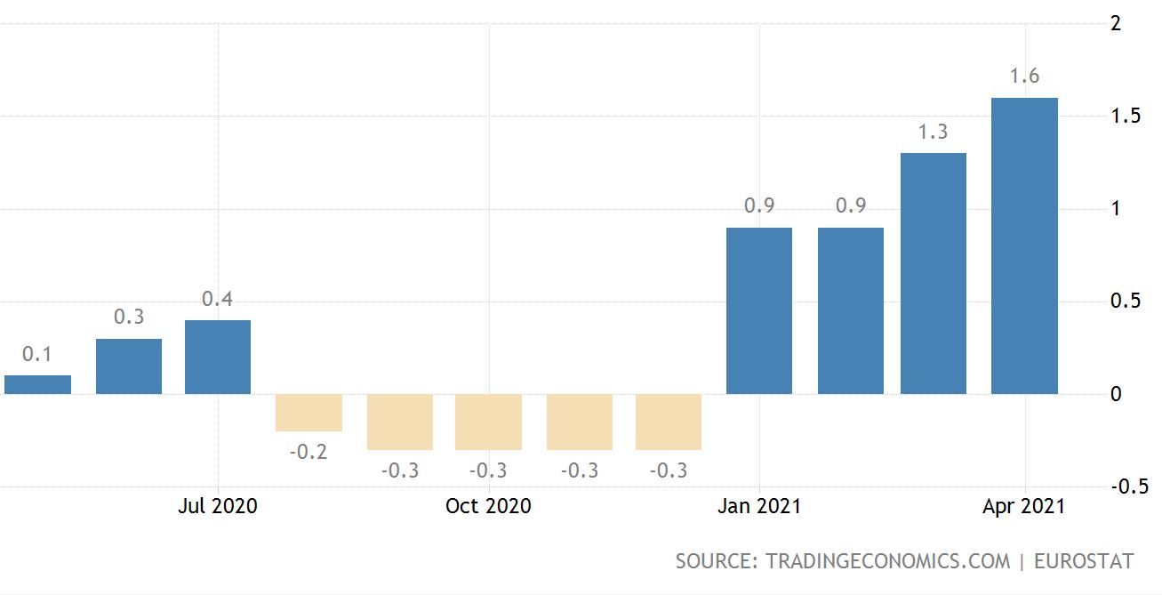
The above chart shows sluggish inflation and actual deflation as a result of the Coronavirus.
Deflation has been a major threat to the economy for many years since the global financial crisis. Looking ahead though because of the significant monetary and fiscal stimulus from the European Central Bank, inflation looks to be reappearing once again. By some estimates, inflation is projected to increase from the current level of 1.1% to 3.1% in 2021, due in part to rising commodity prices.
Spiking inflation could force the European Central Bank to tighten its monetary stance by raising interest rates. The European Central Bank prefer to see inflation sitting at round 2% therefore an increase above that rate may spur the European central bank into action.
On the other hand though, the European economy continues to limp along as I said and monetary policy needs to remain accommodative until the economy gets back on its feet in a sustainable way which will take time.
So, there’s possibly a bit of a balancing act between a possible surge in inflation and the need to keep interest rates low enough to support economic recovery across Europe.
Unemployment – Europe
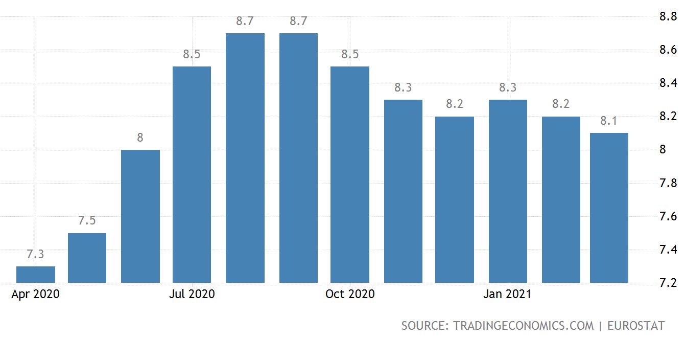
The above chart shows the increase in unemployment across Europe since COVID 19 emerged earlier this year.
In March 2021, the Euro area seasonally adjusted unemployment rate was 8.1%, down from 8.2% in February 2021 and up from 7.1% in March 2020.
Interestingly, compared to the United States where unemployment shows a sharp increase in March and April 2020 followed by a quick recovery from May onward, Europe on the other hand saw the unemployment rate adjustments to be more subtle.
The overall rate of unemployment increased to a lesser extent in March and April but the recovery has been more prolonged compared to the United States.
This is interesting because a milder increase in the European Union unemployment rates seem to translate into a smaller decrease in unemployment overall.
The United Kingdom
Economic growth – UK
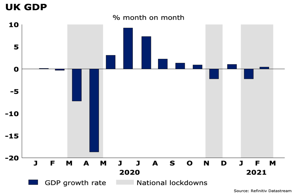
The above graph shows economic activity in Britain, highlighting the COVID-19 contraction and lockdowns.
The struggles of COVID 19 are not over yet however optimism has risen strongly in Britain. The successful rollout of the vaccine in the UK along with the reopening of the economy has helped boost confidence among business leaders.
What we are seeing with the restrictions being lifted in the UK is that business leaders are moving away from a defensive approach to more expansionary strategies.
For example, hiring and investment expectations have reached their highest level in over 6 years which is encouraging. As simple as it sounds, when business leaders are positive, this tends to flow down throughout the organization and what we then have is positive expectations leading to action.
Those businesses with solid cash balances and increasing revenues suggest an increase in business spending and activity. Again, that flows on throughout the economy.
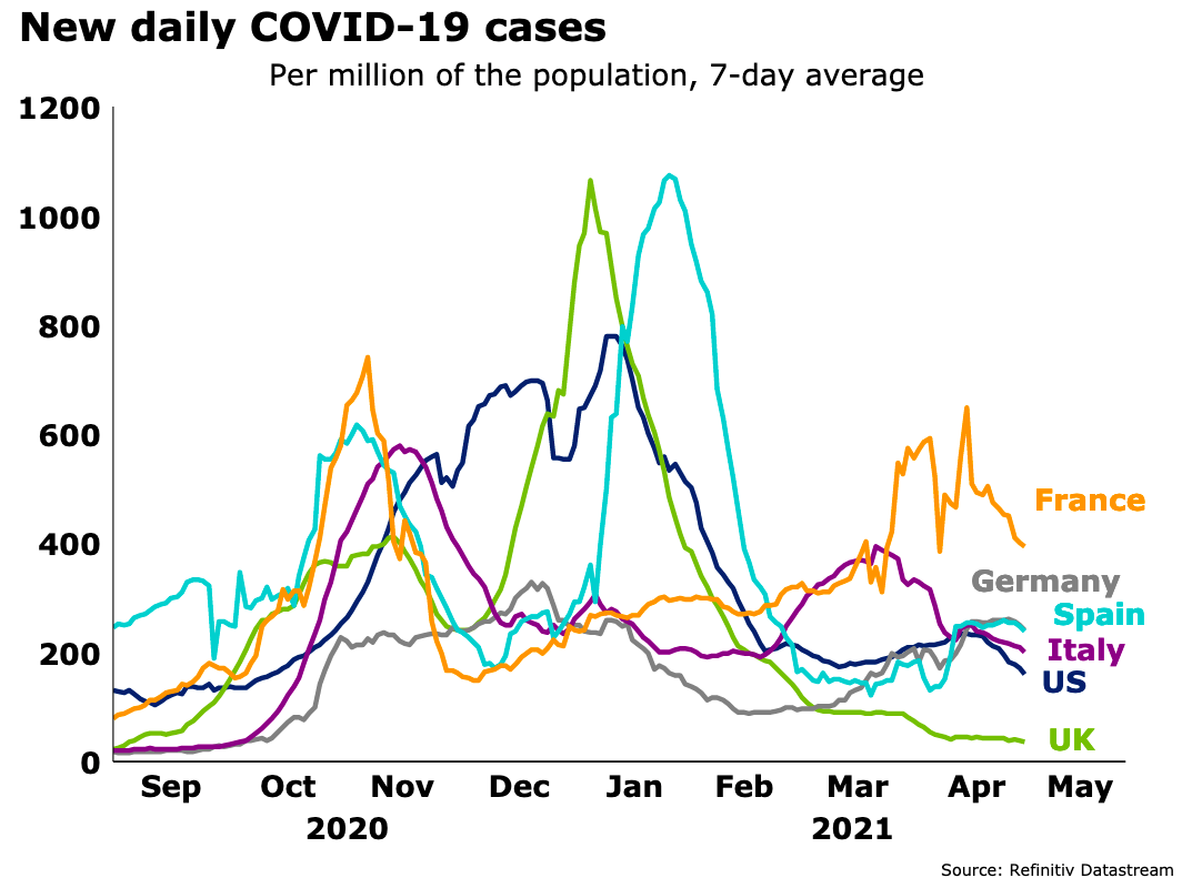
The above graph tracks the spread of COVID-19 across a number of European countries and Britain.
Although the spread of COVID-19 cases in India is surging, Britain on the other hand is in the process of easing restrictions as the spread and hospitalization rates decline.
By contrast, a number of other European countries have needed to tighten restrictions that were eased after cases peaked in November 2020.
COVID-19 Vaccine Rollout
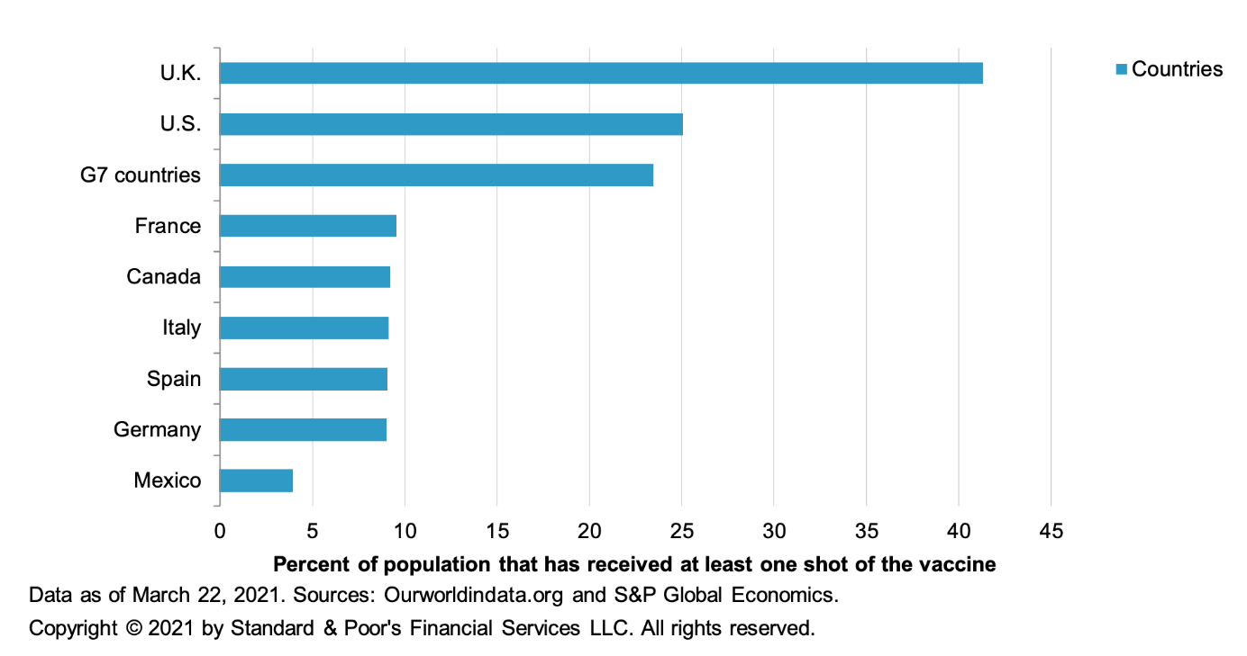
The above graph shows what percentage of population has been vaccinated against COVID-19.
Vaccinations have been rolled out at pace in Britain and the US and have started to accelerate in Europe. Real questions though remain around the vaccine rollout in emerging and developing economies and more importantly, whether the existing vaccines will be effective against the emerging mutant variants of COVID-19.
Unemployment – UK
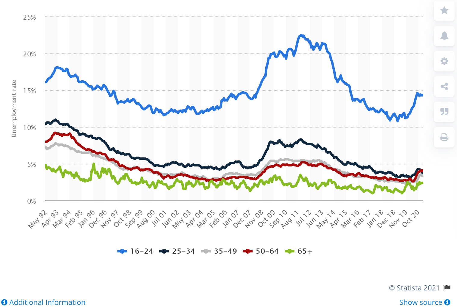
The above graph shows national unemployment, which is rising and compares it to youth unemployment (the top blue line) rising faster.
The unemployment rate in the UK obviously increased as a result of the spread of COVID-19 but did not climb as high as many were expecting. This is likely due to the fact that businesses became more efficient at handling lockdowns along with the government support through billions of pounds of stimulus and job support programs.
Some government support schemes such as furlough, are due to end in September this year. By some estimates, approximately 2.2 million people or around 6.5% of all workers could be unemployed at the end of this year. However, the unemployment rates is expected to decline next year as the economy recovers. The most affected appear to be younger people and those in hospitality, retail, and entertainment.
In March 2021 there were 3.7 million people seeking either job seekers allowance or the universal credit because they were “looking for work”. This compares with 1.4 million in March 2020 before the pandemic began to really take effect.
Because some of the rules around some of these support programs have changed, its become difficult to measure. For example, some of these people affected might be working but could be on low wages or shorter hours.
Interest Rates – UK
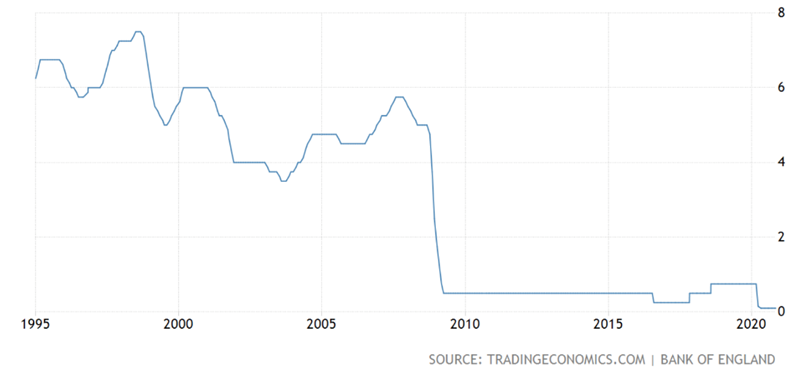
The graph above shows the decline in interest rates, which are sitting at all-time lows.
Interest rates in Britain have been historically low since the bank of England reduced interest rates from 5% to 0.5% in 2008.
Currently the rate is 0.1%. Rates have been low in Britain for approximately 13 years and so a return to 5% interest rates would seem unlikely anytime soon.
Inflation Rate – UK
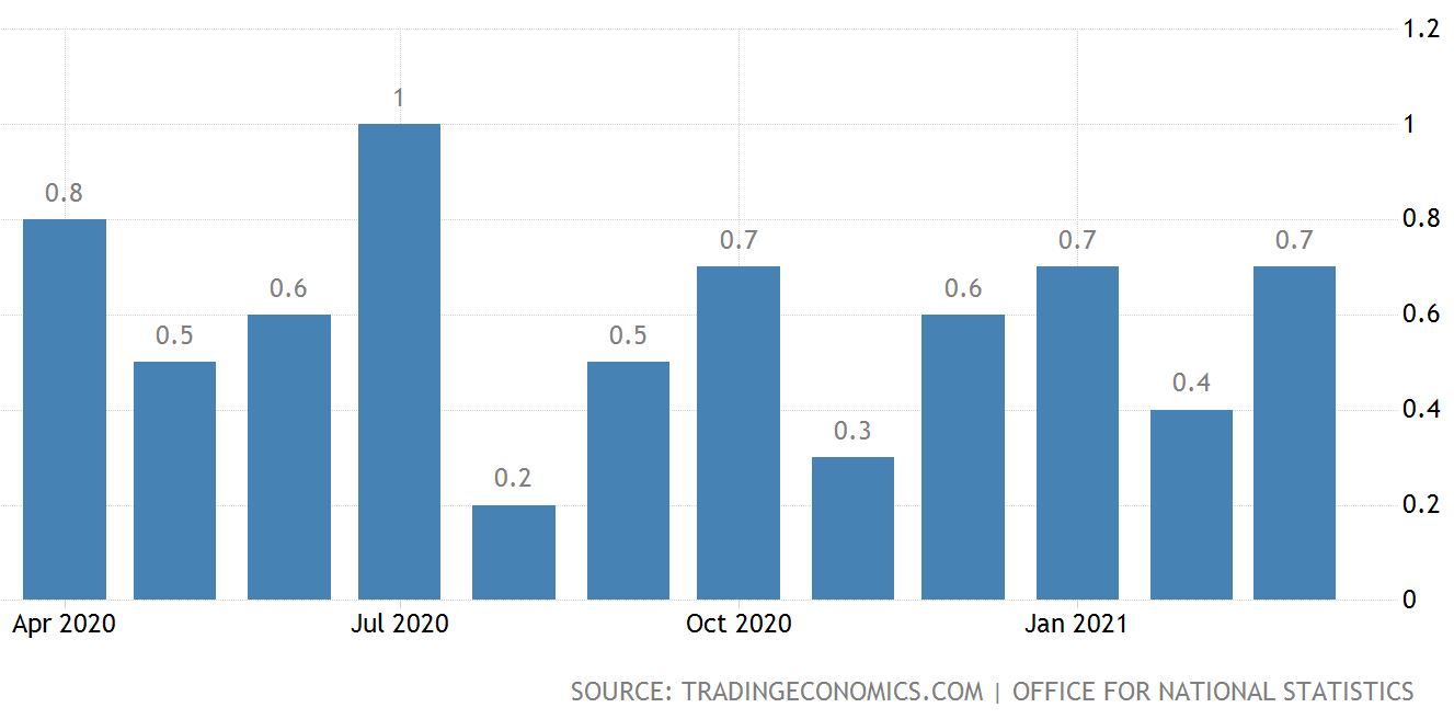
The above graph shows the inflation rate in Britain.
Like many other countries around the world, inflation in Britain has been subdued for many years, and mostly as a result of the global financial crisis.
Interest rates and inflation tend to go hand in hand and so like elsewhere, a sudden spike in the inflation rate could see the UK Central Bank respond by raising interest rates – at least that’s the theory.
In Britain the consumer price index (CPI) which includes occupied housing (CPIH index) rose by 1% in the 12 months to March 2021 up from 0.7% to February. The main contributor to the above rate came from transport coming in 0.44 percentage points higher. A rise in fuel prices and an increase in clothing prices also helped contribute.
Looking ahead the Bank of England has forecast that inflation could reach 1.9% by the end of 2021 although some economists now expect this rate to exceed 2% before then.
In terms of rising interest rates, inflation would be a likely trigger.
It would appear though that, whilst the Bank of England could tighten monetary policy in 2022 ( raise interest rates ), many regard 2023 as more likely with some suggesting as far out as 2025, which to me seems less likely. I say that because there is pressure for inflation to rise now and it’s just a question of whether it’s a subtle rise over time or a spike that continues and needs central bank action to contain it.
So, central bank support, and job support schemes, a solid effort with vaccinations, ongoing low interest rates all combine together to help Britain escape the clutches of the COVID-19 pandemic recession.
It’s far from over, however the UK economy is on the right track.
Australia
Overview Australia
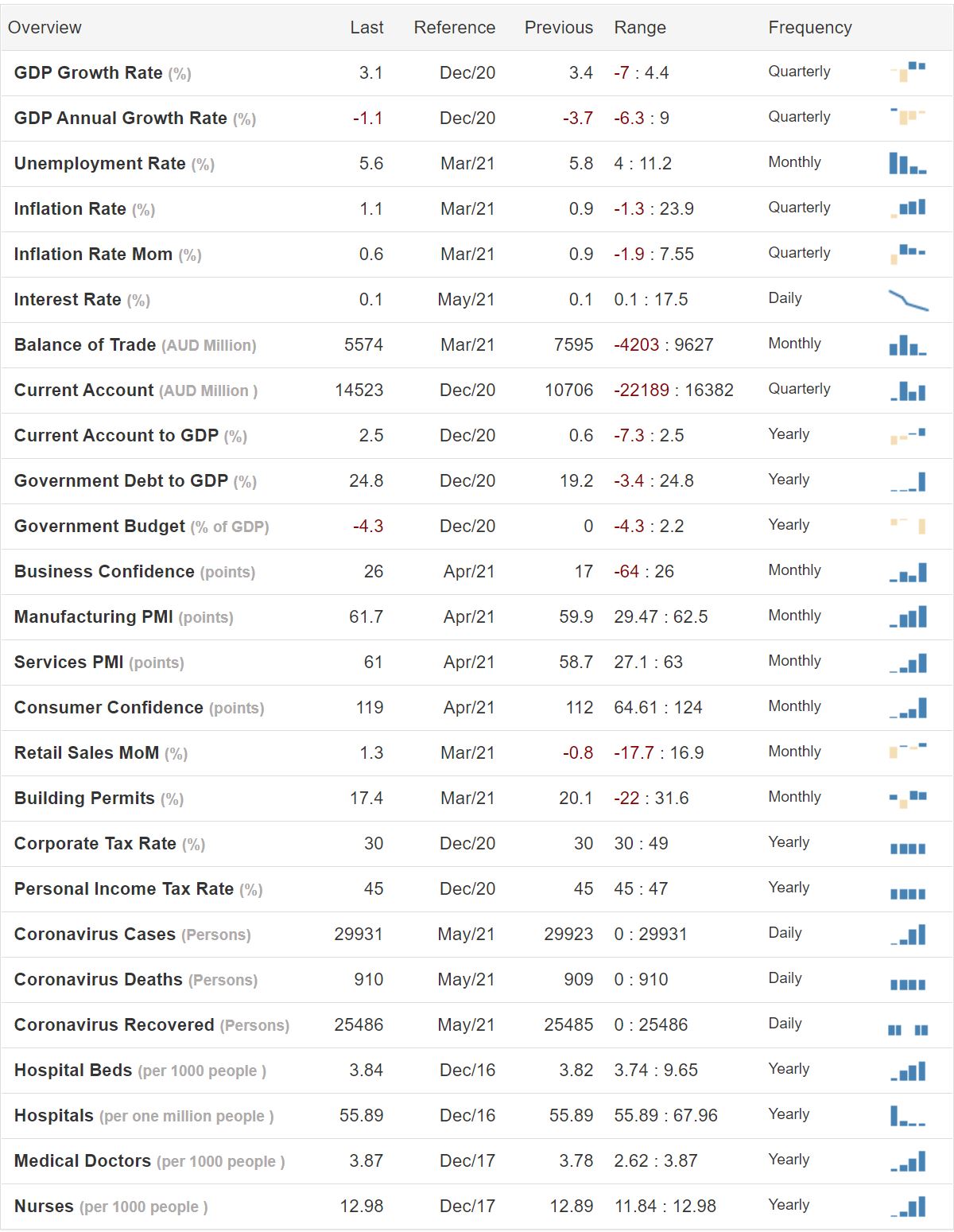
The above dashboard provides a variety of economic indicators, which makes for interesting reading when you scroll your way down the table.
The Australian economy suffered a significant contraction as result of the COVID-19 pandemic recession but has since recovered quite well. Tangling with China on the political front could spill over into sanctions from China which could potentially harm future economic growth for Australia. So, not a good idea to argue with China and yet difficult not to, as China and other countries including New Zealand edge closer to their own argument with China.
Economic Growth (GDP) – Australia
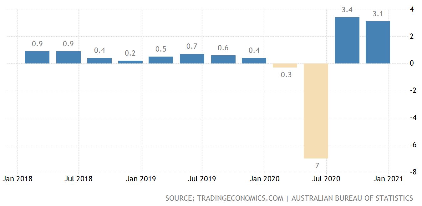
The above graph tracks economic activity in Australia, showing the impact of the Coronavirus toward the right of the chart.
A recent report suggested that Australia’s living standards have actually increased over 2020 at a faster rate than the average of the past decade, due mainly to surge in commodity prices and low interest rates. This report goes on to suggest that even though the job keeper program expired at the end of March that unemployment will likely continue to decrease over 2021 even if it is quite slowly.
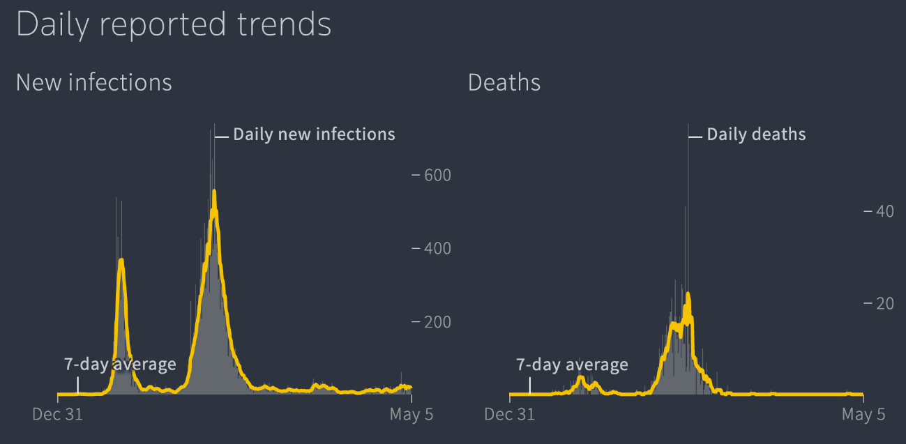
The above graph shows that the new infections on the left side chart and the level of daily deaths on the right side of the graph.
There had been 29,865 infections and 910 COVID-19 related deaths reported in Australia since the pandemic began. As of the 4th of May, 13 new infections were reported. The COVID-19 pandemic appears to be under control in Australia although it can be tricky as we’ve seen with recent reports of single community related cases that seem to emerge out of the blue.
Anyway, the Australian government has eased restrictions over the last several months that has helped to place the economy in a better position for faster recovery. Like New Zealand, Australia has the pent-up demand factor created by the COVID-19 restrictions which may provide a tailwind and help the Australian government move away from policy related stimulus.
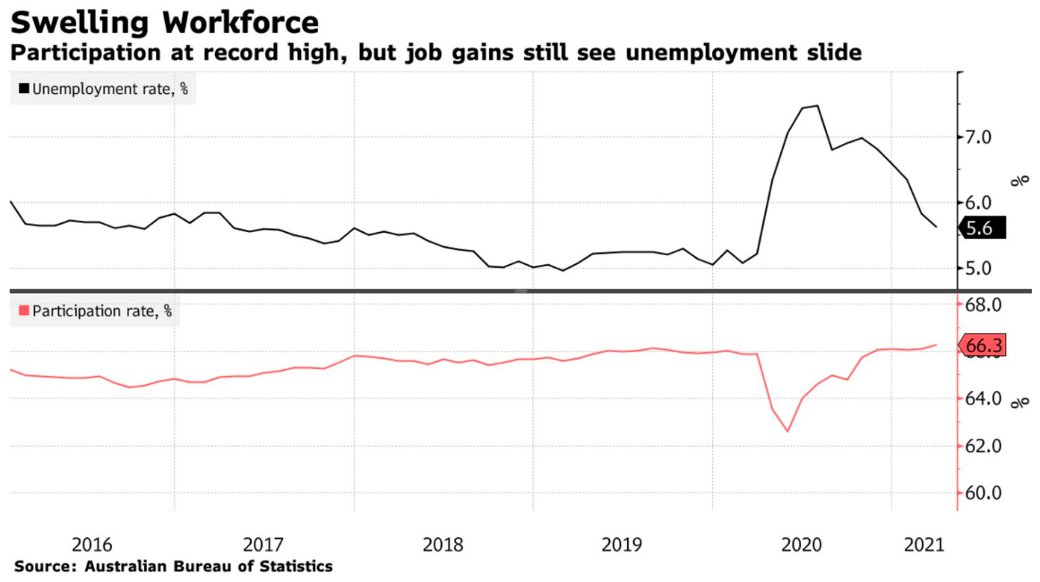
The above graph measures both the unemployment rate and the participation rate percentage
of the workforce actually working, compared to the overall size of the potential labour force.
Interestingly, full-time jobs have fallen by 29,800 whilst part-time have soared by 91,500. Australia appears to have an increasing supply of labour which if sustainable, could even mean an increase in wages growth which would be a first for a very long time.
The Australian economy has reached the point where some are suggesting that it’s no longer in recovery from COVID-19 but has returned to growth as usual mode.
Interest Rates – Australia
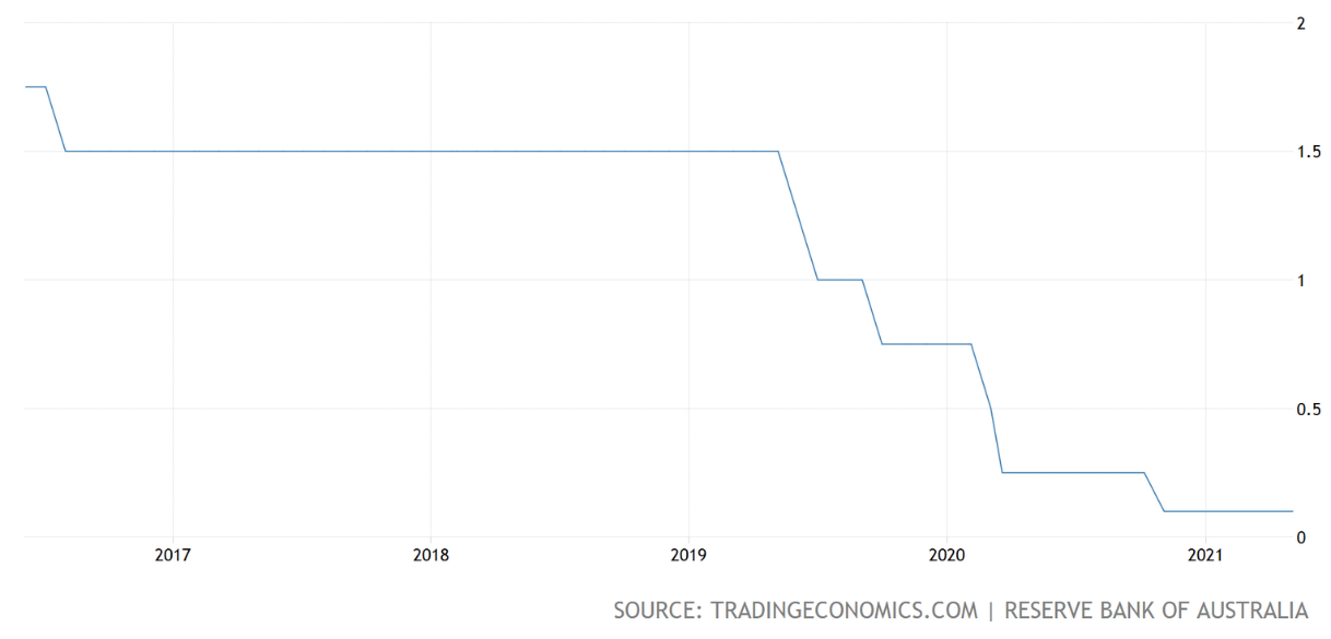
The above graph tracks the official cash rate in Australia.
The governor of Australia’s Reserve Bank interestingly mentioned recently that record low interest rates fuelling a surge in property prices will be part of the landscape for several years, mainly because there is limited prospects at the moment of a bounce back in wages growth.
This is interesting when you think about it because, there has been a lot of commentary for New Zealand’s Reserve Bank governor, Adrian Orr to take strong measures against residential property price rises. Yet, the Australian Reserve Bank appears ambivalent about it.
The Australian reserve bank governor Phillip Lowe also suggested in a recent speech that the official cash rate will probably remain at historic lows until at least 2024. He would like to see wages growth reaching 3% before that time but that’s difficult to see at the moment.
He’s also suggesting that he would like to see inflation reach a sustainable 2-3% and for wages growth to be materially higher than it is currently.
Looks like interest rates in Australia will remain lower for longer, like elsewhere ( at least until inflation comes along in a sustainable way ).
Inflation – Australia
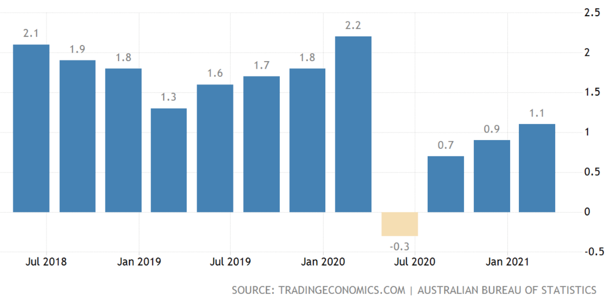
The above graph tracks the inflation rate in Australia.
Although there was a period of deflation for short time in 2020 ( see the graph above ) Australia has recovered well and inflation is tracking a bit above 1%.
As mentioned previously, wages growth and also inflation remain somewhat subdued whereas property prices and commodity prices have been rising strongly.
There is the expectation that inflation rate for the June quarter may spike from above 3% temporarily as measures taken over the last 12 months impact and then subside. Higher petrol prices may also help boost inflation over that quarter as well.
Underlying inflation is expected to sit at around 1.5% over 2021 before gradually increasing to around 2% by mid-2023.
Ideally there should be some increase in wages growth as the unemployment rate continues to decline further. Wages growth however looks as though it might be further out into the future.
With record low interest rates, improved business and consumer confidence and rising house prices, Australia looks to be back in growth mode once again.
New Zealand
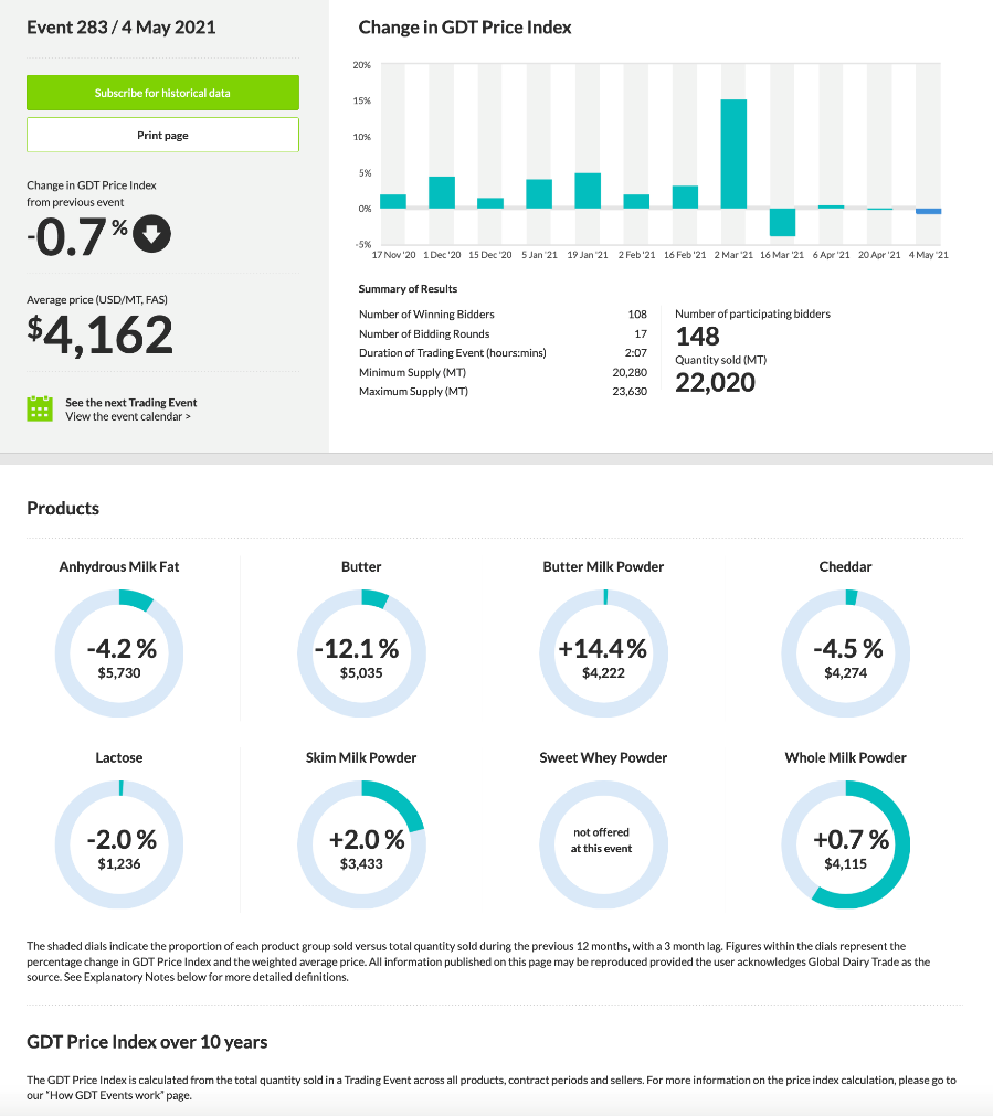
The above tables provide a variety of information about dairy and milk fat prices.
Note the recent increase in the auction price.
The New Zealand economy has remained reasonably resilient throughout the COVID-19 pandemic and more recently, helped along by increasing dairy prices. Butter prices are up 34% from the same time last year and whole-milk powder has increased by 46% from one year ago.
It looks as though there is strong global demand, some supply growth and possibly some rebuilding of stock levels that have come together to help support milk powder and milk fat prices.
Commodity Prices – New Zealand
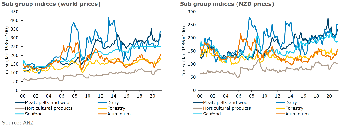
The above graphs show the movement of commodity prices with the left-hand graph showing world prices and the right-hand chart showing New Zealand dollar-denominated prices.
According to the ANZ World Commodity Price Index, this index increased 2.3% over the month of April going on to a record high. The drivers appear to be logs, aluminium, lamb, and beef. In New Zealand dollar terms, the index increased 2.2% over the month.
Shipping costs remain high due to congestion at some ports and increased demand for commodities. There are some indications that the cost of exporting goods to the likes of Asia may be stabilizing although by all accounts getting product to market from New Zealand remains challenging.
Economic Activity and Unemployment – New Zealand
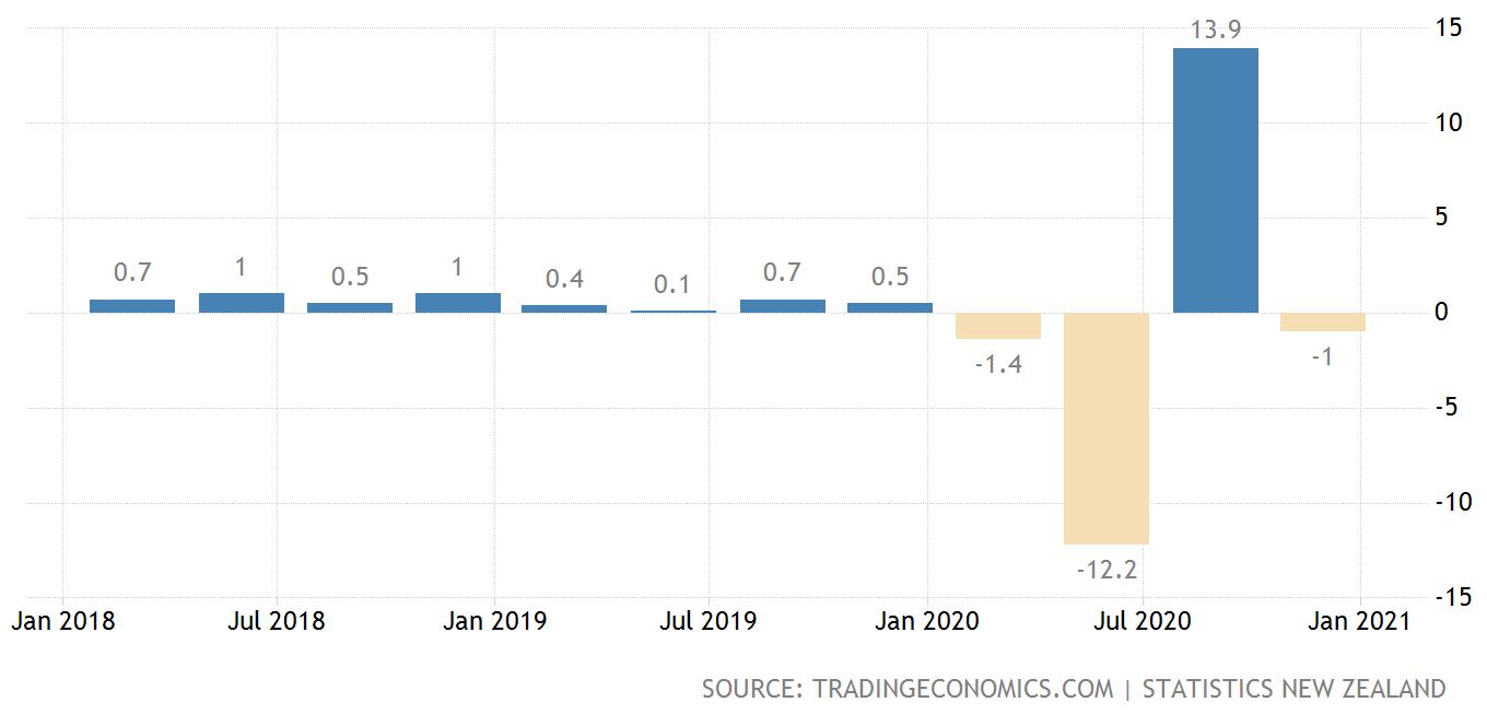
The graph on the left shows economic activity as measured by GDP and the chart on the right shows unemployment.
The New Zealand economy took a significant hit in 2020 as result of the COVID-19 pandemic recession but rebounded sharply.
More recently though, the gloss has gone off the rebound with economic activity contracting somewhat – not ideal. The market was expecting a 0.5% increase in economic activity but instead was met with a 0.9% contraction (on an annual basis) in the last 3 months of 2020. The decline was mainly due to reducing transport, postal and warehousing services. Mining was also down significantly at the same time.
On the other hand, education and services expanded 3.6%. Over the year ended December 2020 economic activity as measured by GDP contracted by 2.9%, one of the largest annual falls ever for New Zealand.
This is a timely reminder that New Zealand generally does perform quite well all things considered but we are a tiny economy and very narrowly based, which makes New Zealand vulnerable to significant changes on the global landscape and of course means we are a high-risk economy generally.
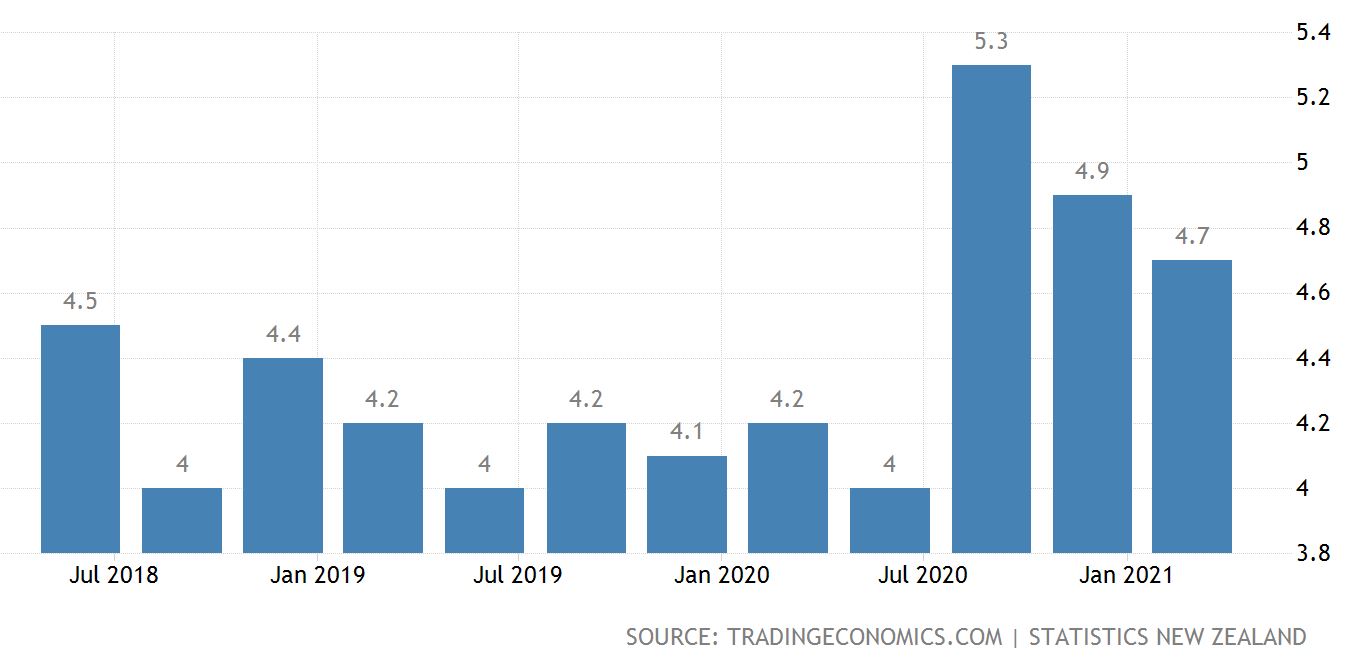
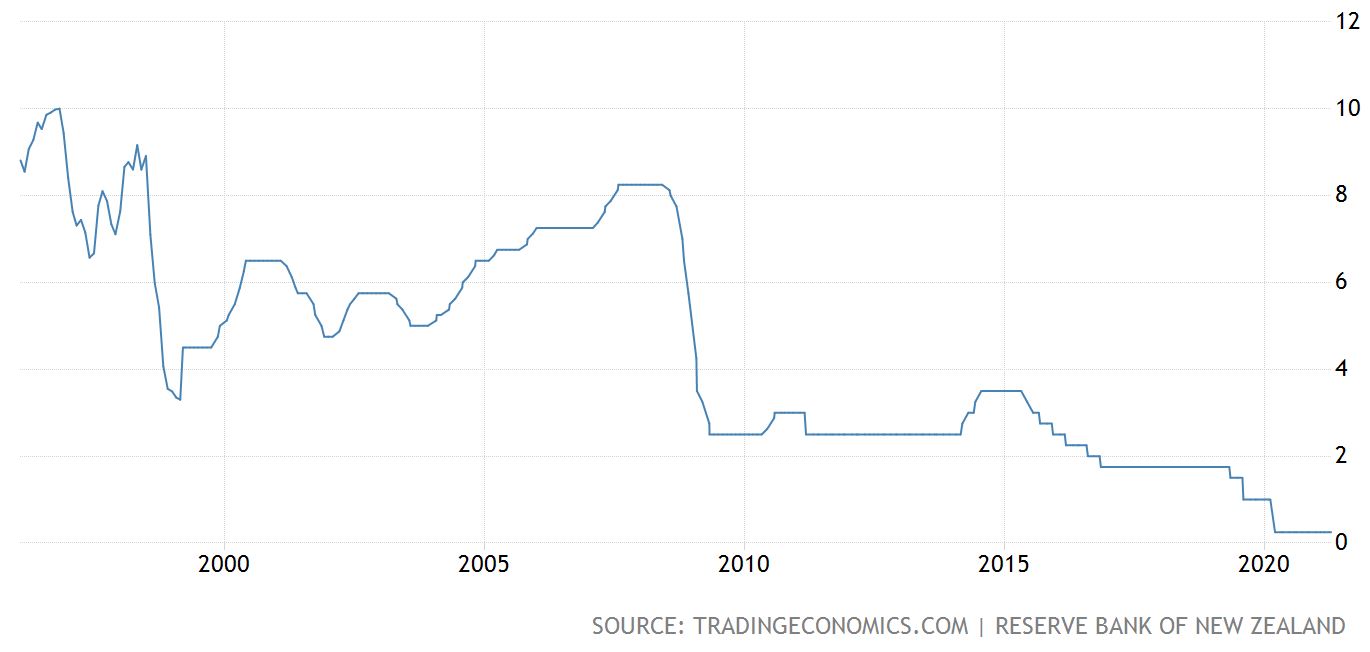
Interest Rates and Inflation – New Zealand
The chart on the left hand side tracks interest rates in New Zealand and the chart on the right shows the inflation rate.
The New Zealand reserved bank held its official cash rate at a record low of 0.25% during its April meeting.
Also, the Large Scale Asset Purchase program (LSAP) of up to NZ$100 billion and the Funding for Lending Program (FLP) operation have been left unchanged.
Policy makers are keen to leave support measures in place until they are confident that economic growth, inflation and their employment objectives are sustainable.
Interestingly, they have stated that they will tolerate some excesses in terms of unusually high inflation and other temporary factors that may occur in short to medium term.
I wonder if that includes rising house prices !?
As I mentioned earlier, Australia’s Reserve Bank appears to be willing to allow house prices to rise as part of the process of helping the economy to get back on track.
Another interesting facet of the New Zealand economy is the fact that it is largely based to some degree on residential property. More specifically, if they allow residential property prices to decline sharply for too long, because residential property plays such an important part of the economic mix, this will have a strongly negative effect on economic recovery.
Politically then, this government will want to slow down rising prices. Economically though, at the same time they need to be careful not to damage residential property prices too much because that could stifle economic recovery.
Annual inflation in New Zealand increased to 1.5% in the first quarter of 2021, from 1.4% in the previous 3 months. This was compared to market expectations of a 1.4% gain.
The reserve bank would want to see inflation increase a bit more and sustainably as part of the mix of ensuring the economic recovery is sustainably underway.
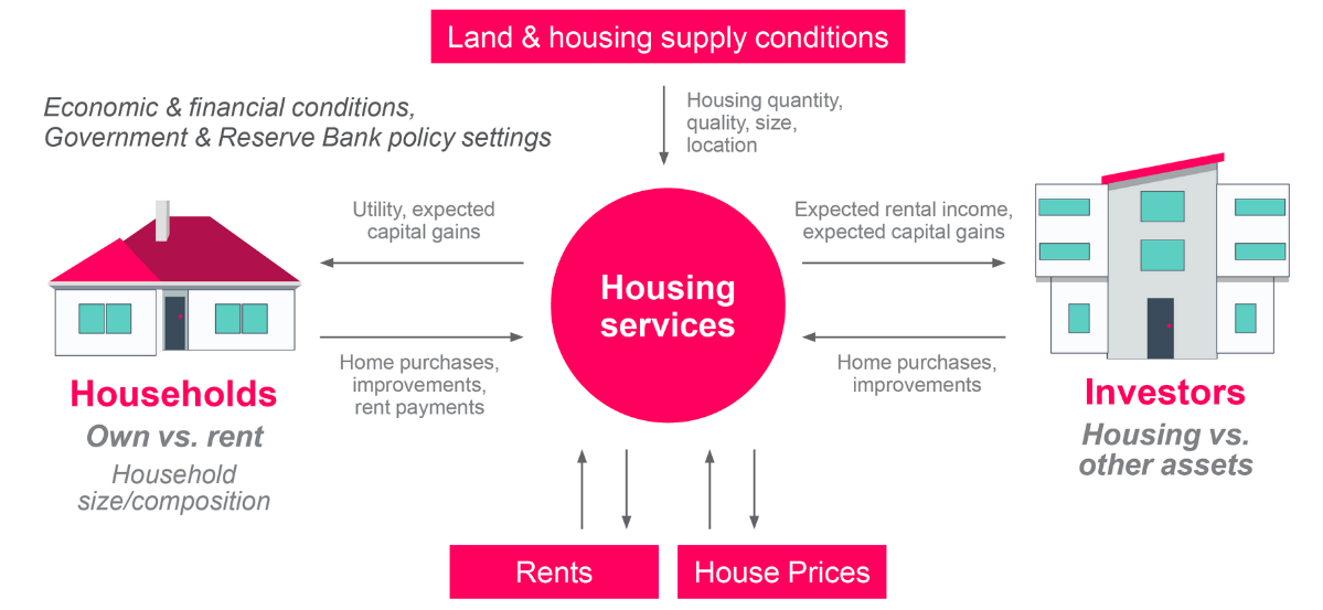
The above diagram is a model that the Reserve Bank of New Zealand uses to assess its policy setting
around housing in New Zealand.
In simple terms, the NZ Reserve Bank are assessing the sustainable level of house prices by thinking about the value that people derive from housing services as well as understanding the drivers of demand and supply.
Everyday Kiwi first-home buyers likely want to see the Reserve Bank act immediately to stall rising house prices and make it easier for them to get on the property ladder.
The challenge that the Reserve bank faces is that whatever that they decide to do, they’ll need to make sure that it does not have an unexpected reaction down the track that becomes difficult to contain.
They will adopt a very measured approach to housing I believe. That may however include other ‘speed bumps’ in addition to the current loan-to-value ratio and the recent removal of deductibility of interest for investors here in New Zealand. It could, for example, consider a debt-to-income ratio that has been talked about over the last year or so.
The New Zealand economy has rebounded, thanks to the efforts of Jacinda Ardern and her team. It has been a bit patchy from time to time and there are still fears that a community infection is just around the corner.
Without doubt, in hindsight there are a number of initiatives that could have been executed more efficiently however we are in a good place, as is the global economy as it emerges from the clutches of the COVID-19 pandemic recession.
I know it’s not over yet. Still, we are heading in the right direction – all things equal.
To Summarise …
Tracking economic activity and personal mobility
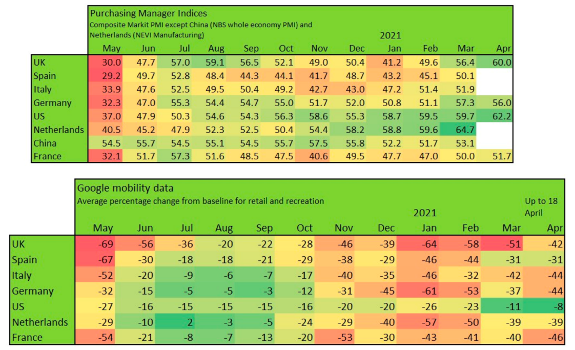
The top table above tracks the Purchasing Manager Indices for selected economies (the top table). The lower table tracks the change in personal mobility. The red colour means reducing mobility which is a bad thing. The greener the colour the greater the increase in mobility and the better. Likewise for the Purchasing Manager Indices, red is bad, green is good. Remember that with regards to the top heat map, that a number below 50 is not a good thing and above 50 means growth and expansion. Looking at the lower table, showing mobility data, it is interesting to see how the red indicators reappeared again from November through March for many countries.
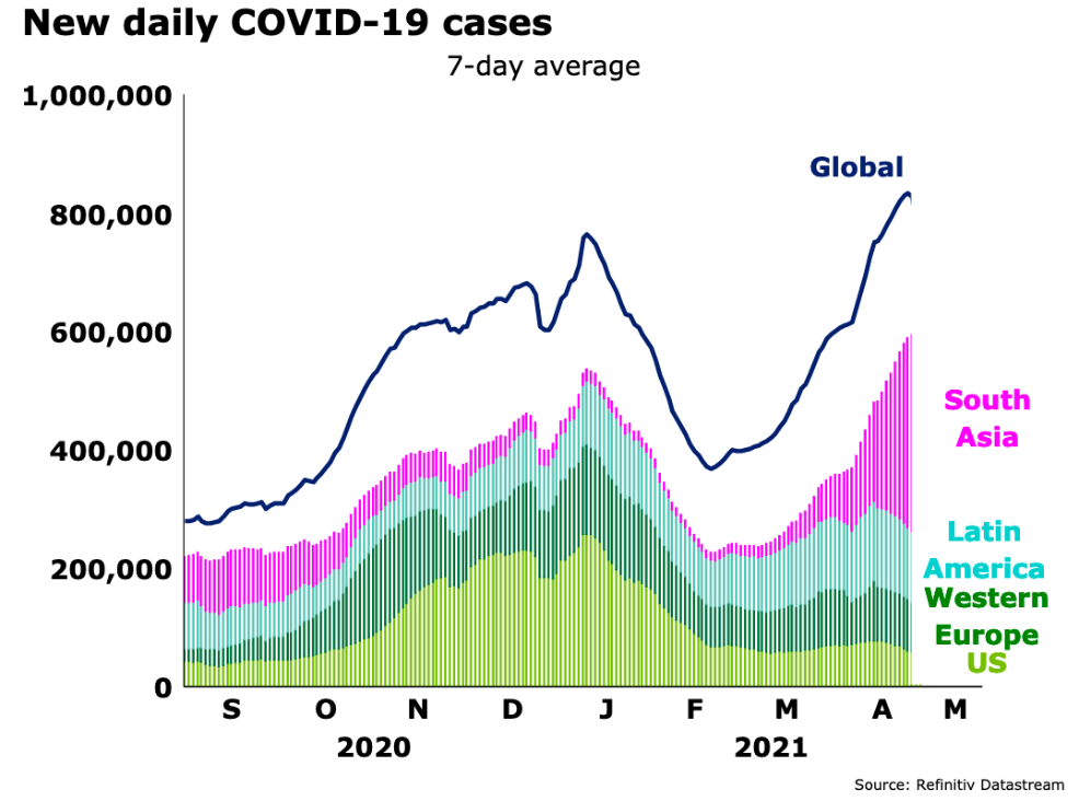
The above graph tracks the change in COVID-19 infections. See who is under control and who is struggling?
The above chart provides a clear indication of the trajectory of COVID-19 infection cases.
South Asia and in particular India is surging with Latin America struggling to bring COVID-19 under control.
Western Europe and the US ( and although not shown, Australasia, China ) have achieved more with regards to COVID-19 containment. Hopefully, the world will step up and assist India, Latin America, and other developing economies. Until they are under control with the spread of the virus, the rest of us are still not safe. Certainly, global trade may struggle to continue as before the coronavirus emerged.
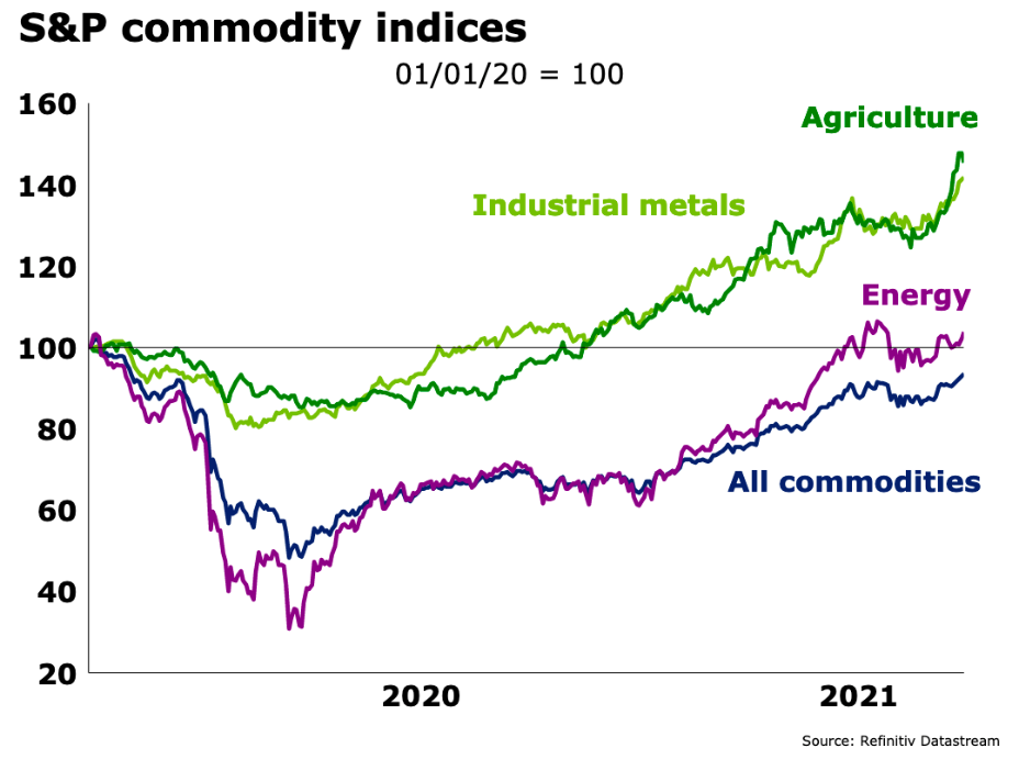
The above graph tracks the prices of industrial metals, agricultural commodities, energy,
and all commodities (the dark blue line).
Although its early days yet, the talk of increasing inflation is circling the markets and certainly rising commodity prices support this view.
A sharp spike in inflation would see a number of central banks around the world respond by spiking interest rates up in order to keep inflation under control. It is a bit of a double-edged sword though because prolonged increased interest rates add to the fire of inflation overtime as well.
On the other hand, inflation, I suspect is the one cure all for ( the big bad ) high levels of debt globally – time will tell…
Although an inflationary environment is a different environment in some ways, on the other hand it doesn’t change the underlying fundamentals for investors.
It is a different environment that can create a so-called “capital dislocation” where some people and businesses are caught out, to a greater or lesser extent – others thrive.
That’s the same in every part of the cycle and with every new event that suddenly emerges – just a question of working out where you and I sit and how well we are placed.
Providing we’re adapting a fundamental approach; it shouldn’t make much difference to us.
Perhaps the first step is to be careful not to read too much into the popular media narrative that will no doubt be suggesting all kinds of hell are about to break out across the world if inflation looks like it’s starting to take hold.
Step 1 then, could be just to keep our powder dry so to speak, focus on the facts.
Focus on our goals.
Keep it fundamental.