Is Donald Trump Right!?
Market and Economic Update – Fortnight Ended 28th June 2019

Peter Flannery CFP AFA
“If you have one economist on your team,
it’s likely that you have one more than you’ll need.”
Warren Buffett
The Markets
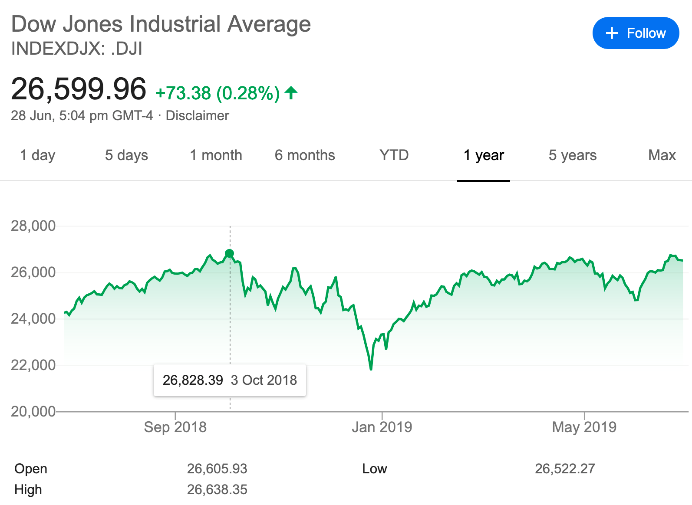
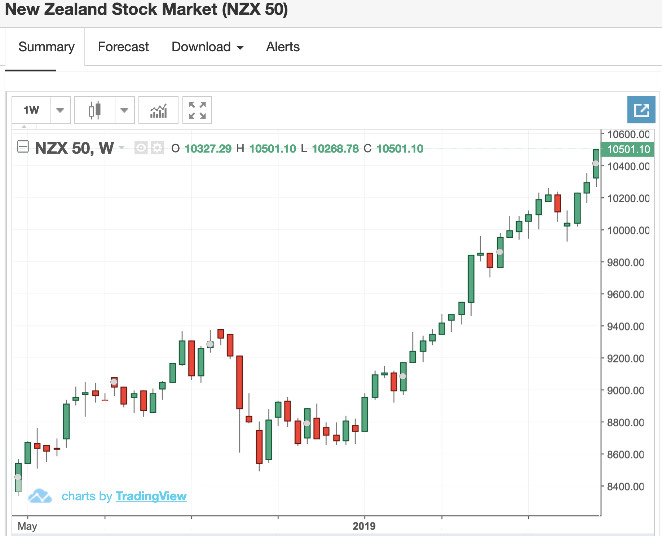
The left side chart shows the movement in the Dow Jones Index (the American share market) and the chart on the right shows the movement in the New Zealand share market, both over the last 12 months.
Can you trust the markets? I ask this question because markets in the US and New Zealand have been buoyant over the last six months or so. The question is why? There are, of course, a variety of factors; the main ones being the realisation across global markets that, despite trade tensions between China and America, the global economy is not coming to an end just yet. In addition, we have seen a confirmation by Jerome Powell, the US Federal Reserve Governor, that he is continuing down the path of holding off on further rate hikes, with increasing commentary around the possibility of a rate cut by the US Fed in due course.
The New Zealand share market has risen reasonably strongly on the back of investors hunting down shares with a high dividend yield. From an investment perspective, for those investors looking for yield / income (they are likely bailing out of term deposits and bonds, whose returns are ever diminishing), those high yielding investments are worthwhile from an income perspective. Although it changes from day to day, there are good yields available (easily above 6%) on the likes of Hallenstein Glasson, Spark, Briscoes and others.
Bear in mind though that strong yields coming out of these companies is a result of the dividends being paid, which in turn means that they are paying out lots of profit – not so good for long term growth. In the short term then, for those looking for income, these companies offer a worthwhile home for funds, driven no doubt by those ever-diminishing interest rates from term deposits and corporate bonds that mature and re-enter the market at a significantly lower rate than even two years ago.
So, can you trust the markets? With prices rising because investors are chasing the highest yields they can find, for those playing that game (this is playing the stock market), this approach will work until it does not. Although it is difficult to predict the future, right now, it looks as though that approach may well work for the foreseeable future, as interest rates remain low and may even decline further. So, I suppose the answer is that you can trust the markets … until you cannot!
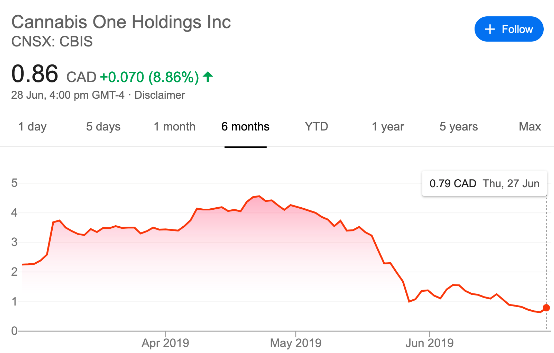
The above chart shows the trading price of a Canadian business called Cannabis One Holdings Inc.
Since the company’s April high of CAD4.56, the trading price has declined by 83%, closing recently at 0.79c. As you may know, companies involved with Marijuana have been popular with some investors in a number of countries around the world, as they seek to take advantage of being early adoptors to what they hope is a promising new industry. They want to get in “on the ground floor”. It may well be for all we know; however, nothing is certain. Therefore, investing in this area can only be speculation, not investing. This particular company has been the target of short sellers. Basically, investors take a position and decide to sell off their holdings, creating a landslide decline in the trading price. There could be a variety of reasons. For example, it may be they actually see bigger opportunity ahead and buy (after selling). Creating a sell off, they can then go in after the share price has declined significantly and take advantage of the upcoming opportunity. I am generalising and not referring to Cannabis One holdings Inc. If the business model for this business looked sound long term, then indeed, there would be a good opportunity to buy more shares while the trading price is down; however, for this particular business, nothing is certain and the business model relies on a number of variables all working out favourably. Therefore, we have, as I mentioned earlier, a speculative option rather than a reliable investment. I know, there are lots of speculators who get excited about the idea of investing in a Marijuana company. Do you think it is wise to follow them?
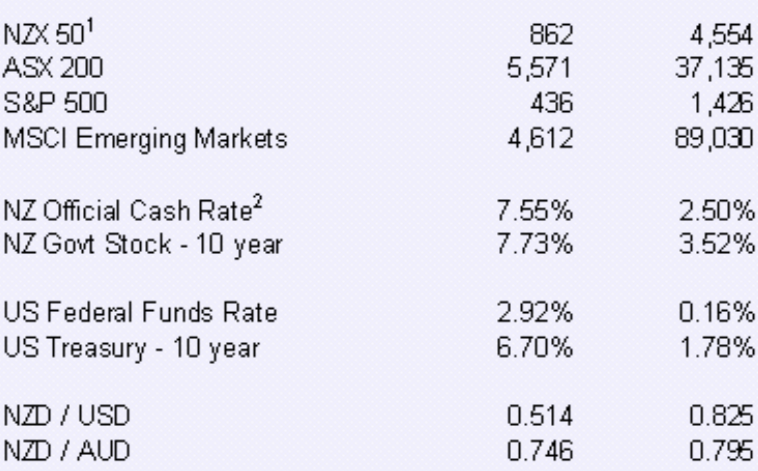
This chart shows the movement in the indexes of the New Zealand share market (NZX50), Australian share market (ASX200), American share market (S&P500) and global markets (MSCI) emerging markets from 1992 to 2012. It also shows New Zealand’s official cash rate and 10 year government stock rate. Below that, it shows US Federal Reserve funds rate (a short term rate) and then the US Treasury 10 year bond rate. Below that, is the cross rates for the US Dollar and Australian Dollar. Please note that the NZX 50, ASX200 and MSCI include dividends, whilst the S&P500 does not.
There is nothing too special about the above chart, other than it shows how things can change over a period of time. It also shows how investing in growth assets can make your money grow. Whilst all of those four market indexes, outlined at the top of the chart, will have incurred, at times, significant pricing volatility (moved up and down), over time, that jagged line of volatility smooths out and the growth over that 20 year period becomes a smooth line. This confirms the point; productive assets grow. Even if you diversify widely across the whole index and slow down your returns, you still can achieve growth. Better though, to be a value investor, so that you can select specific businesses and enjoy a more targeted approach to investing, offering potentially improved returns.
Economic Update
US Federal Reserve Funds Rate
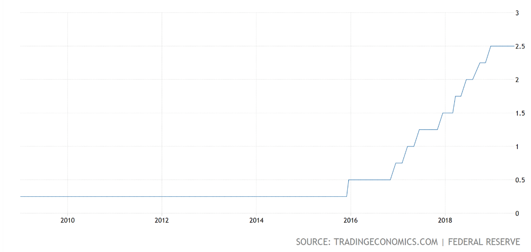
This chart shows the Fed Funds Rate over the last five years, including the recent on-hold pattern.
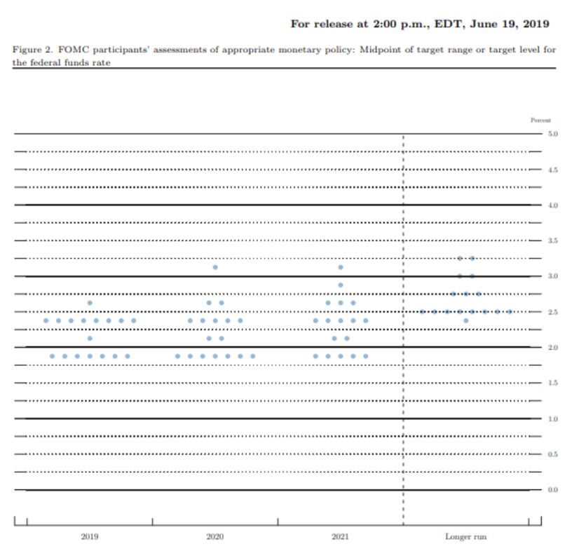
As expected recently, the US Federal Reserve announced that it is leaving its benchmark interest rate unchanged at a target range of 2.25% to 2.5%. Policy makers at the Federal Open Market Committee (FOMC) all submit their projections about where they think interest rates are heading. This happens four times a year. A dot plot (see below) is developed, which is a visual chart. It is anonymous and represents where members think rates will go over the short, medium and long term.
Here are the Fed’s latest targets, released in last week’s statement:
The FOMC dot plot
This is what it looked like back in March this year.
The FOMC dot plot
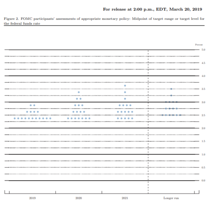
The time line is across the bottom and the level of interest rates on the right side axis. The above two dot plots show what the FOMC is thinking about interest rate direction over the next few years.
The Fed Fund Rates appears to be on hold for now; however, Jerome Powell has left the door open for an interest rate cut in 2020. On all of their minds at the Federal Reserve, will no doubt be trade tensions between the US, China and other trading partners of the United States of America.
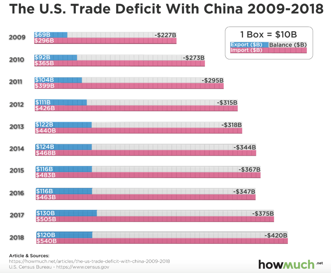
This chart shows the ever increasing trade deficit with China. Maybe, just maybe, Donald Trump has a point!
Every year from 2009 through 2018, America has imported more goods from China than it exported to China. Over that time, the trade deficit has pretty much doubled. Apart from 2016, the total volume of trade between the two countries has steadily increased. In my view, with China’s Belt and Road initiative, I see a settling down of trade tensions between America and China; however, the results out of that initiative, is likely many years away. In the meantime, there is plenty of room for the ongoing tensions between the two countries to continue. Although an oversimplification, China continues to play the long game, demonstrating real patience with the Trump administration; whereas Donald Trump, on the other hand, just wants to get his own way. Rightly or wrongly, he knows what he wants and has a history of going after what he wants until he achieves his goal.

The above image shows two students, pulling a mock ball and chain, representing the $1.3 trillion of outstanding student debt.
Student debt is a number often scrutinised by politicians and economists, although it is questionable as to whether it alone is a concern for the American economy, let alone the global economy. That said, at the height of the global financial crisis, around 2009, student debt was around $611 billion and has been rising ever since. The number is now somewhere around $1.486 trillion.
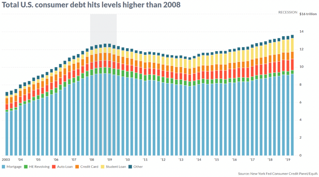
The above chart shows the makeup and amount of total consumer debt.
Consumer debt did reduce in the aftermath of the 2008 global financial crisis; although, as we can see from the chart above, has started to increase again from around 2013. Currently, total consumer debt has now climbed higher than the level of 2008. That said, it is just as important to note that delinquencies (those defaulting on first mortgage loans, for example) are also lower than prior to the 2008 global financial crisis. So, while the level of debt is higher, delinquencies and defaults are quite a bit lower than in the aftermath of the 2008 global financial crisis.
New Zealand
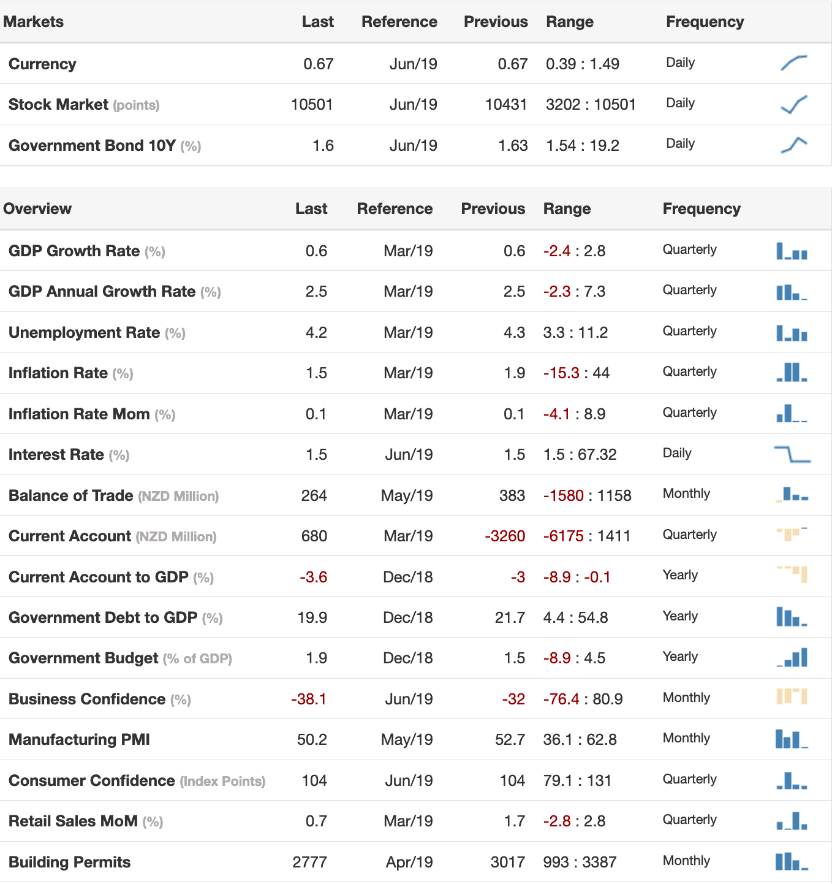
This chart shows a variety of economic data for New Zealand but of particular interest is the level of interest rates in New Zealand, which like many countries around the world, having remained on hold for some time, is now looking to decline even further.
The New Zealand economy, has seen some publicity around softening market sentiment, suggesting that economic growth, at current levels, may be under threat. As the above chart shows, economic growth in New Zealand is tracking at around 2.5% as measured by gross domestic product (GDP). That is an okay rate of growth but not stellar. In summary, New Zealand is tracking okay and compared to some other countries around the world, has a lower level of debt; however, our productivity remains sluggish.
New Zealand Residential Property, Changes in Value and Rent
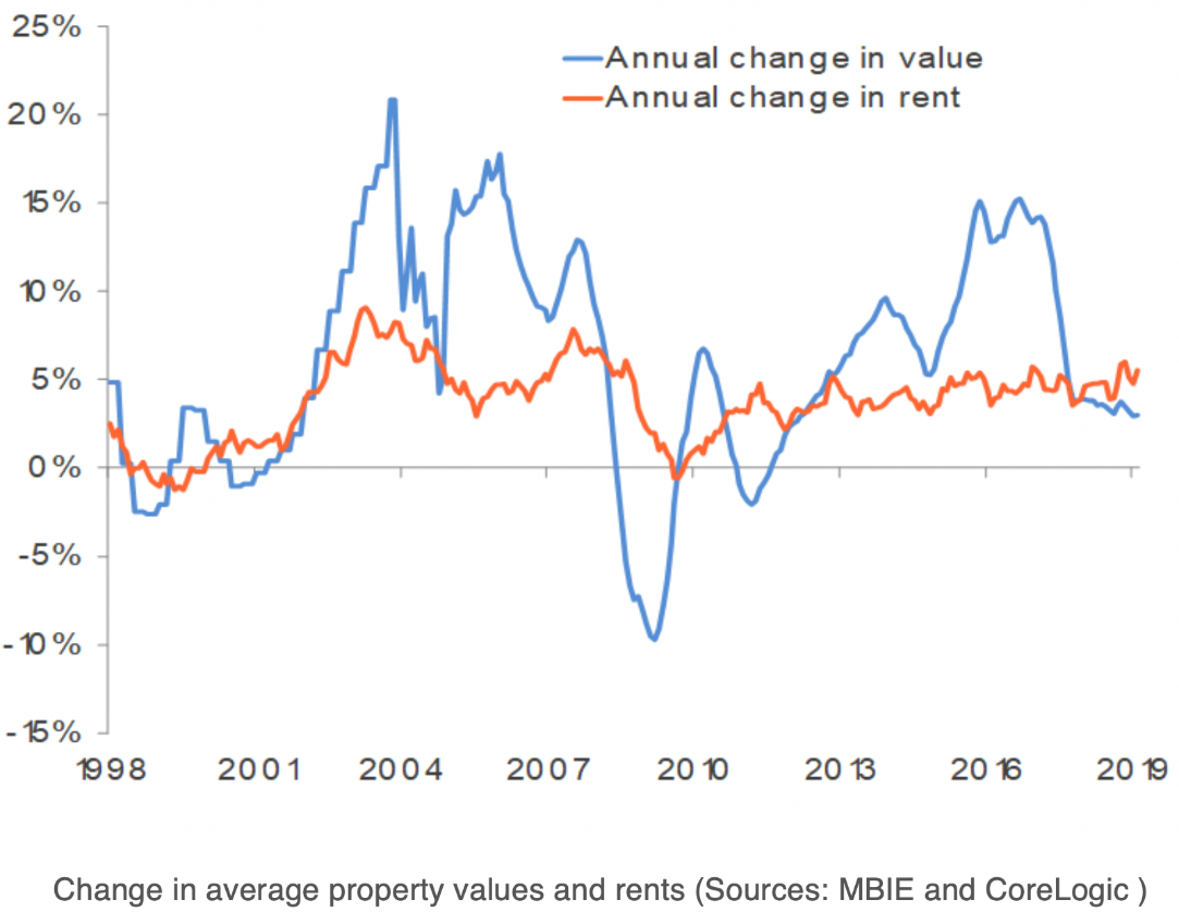
This chart shows the change in residential property prices and rent.
Rents in New Zealand have been picking up across the board, due just as much to softening property prices as anything else. In general terms, rents tend to be anchored by tenants’ income growth, which of late has been somewhat subdued. Across the index, rental yields remain relatively low, sitting at around 3.3% – not much better than bank rates! Without the support of the ever-expanding liquidity bubble, property price growth may be more closely tied to local economic growth and market conditions. After all, why would residential property prices continue to rise otherwise?